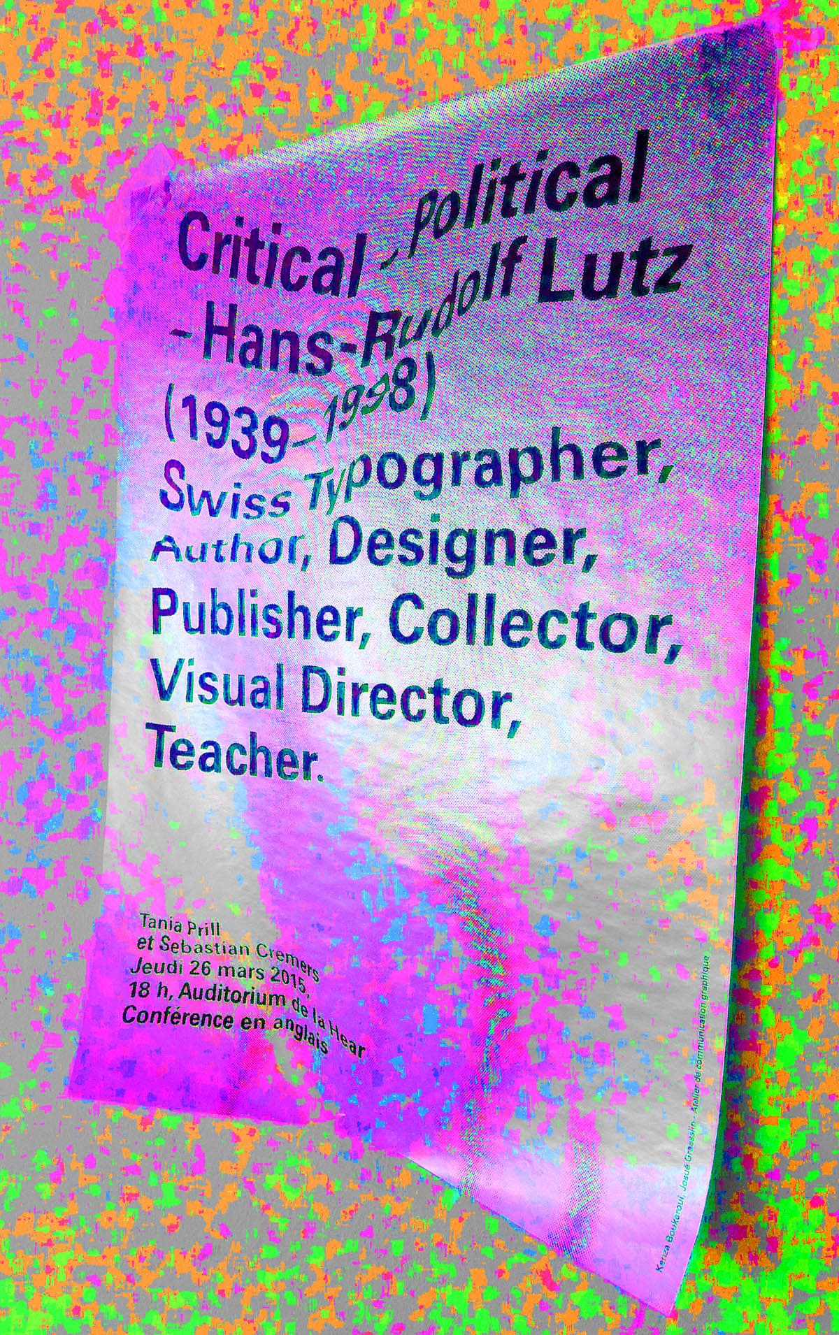
Hello. We are a design studio based in Zurich & Bremen with a focus on editorial design, typography and visual identity. Tania Prill was trained as a Communication Designer and researcher at the HfK Bremen, the former HFG Zurich (ZHdK) and the HGK Basel. 2018 she started her own studio to collaborate with different artists, designers and networks. Before that she was partner in the studio Prill Vieceli Cremers former Prill & Vieceli since 2001.
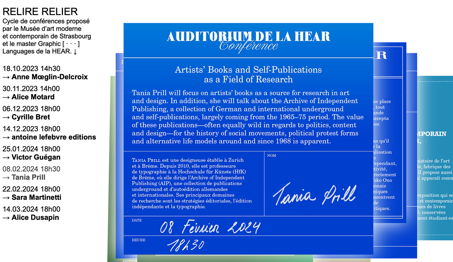
From 2004 to 2010 she was Professor of Communication Design at the HfG Karlsruhe. Since 2010 she is Professor of Typography at the University of the Arts Bremen (HfK) where she runs the Archive of Independent Publishing (AIP), a collection of German and international underground and self-publications. Her main fields of research are editorial projects, self-publishing, typography and design education. She is in charge of the estate of the typographer, teacher, publisher and author Hans-Rudolf Lutz.
Works
Weltformat Festival
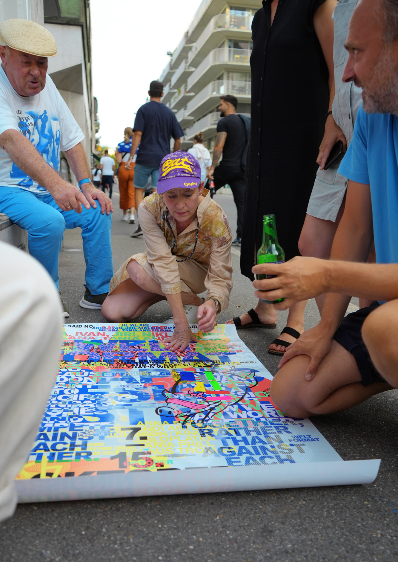
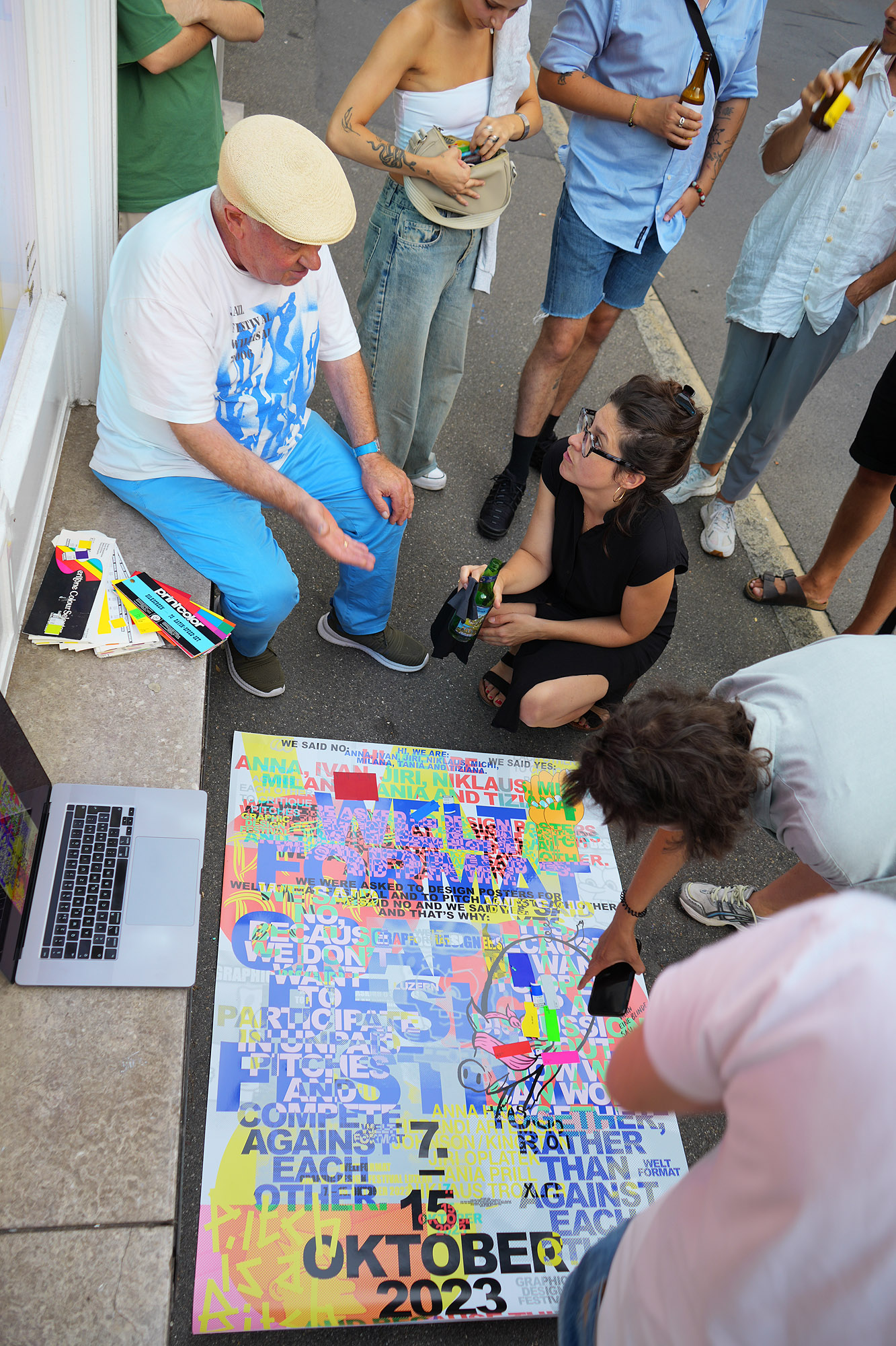
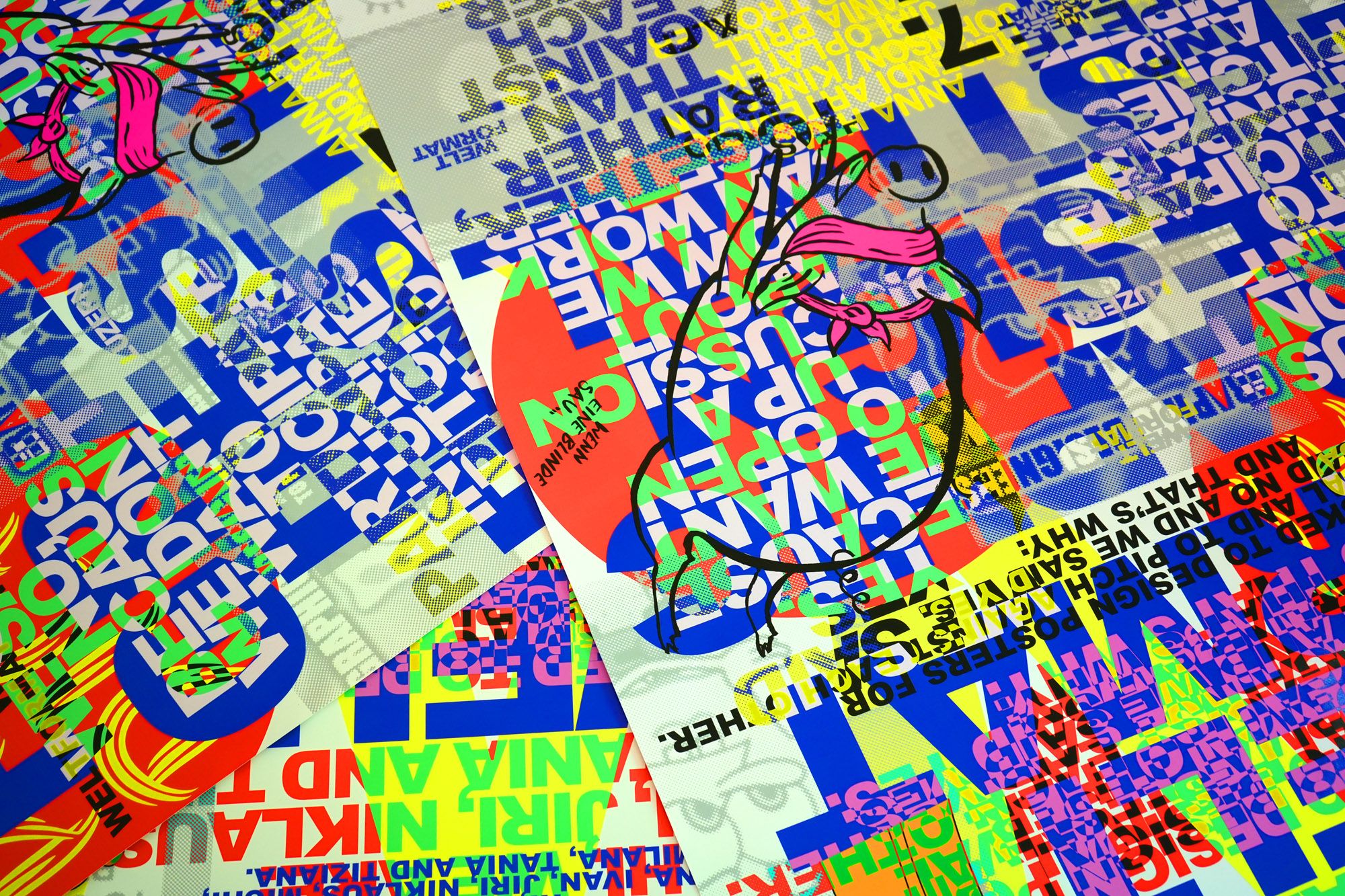
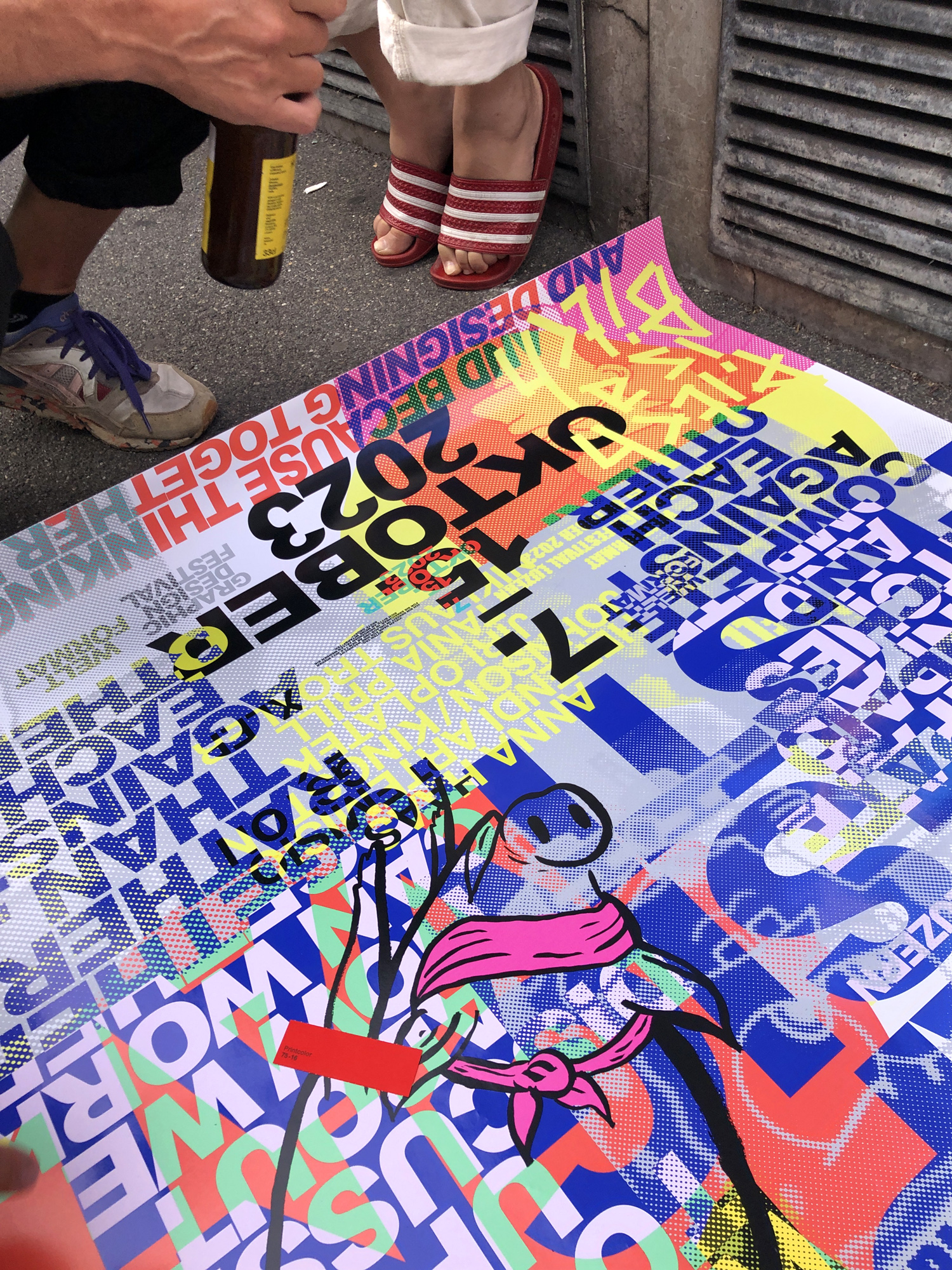
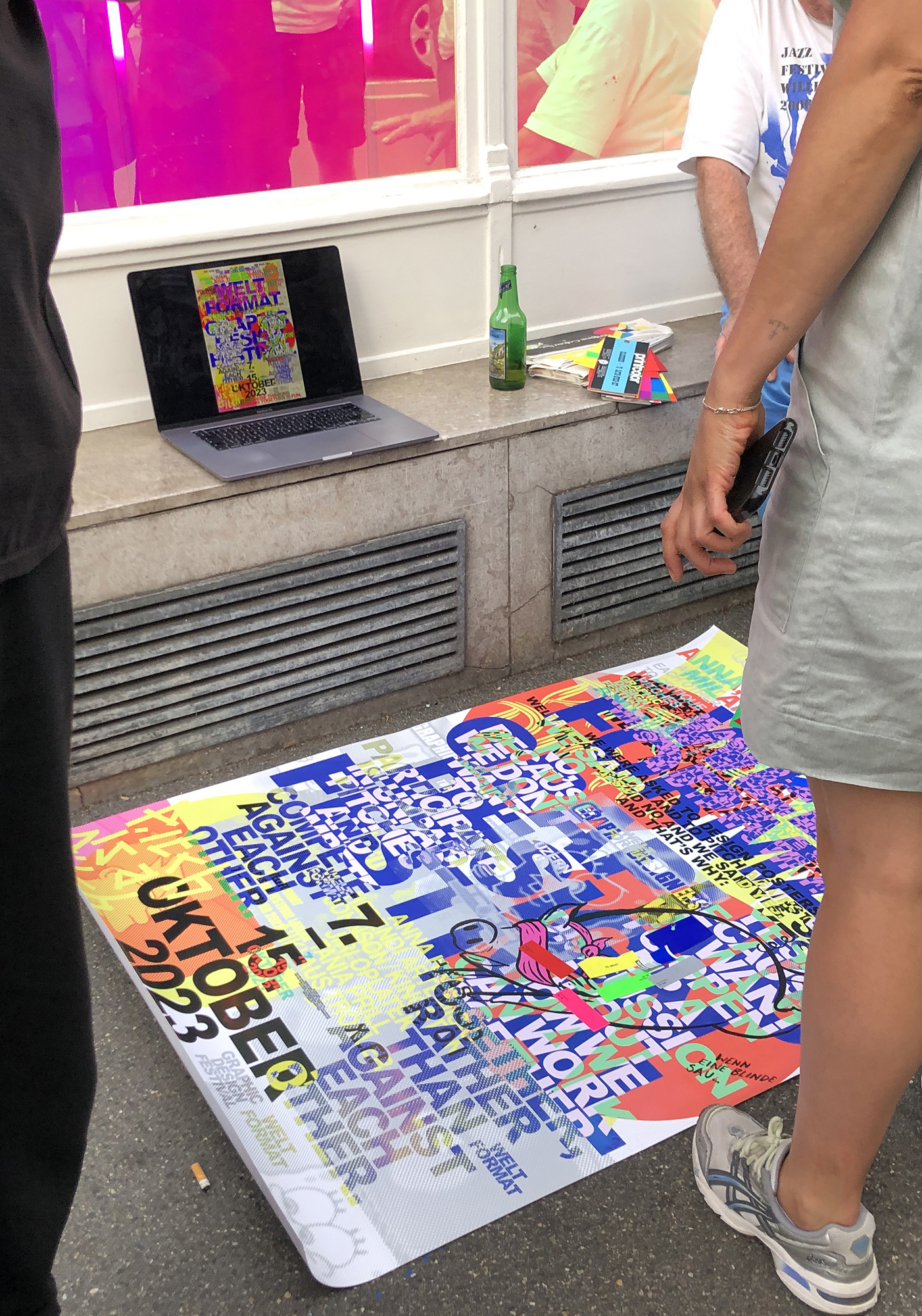
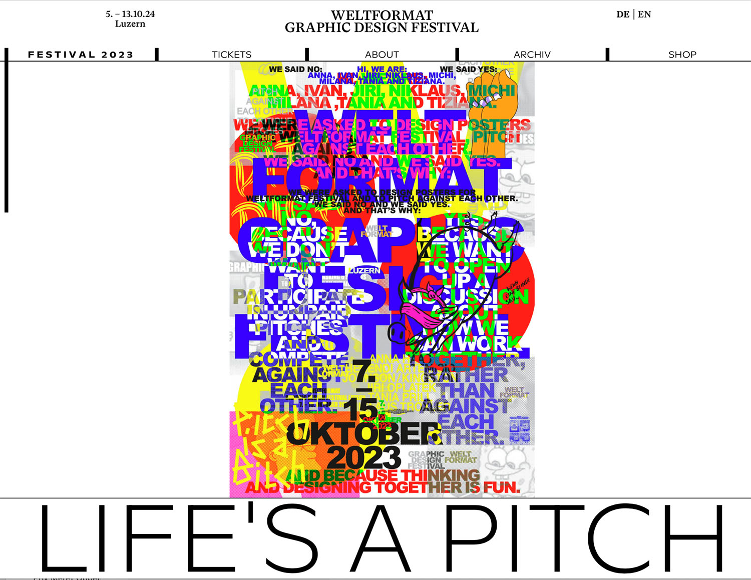
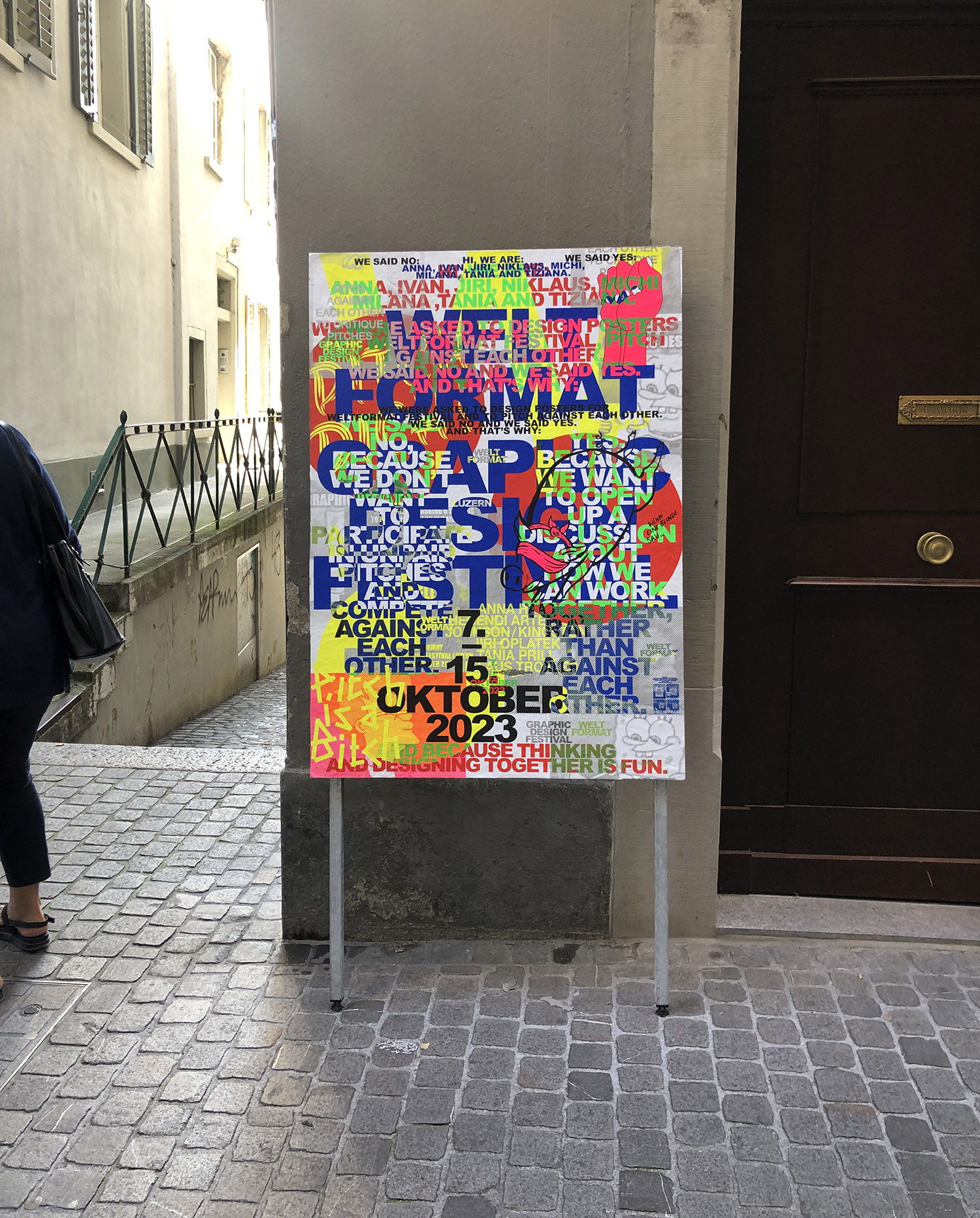
Poster 2023 – Anti-Pitch
Hi, we are: Anna, Ivan, Jiri, Niklaus, Michi, Milana, Tania and Tiziana. We were asked to design posters for the Weltformat Festival, pitch against each other. We said NO and we said YES. And that’s why: We said NO, because we don’t want to participate in unpaid pitches and compete against each other. We said YES, because we want to open up a discussion of how we can work together, rather than against each other. And because thinking and designing together is fun.
DESIGN: Anna Haas, Herendi Artemisio, Johnson / Kingston, Jiri Oplatek, Tania Prill, Niklaus Troxler
Swiss Life Arena

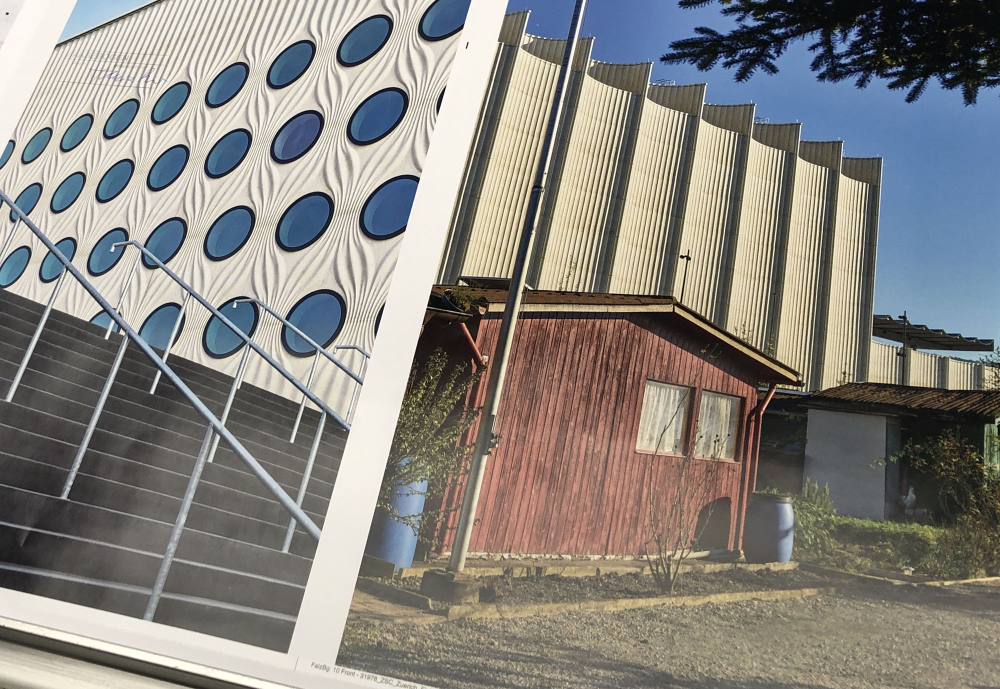
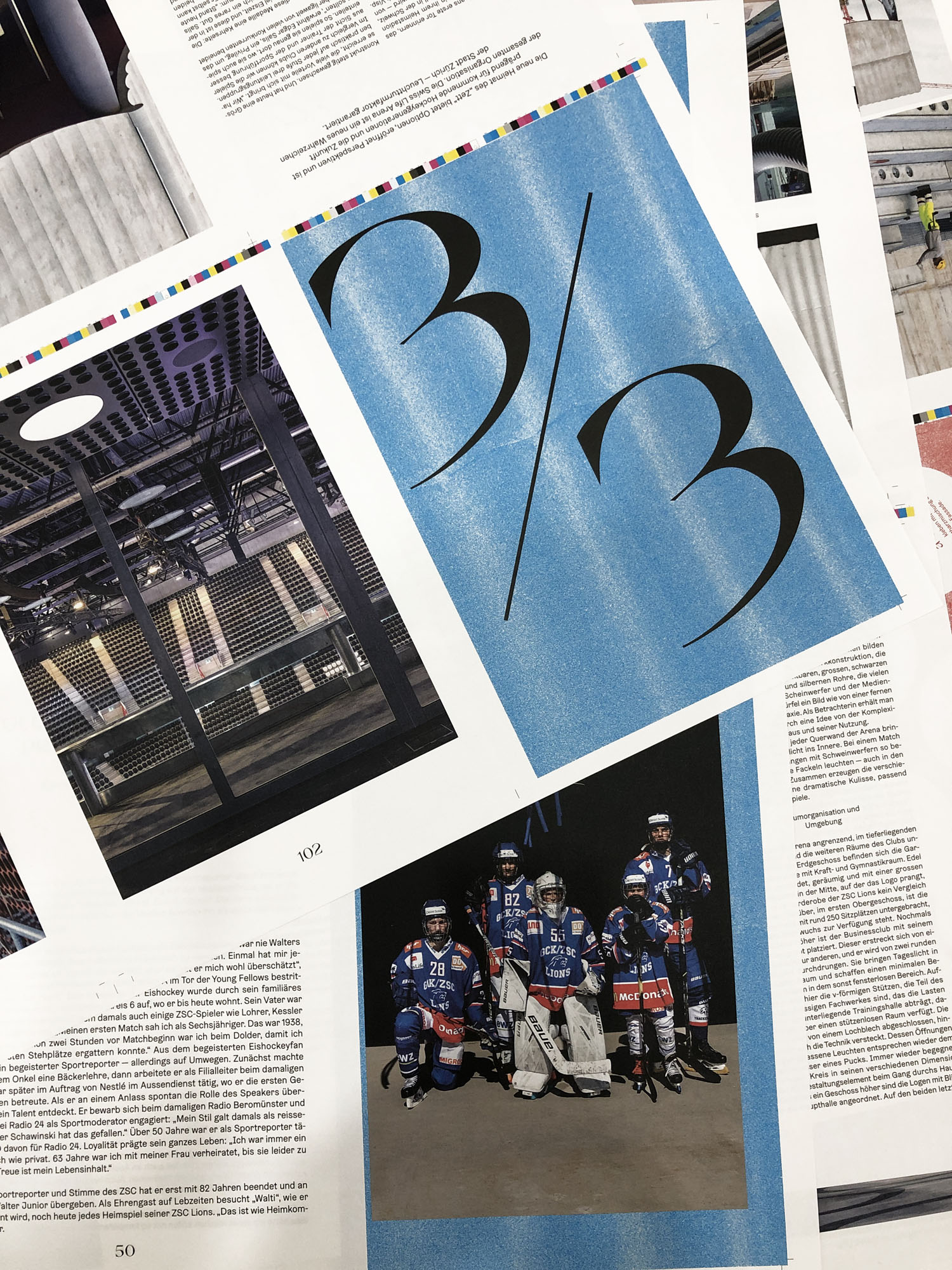
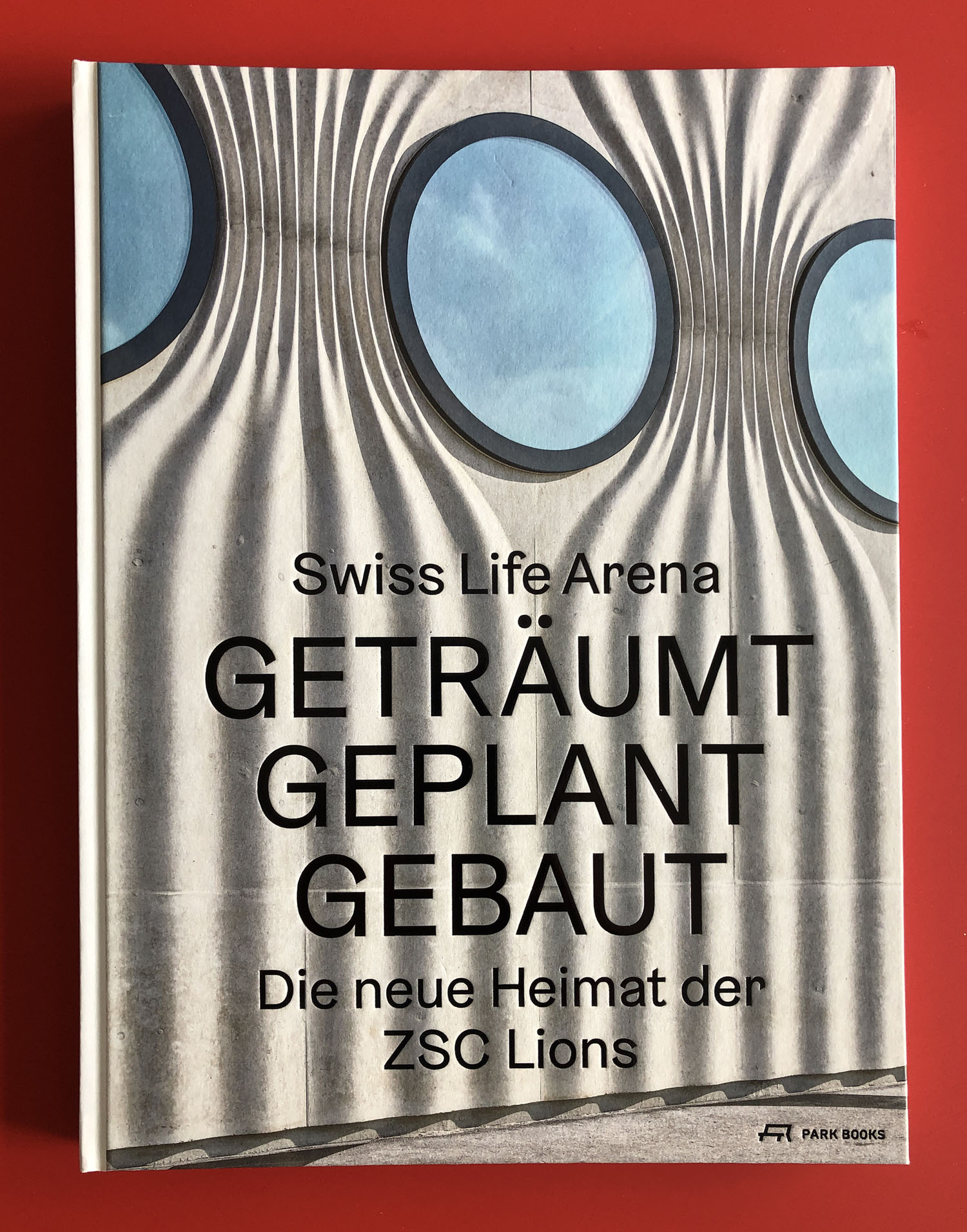
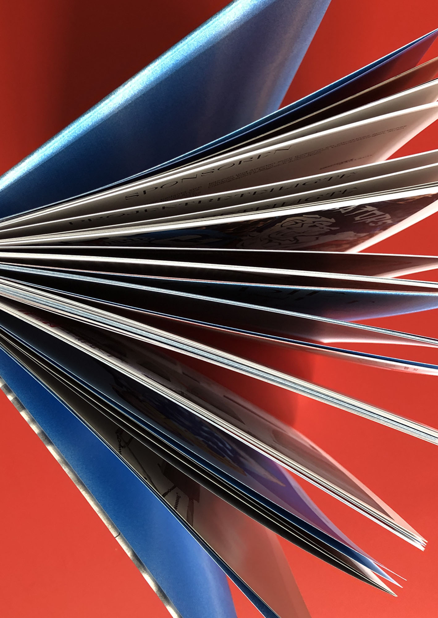
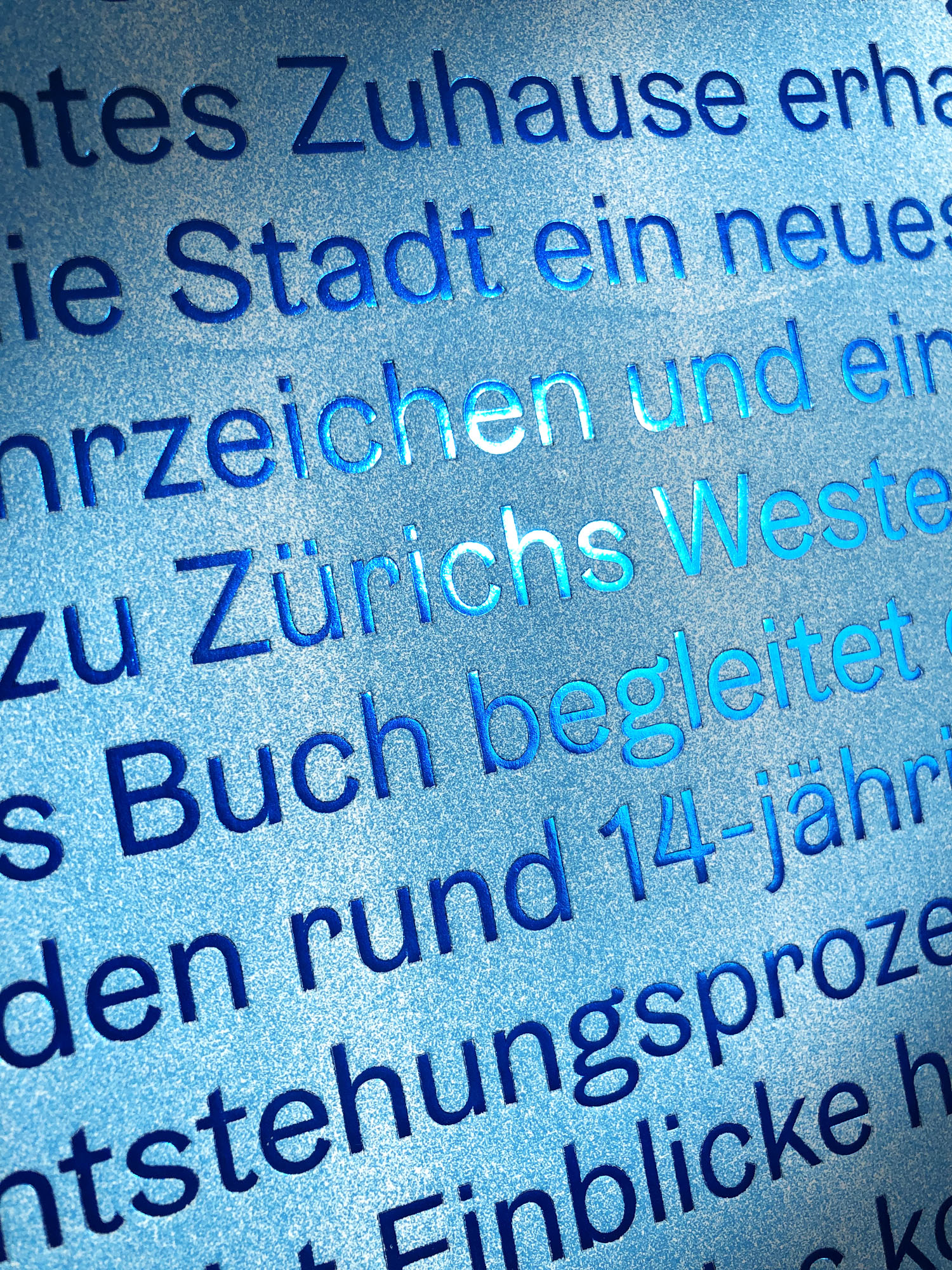
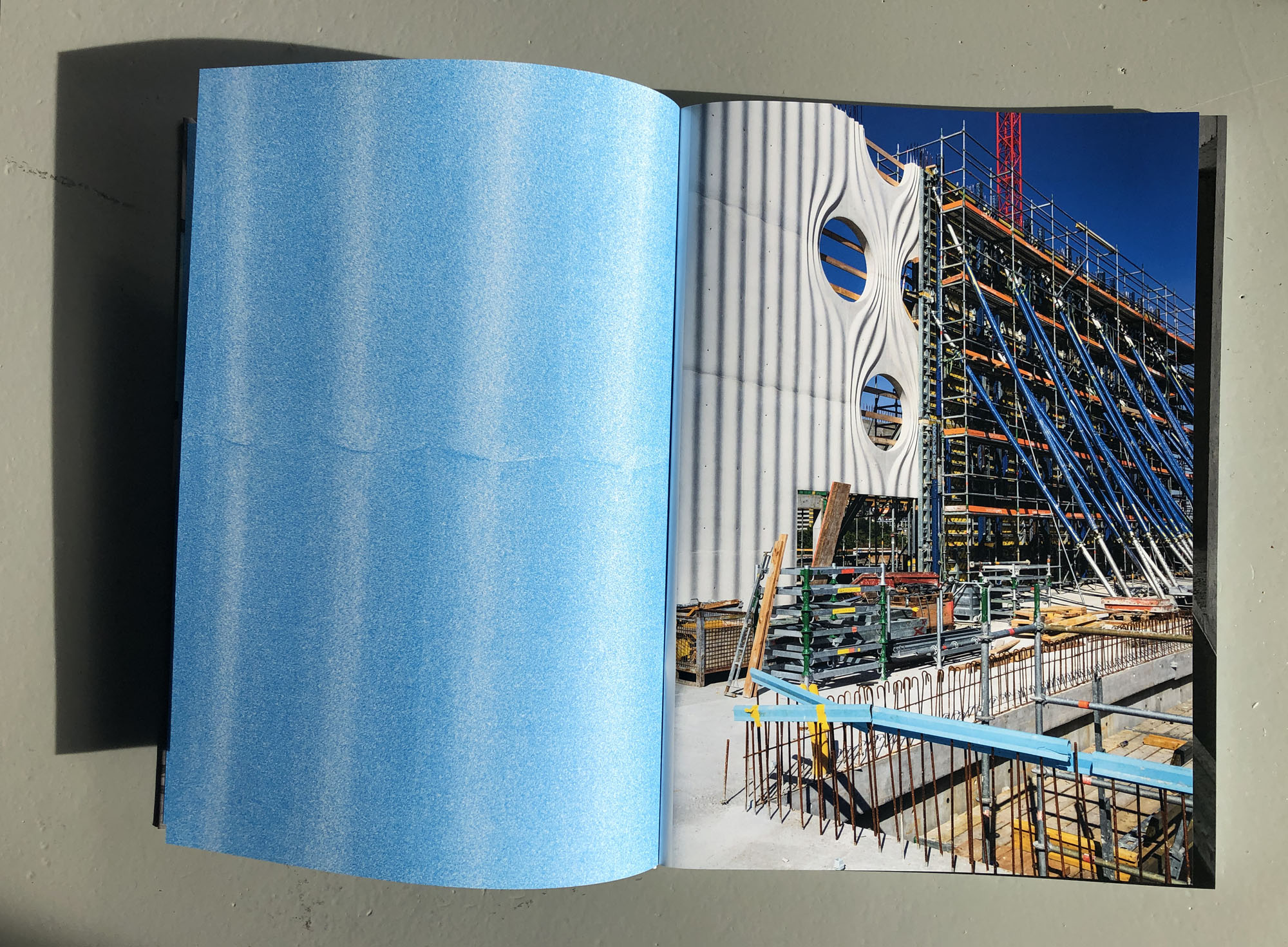
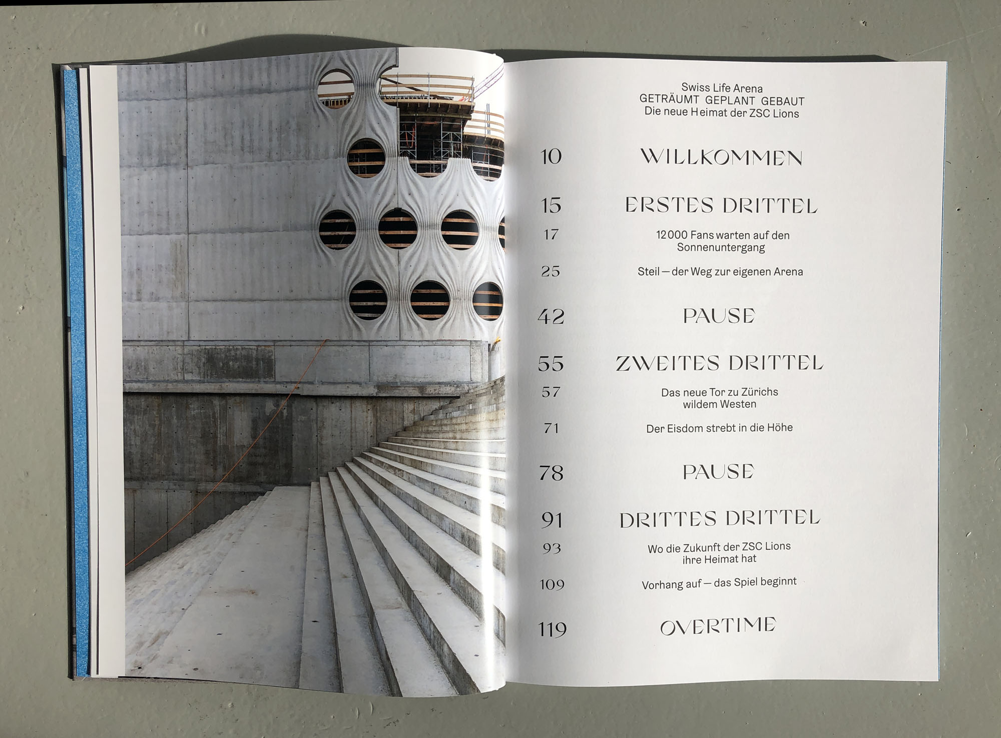
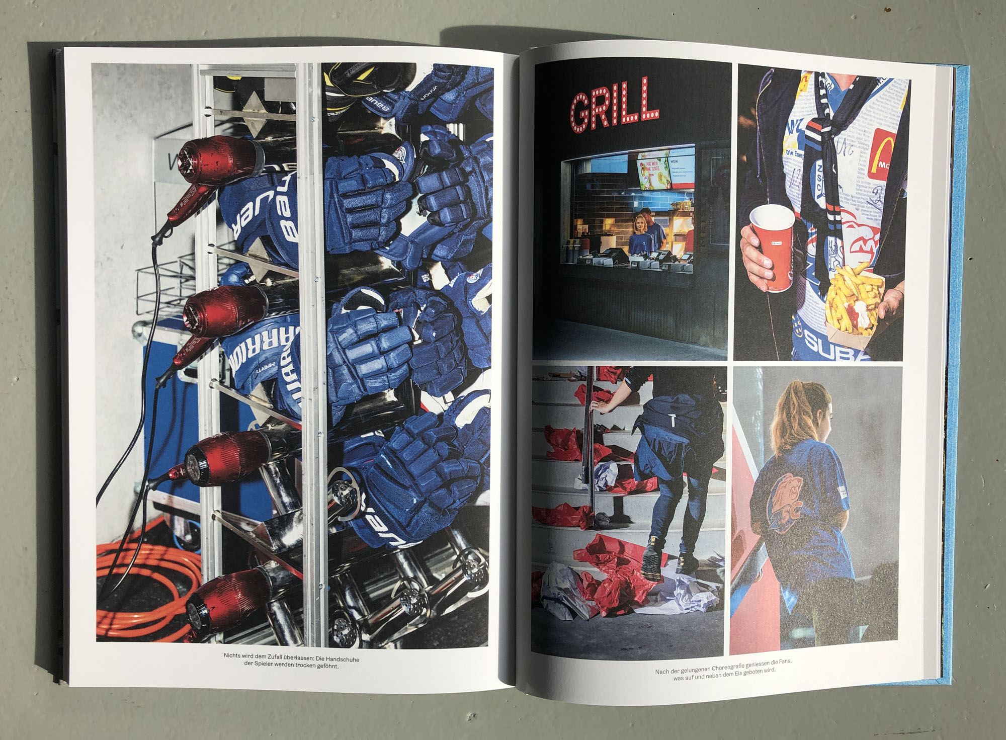

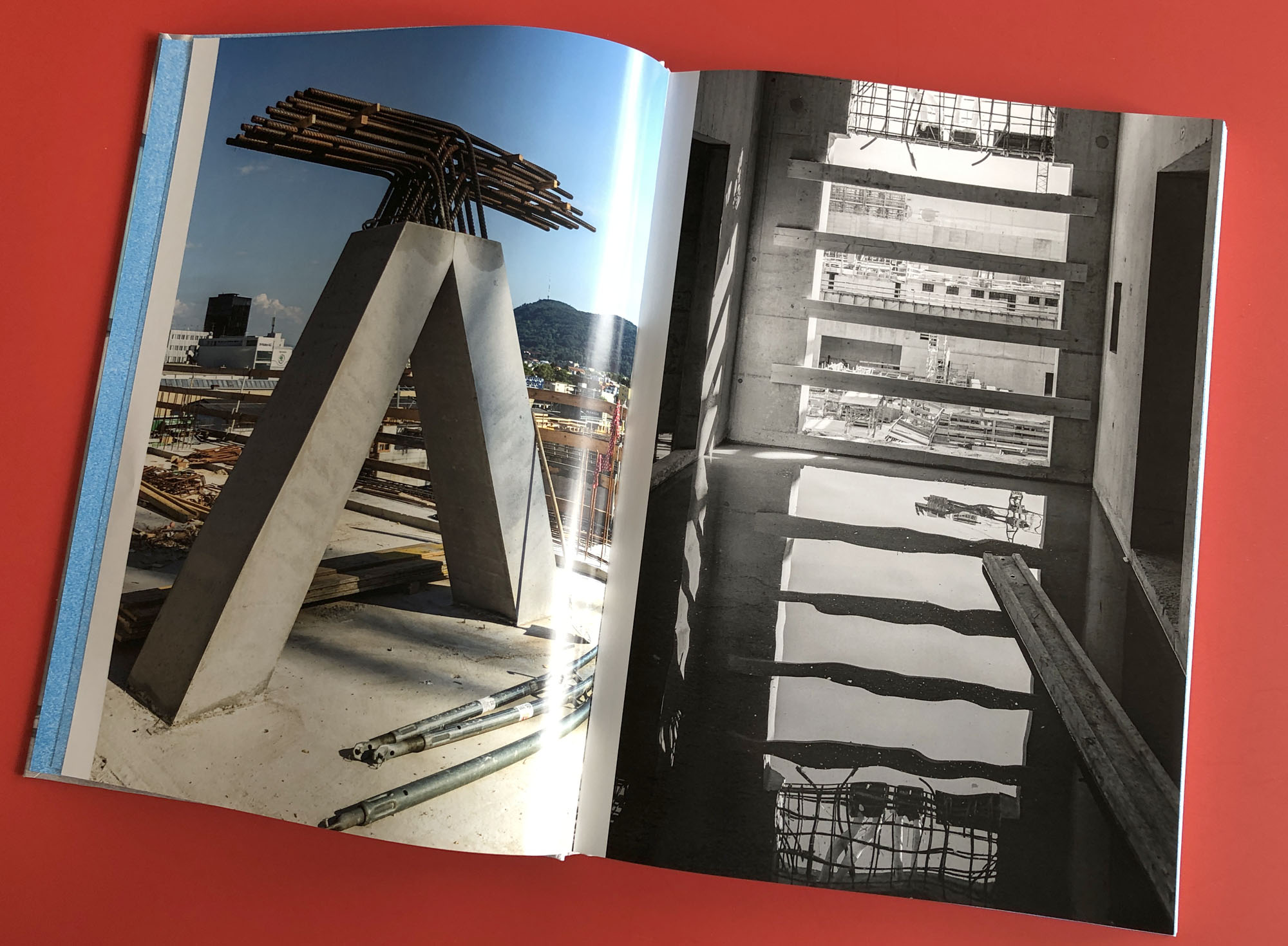
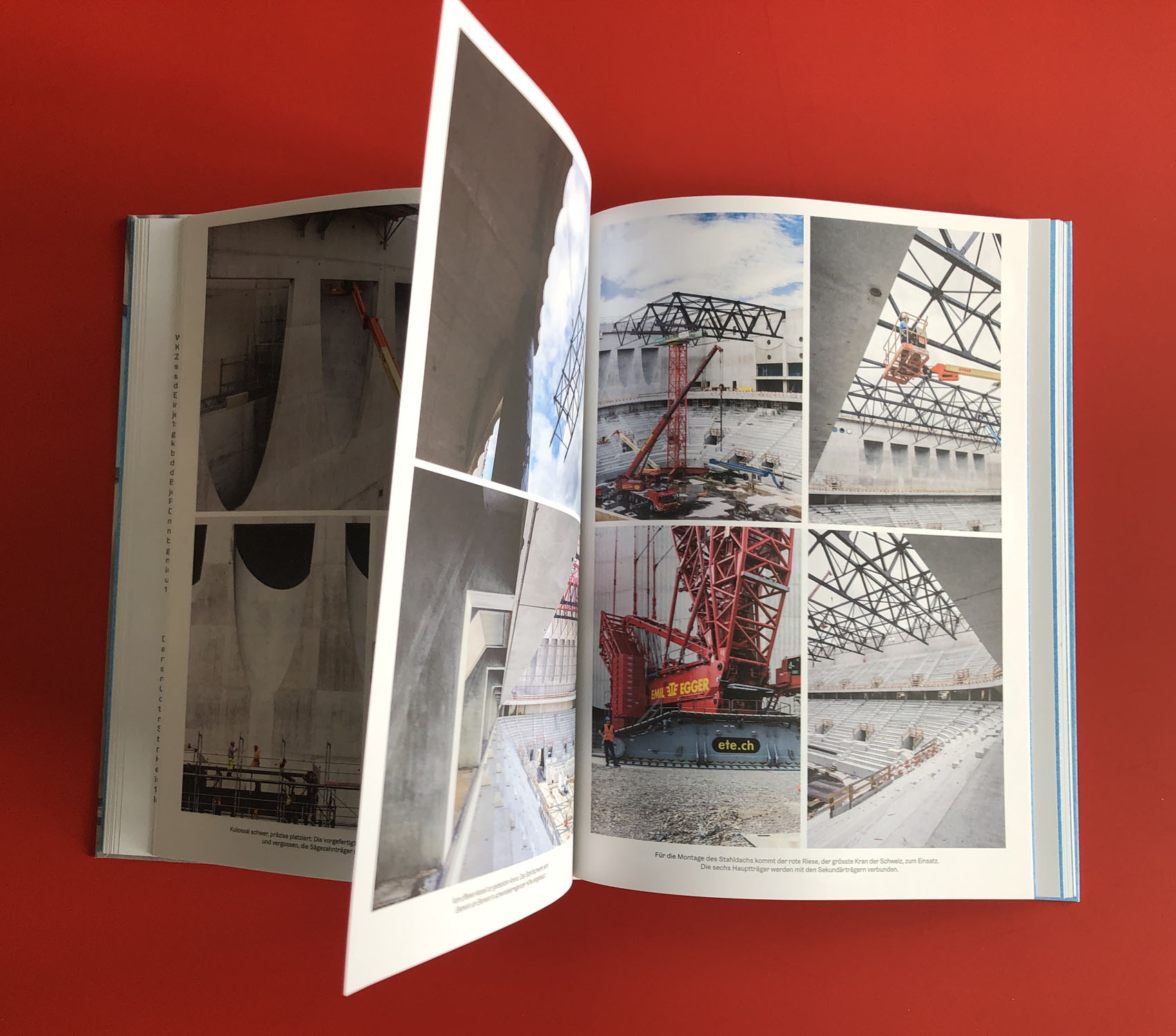
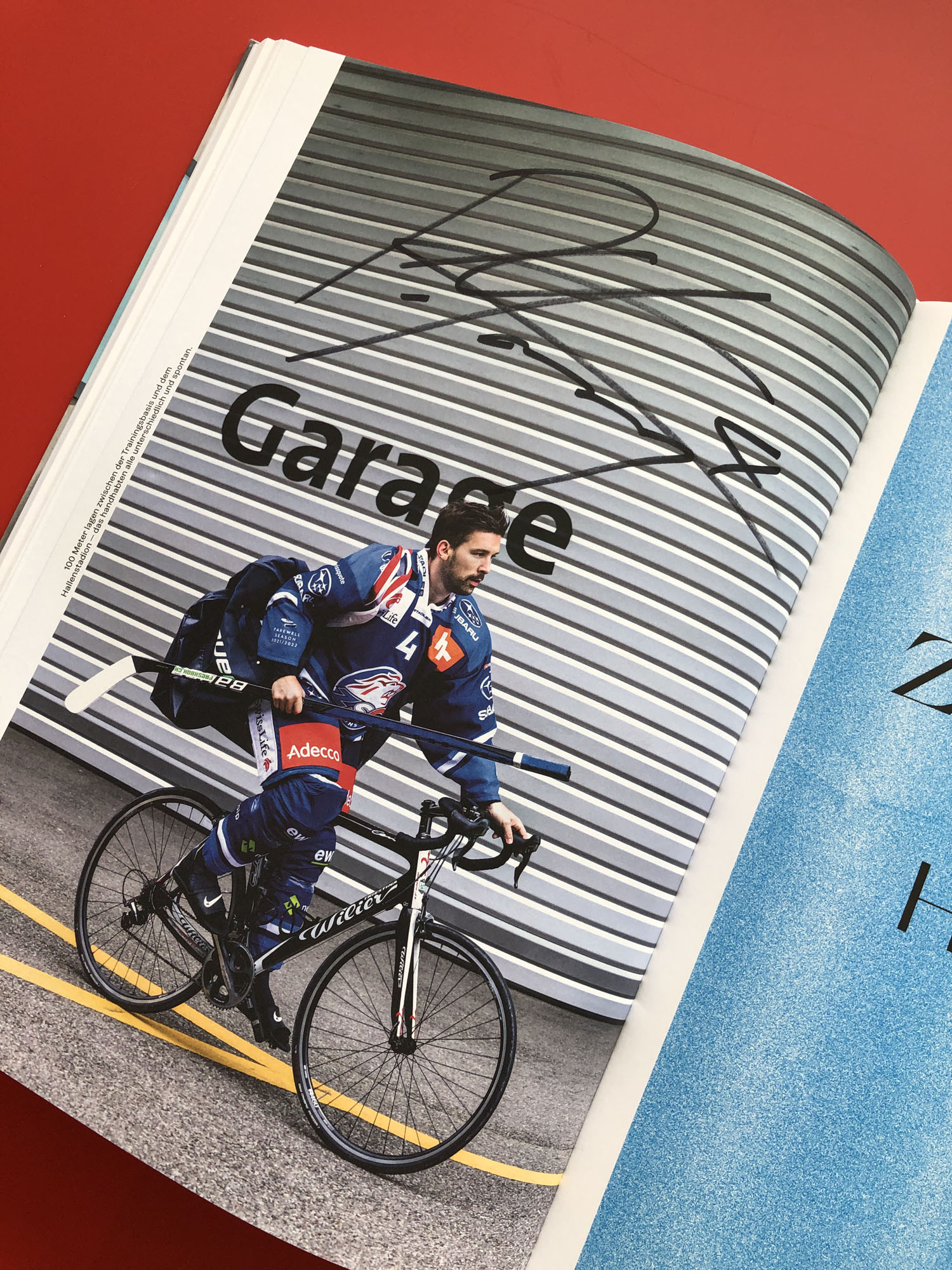
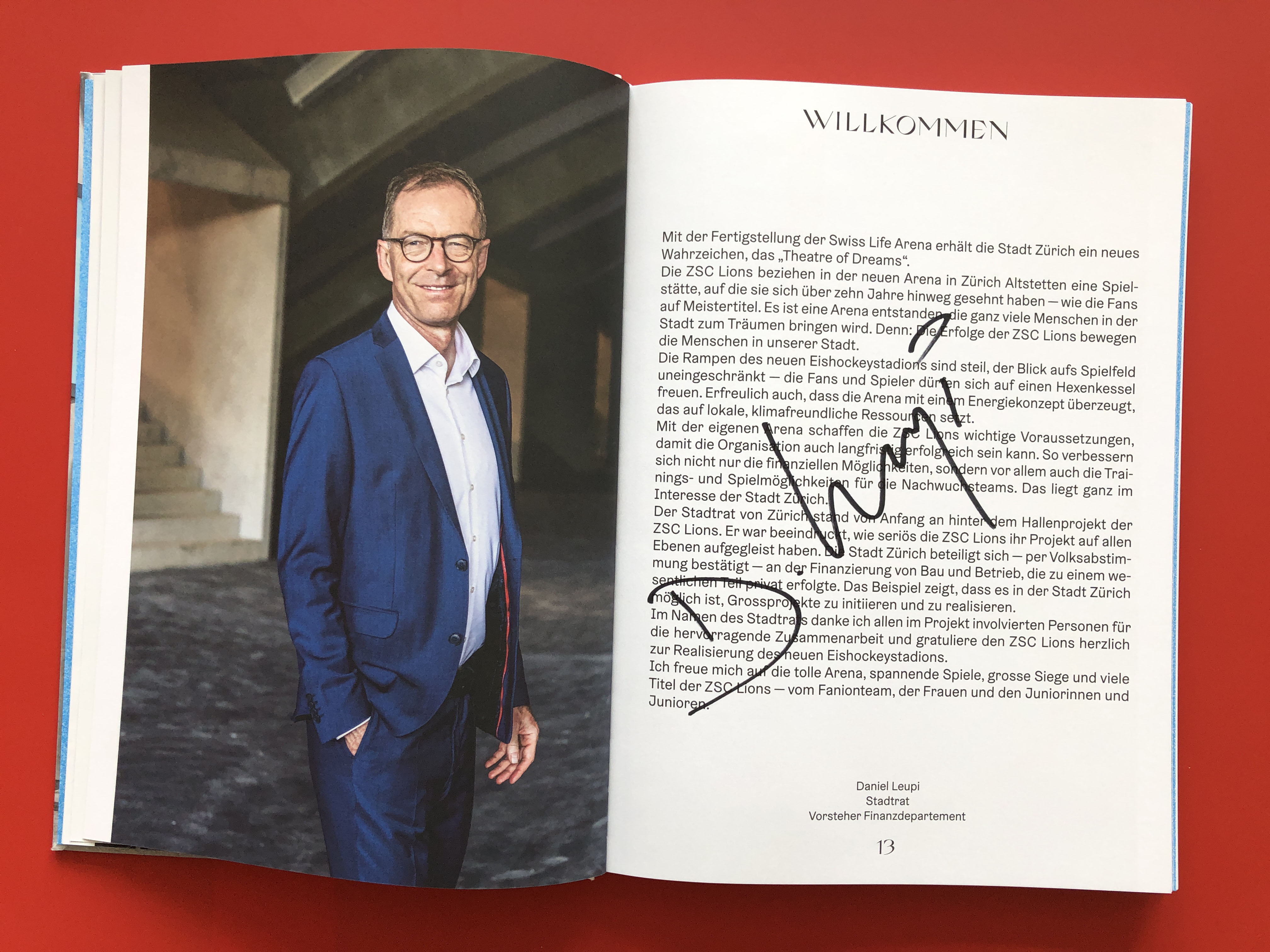
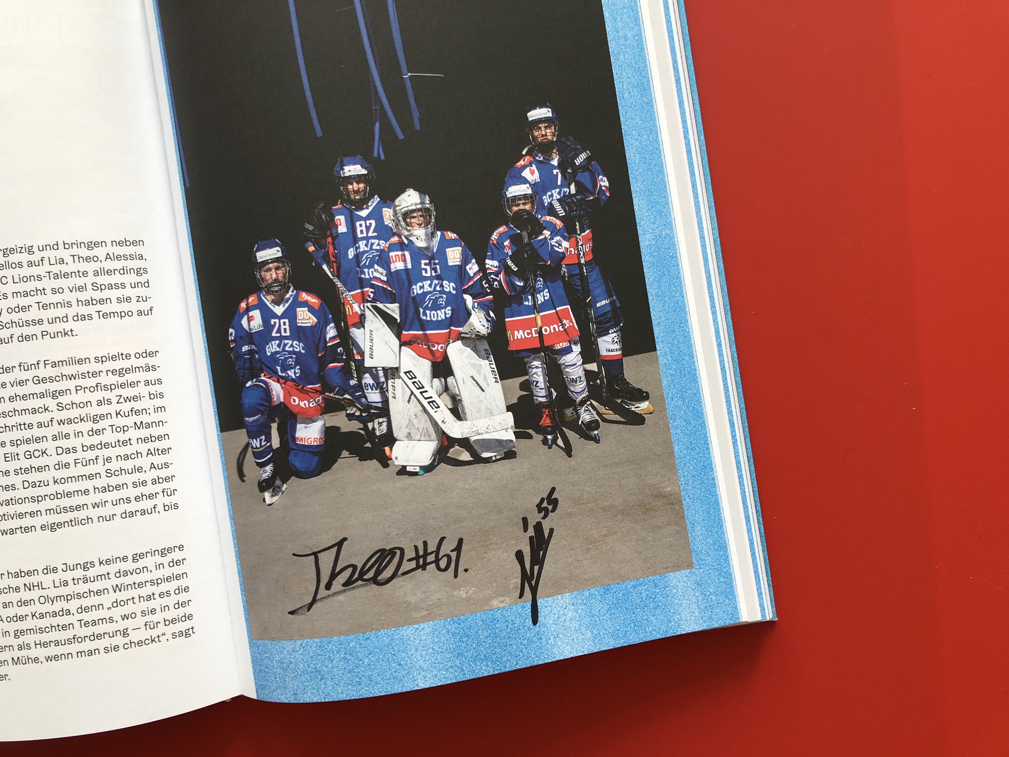
Geträumt Geplant Gebaut – Die neue Heimat der ZSC Lions
Die Monografie über das neue Zürcher Eishockeystadion, das bisher grösste Bauwerk von Caruso St John Architects.
Fotografie: Désirée Good, Philip Heckhausen
Park Books, 2023
Onepage
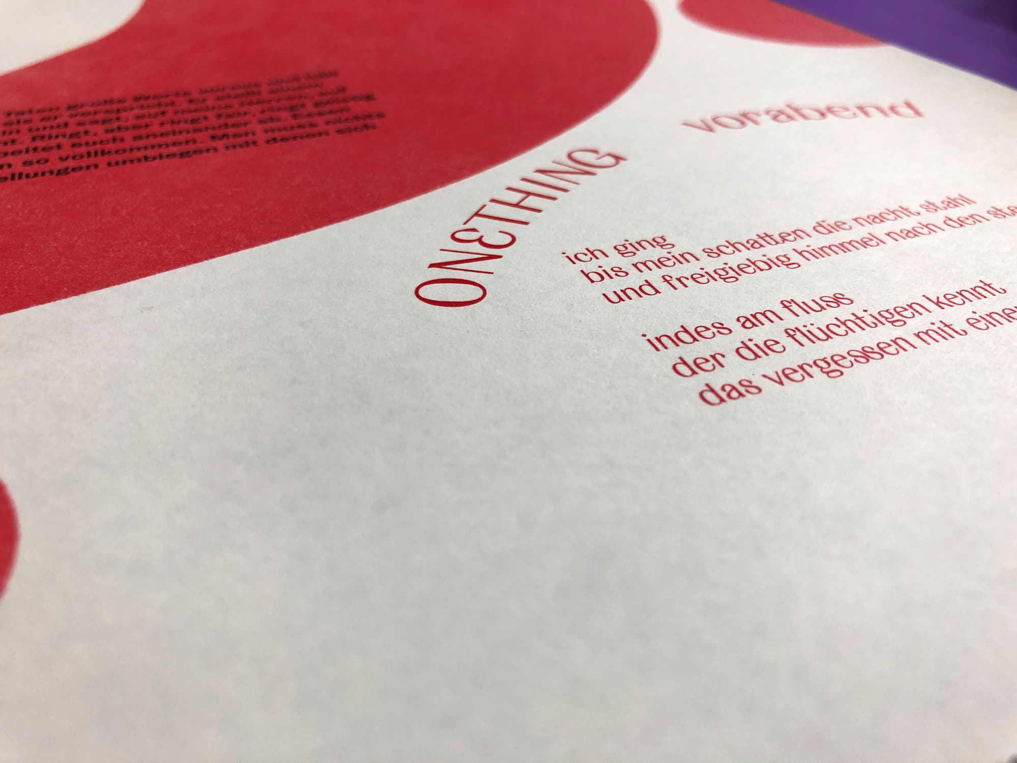
magazine/poster
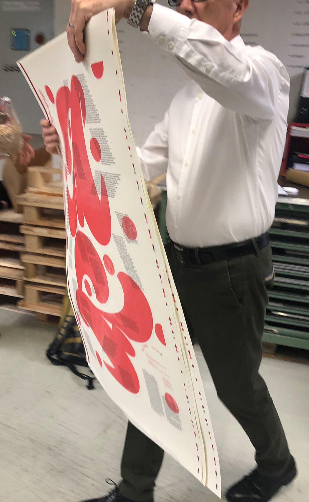
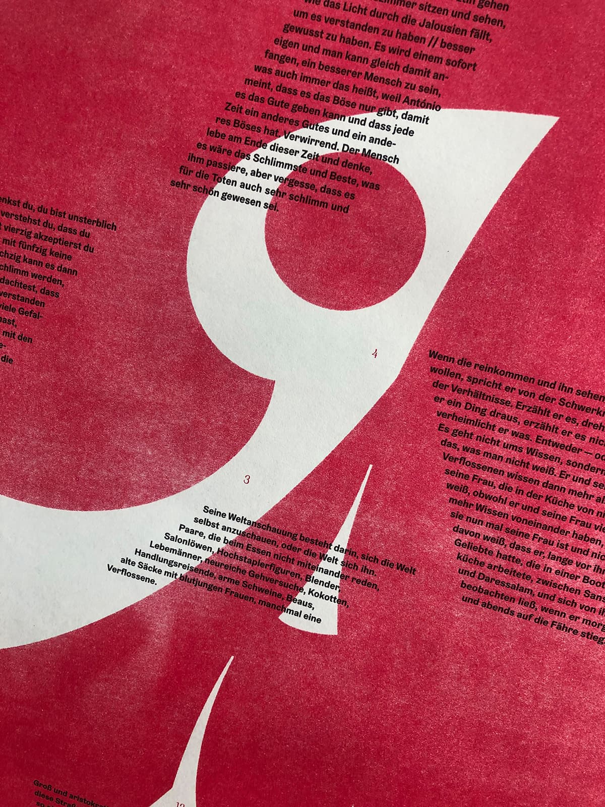
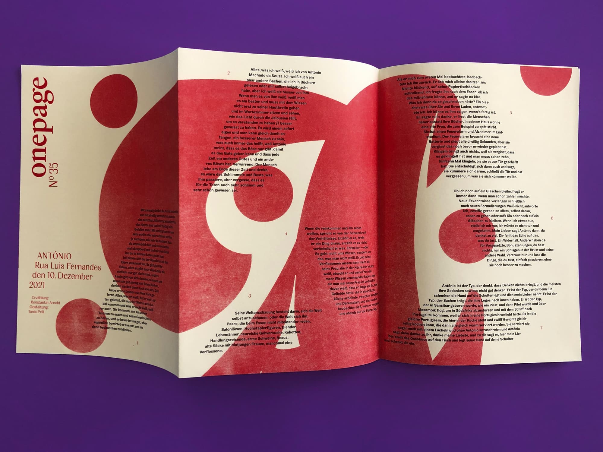
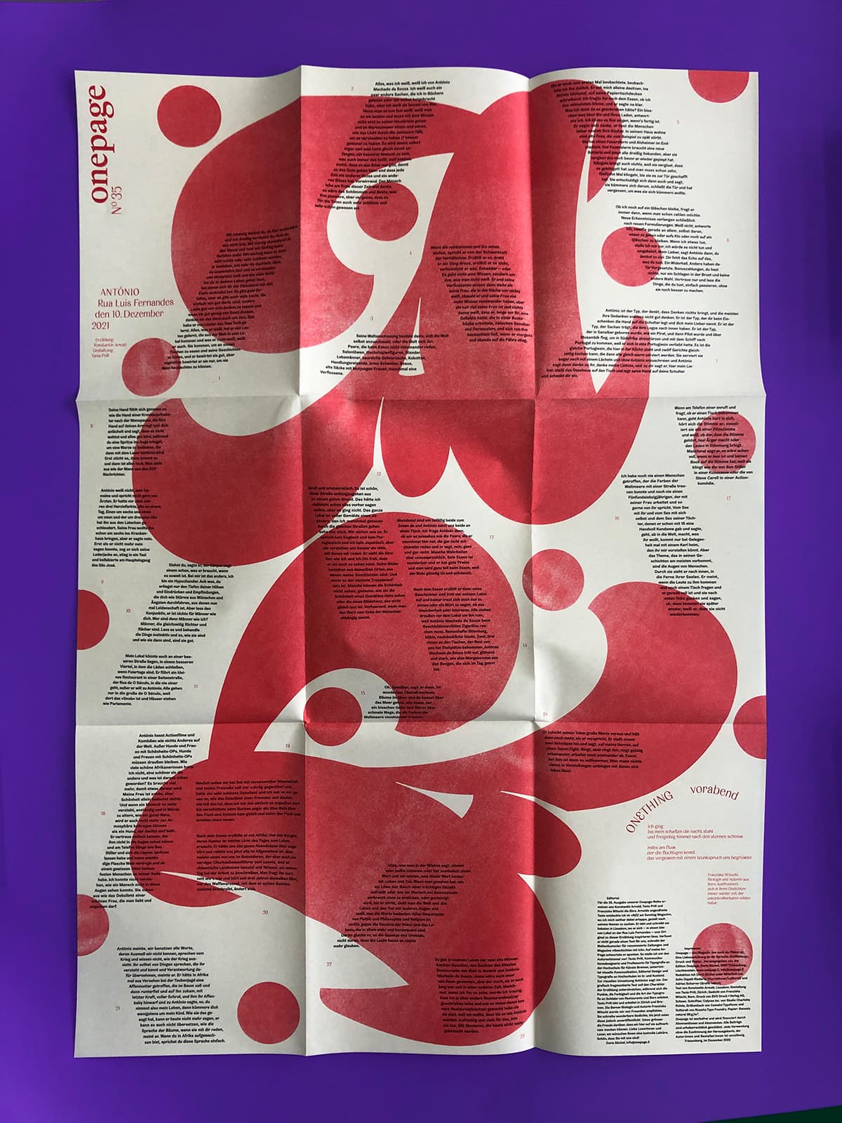
«Onepage brings authors, designers, lyricists, and printers to the table and delicately invites them to interact so that language, design, print, and paper form an equal unit. The result is unique, nonconformist, high-quality text posters.» (Doris Büchel, founder & editor). This commission was a carte blanche to all involved: author, lyricist and designer. The poster is available folded as a booklet or unfolded. https://onepage.li
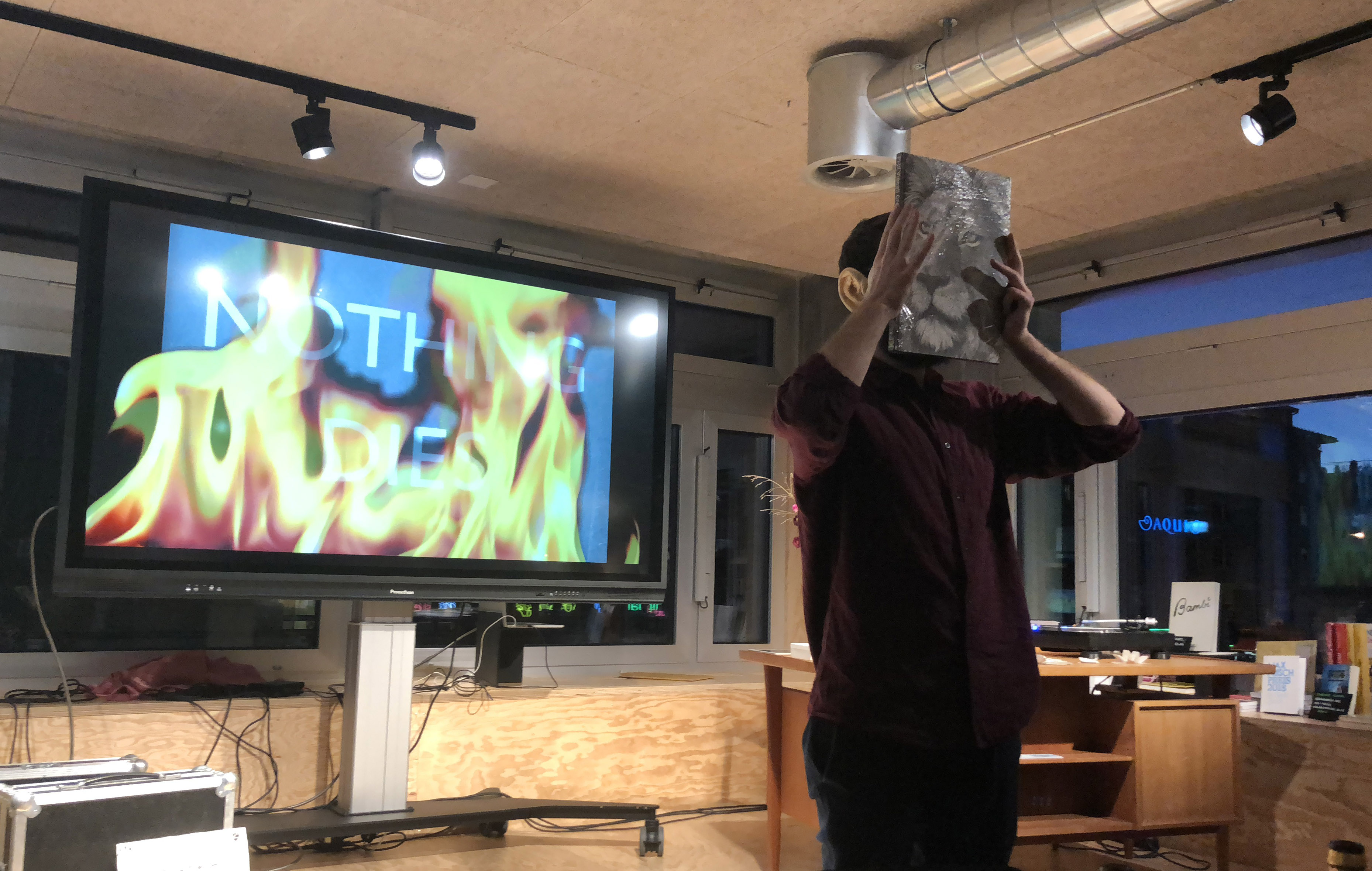
BANALES PUBLIZIEREN
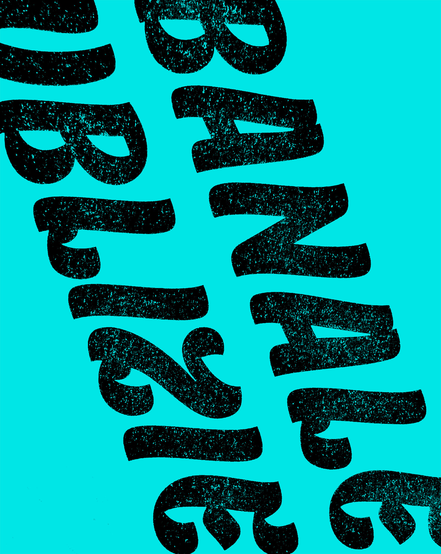
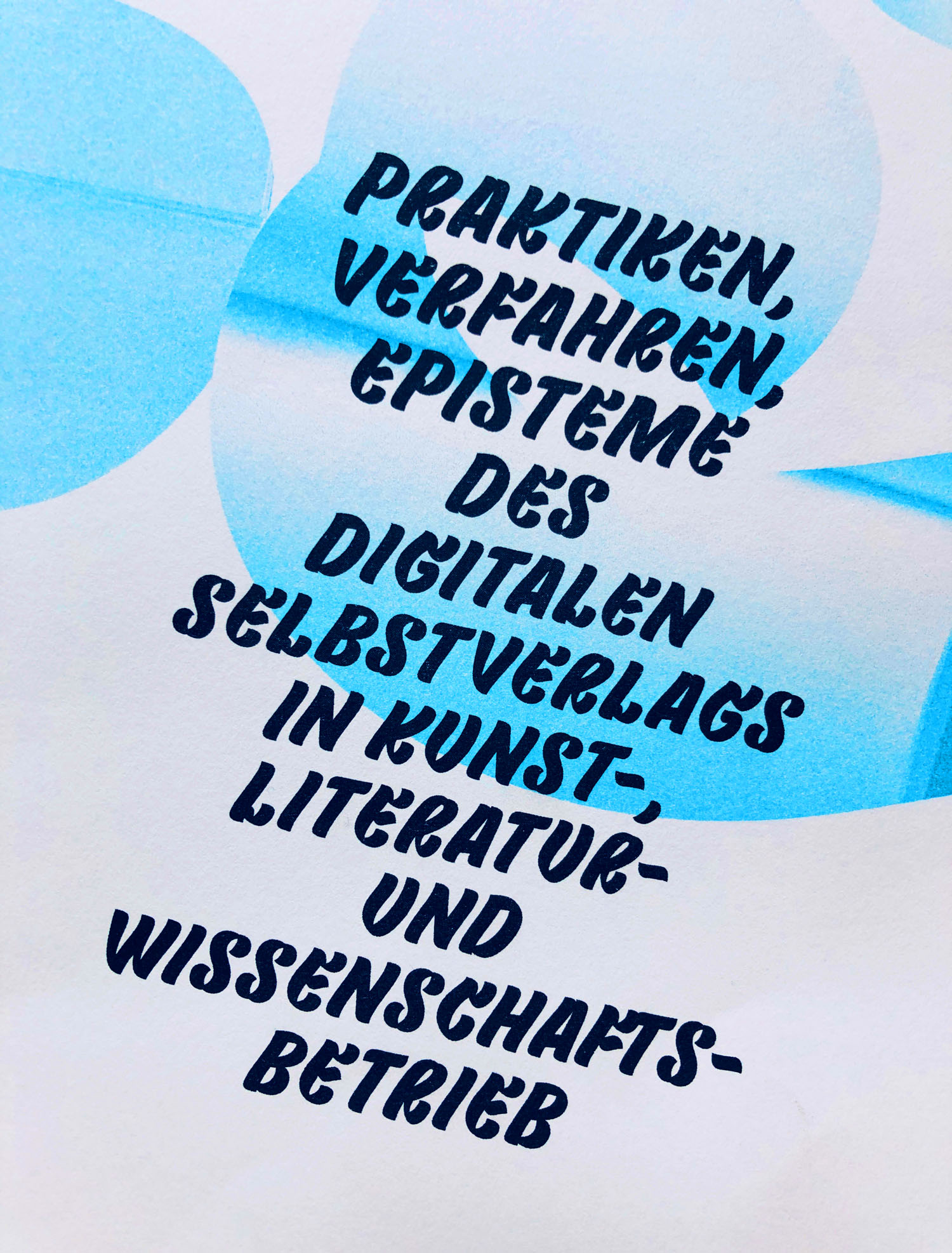
50 Ways To Activate Your Archive – Tania Prill
Internationale Konferenz organisiert von Prof. Elisa Linseisen und Dorothea Walzer
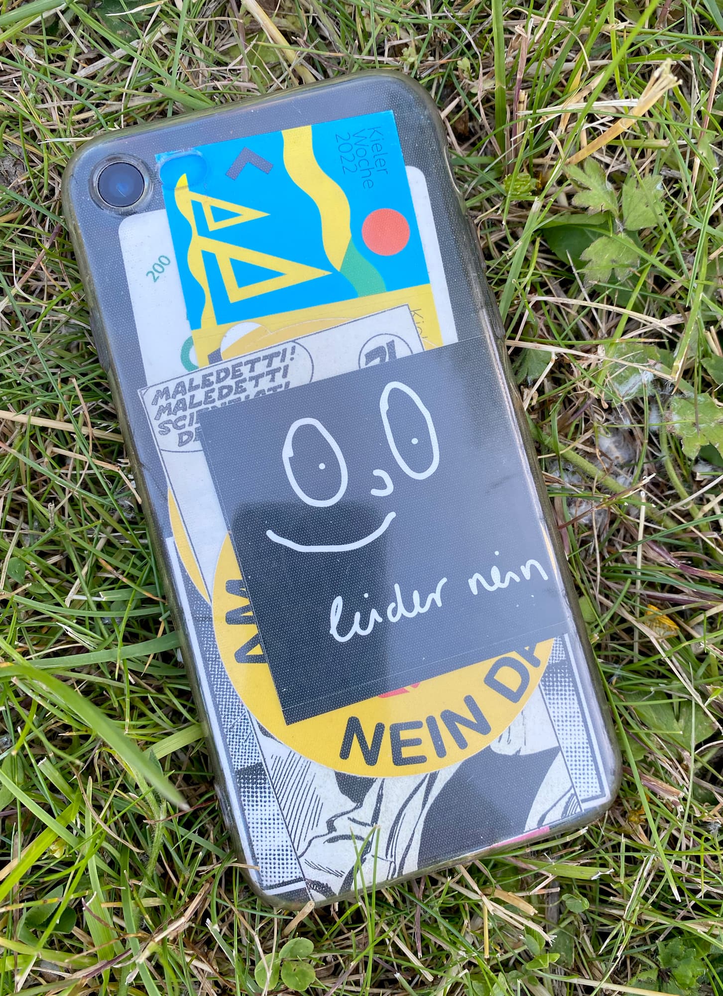
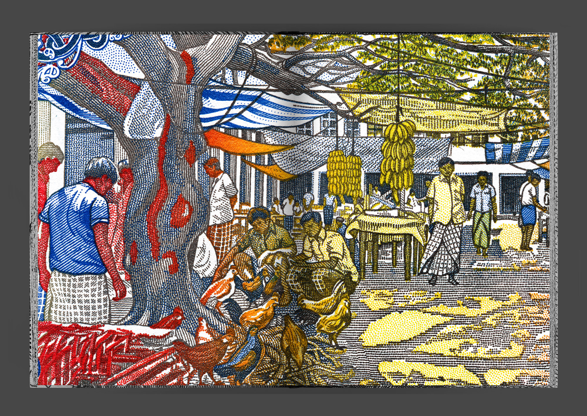
Kieler Woche 2022
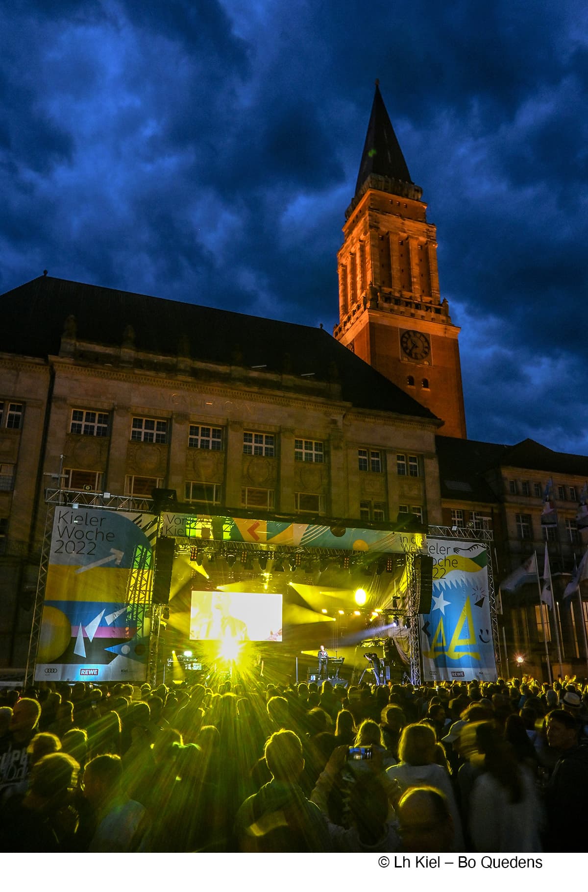
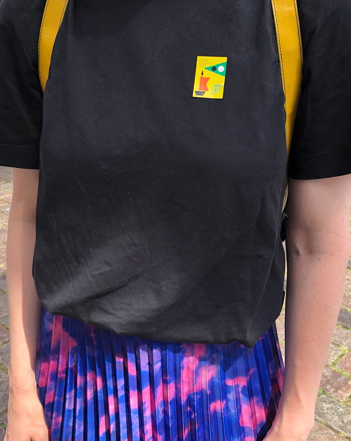
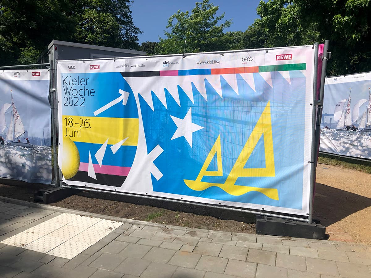
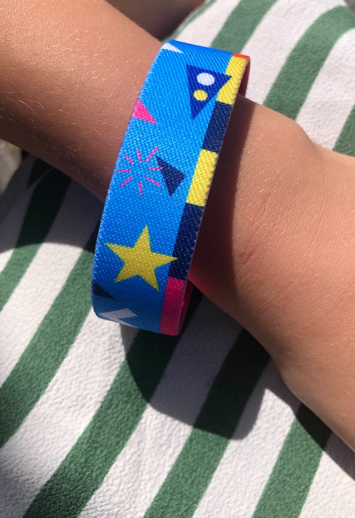
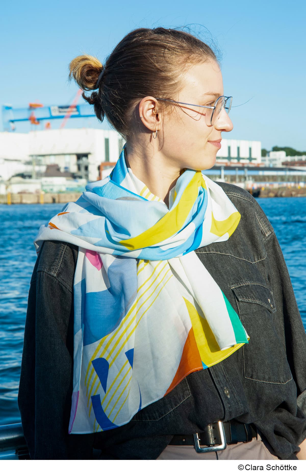
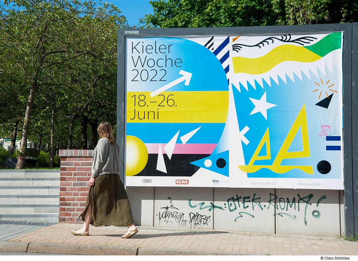
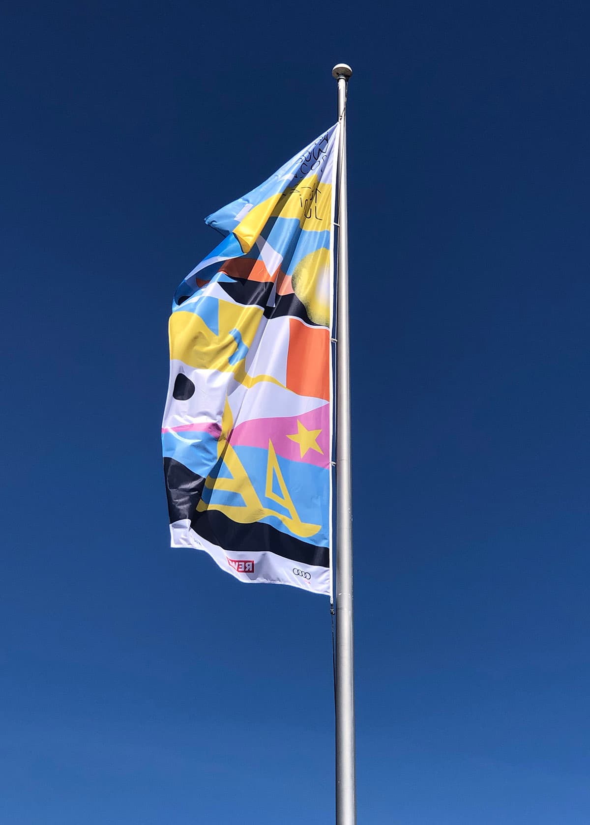
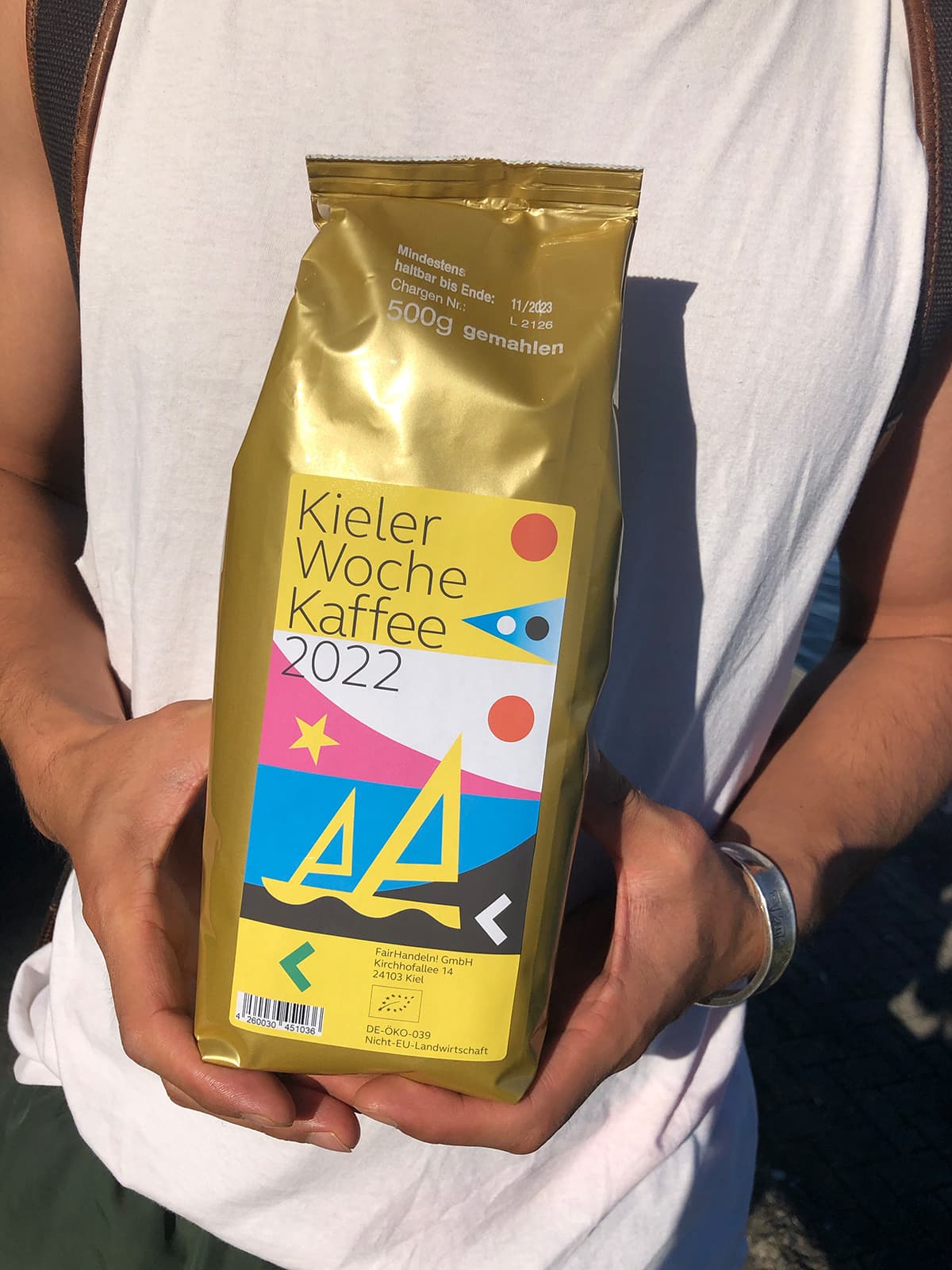
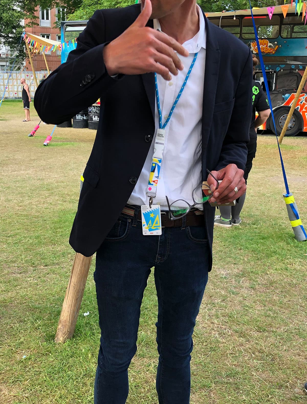
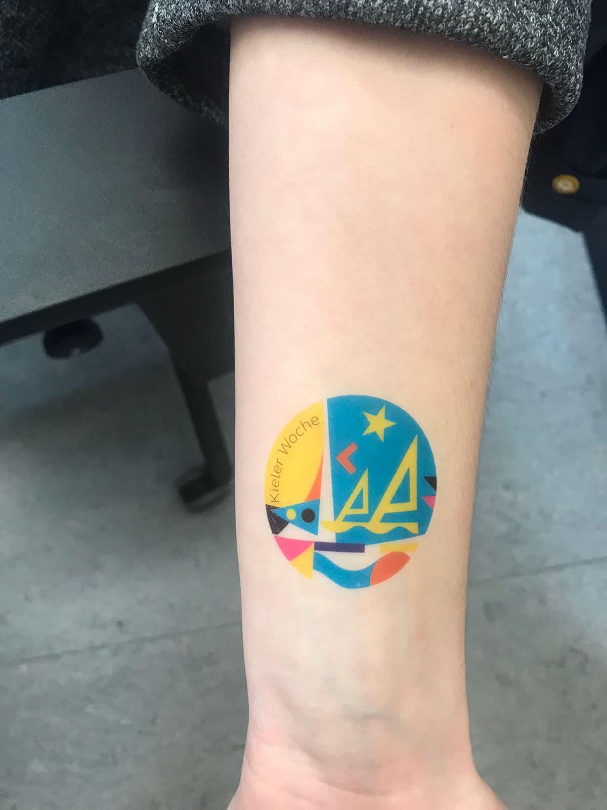
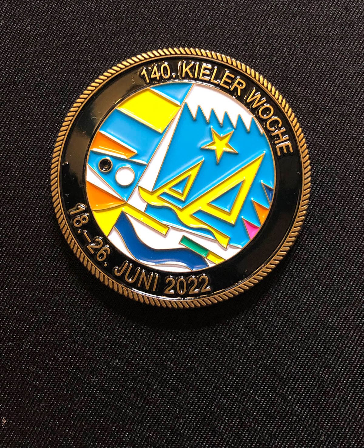
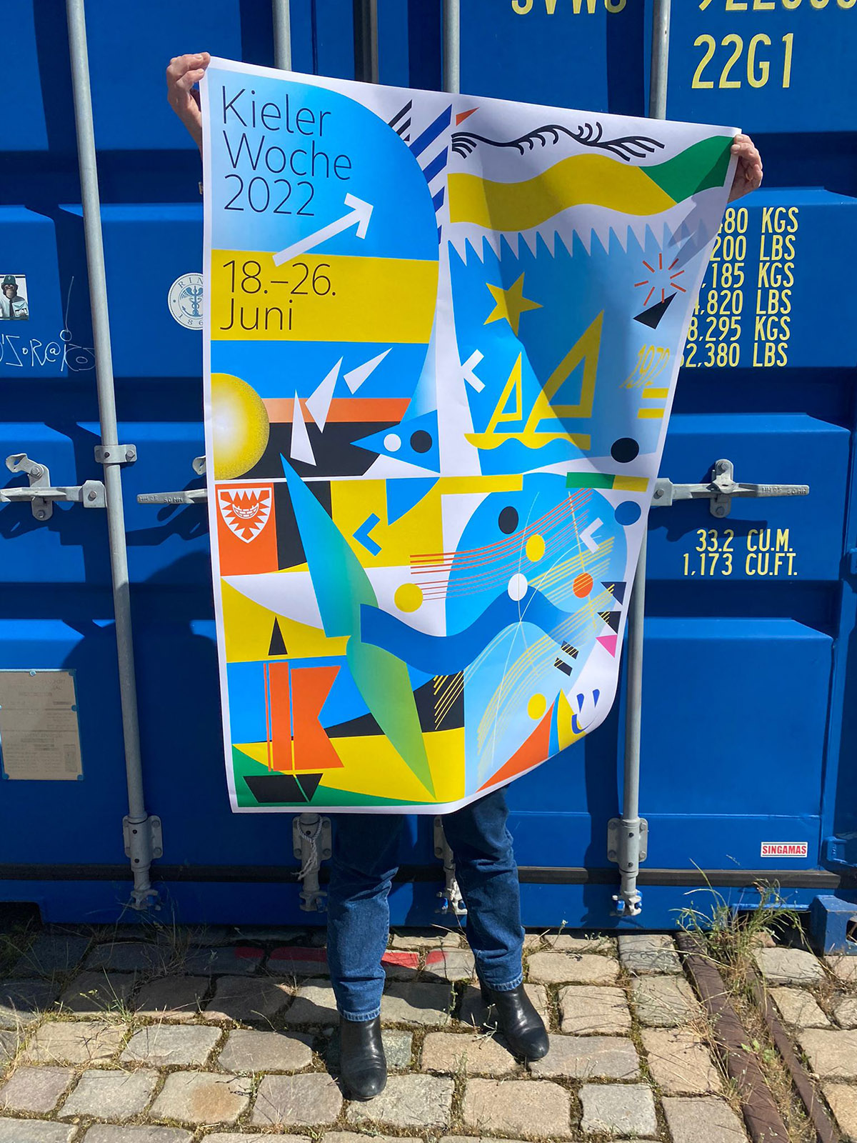
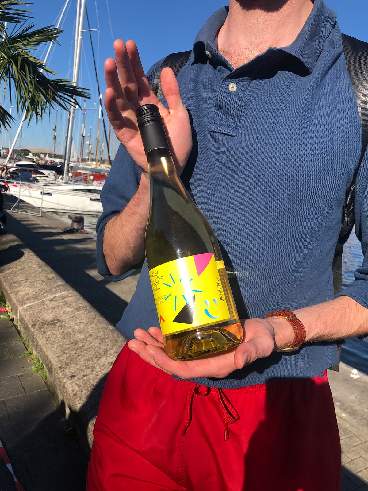
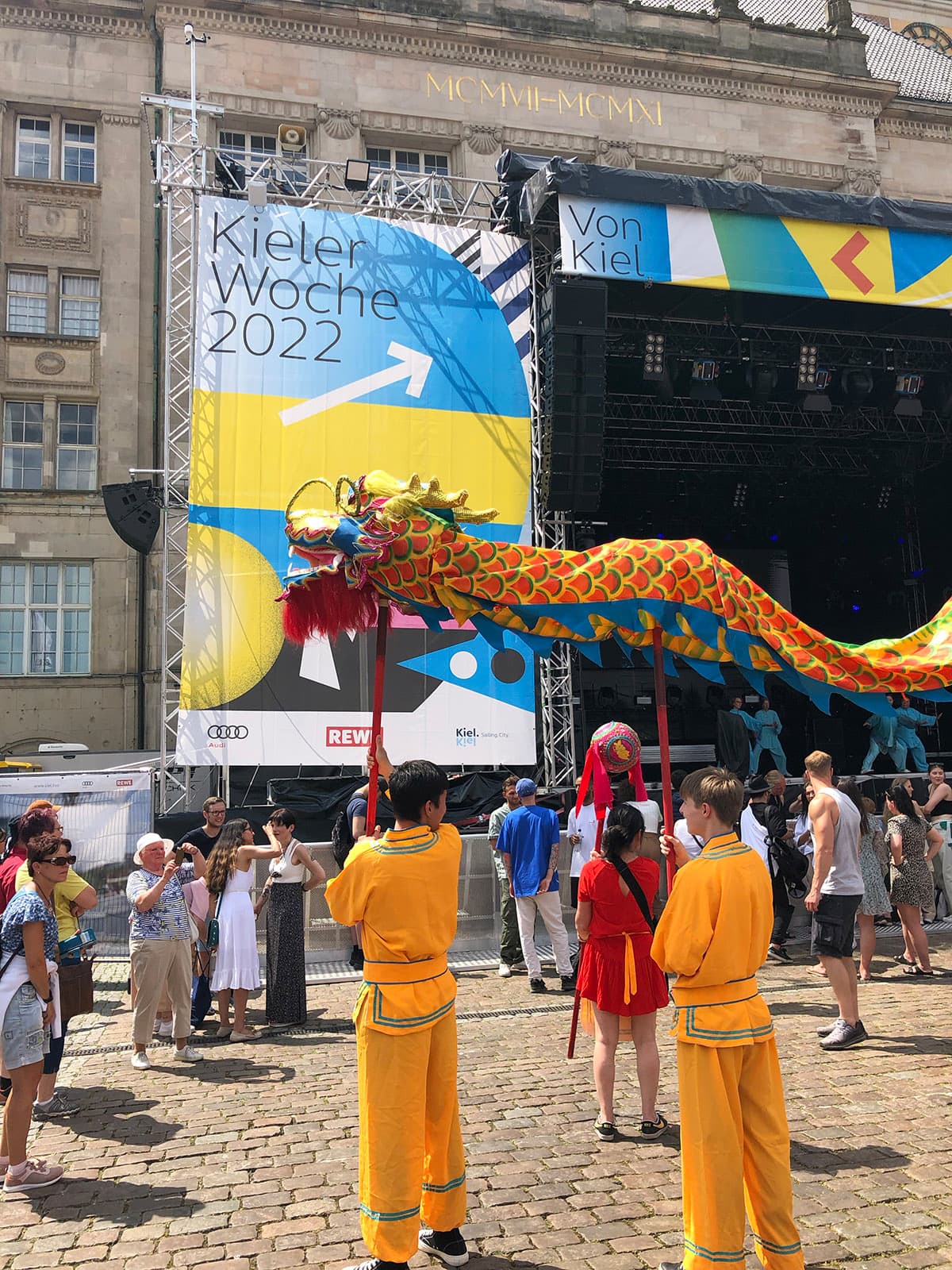
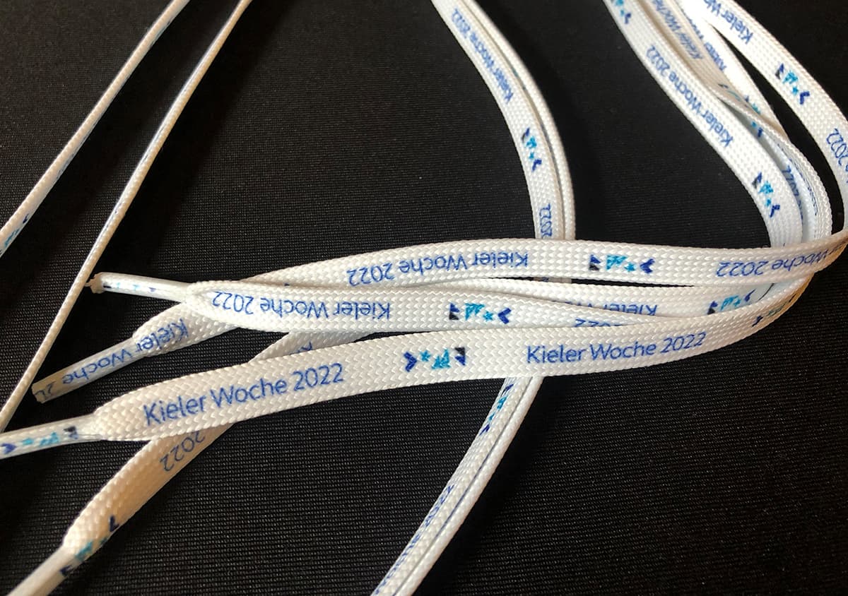
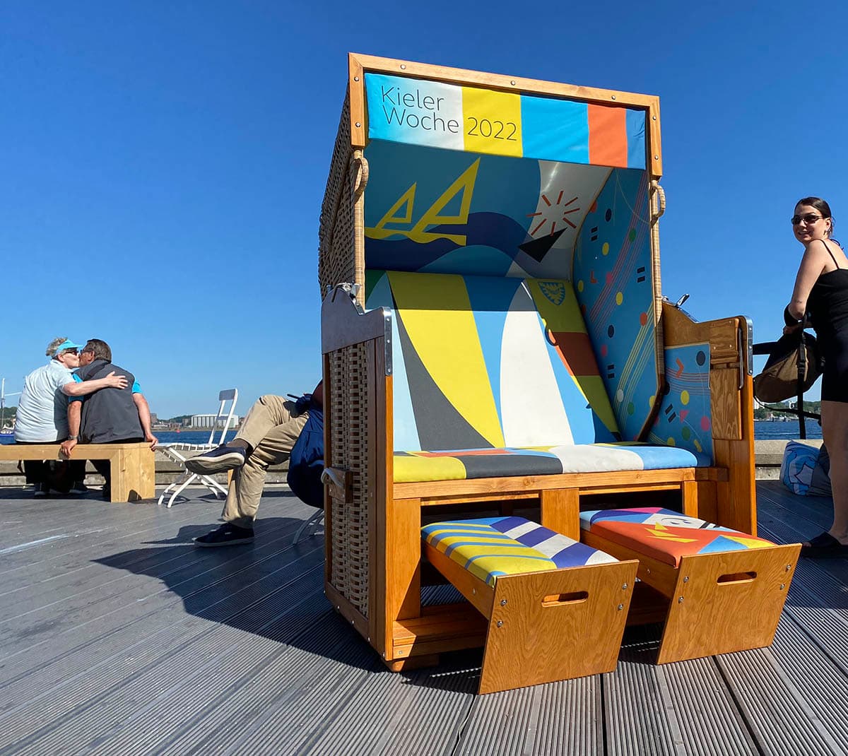
Segelregatta und Volksfest
Die Kieler Woche ist eine der größten Segelregatten der Welt und gleichzeitig ein Volksfest mit unterschiedlichsten Events auf zahlreichen Bühnen. Nach den Covid-Einschränkungen der letzten Jahre, sollte die Kieler Woche, so Philipp Dornberger, wie ein «Phönix aus der Asche steigen». Im Corporate Design für das Jahr 2022 verschmelzen Geschichte und Aufbruchstimmung. Gestalterisch abgeänderte Elemente aus der Reihe längst ikonischer Plakate der Kieler Woche der letzten 72 Jahre formierte ich als Reminiszenzen an Bewährtes und Bekanntes zu einer flexiblen eigenständigen Form des Corporate Design. Es unterlegt das nachpandemische Wiedersehen mit Freunden und Bekannten mit einem visuellem Spiel, das Kontinuität und Zukunft in der Fähigkeit und Bereitschaft zum steten Wandel begründet sieht.
Money
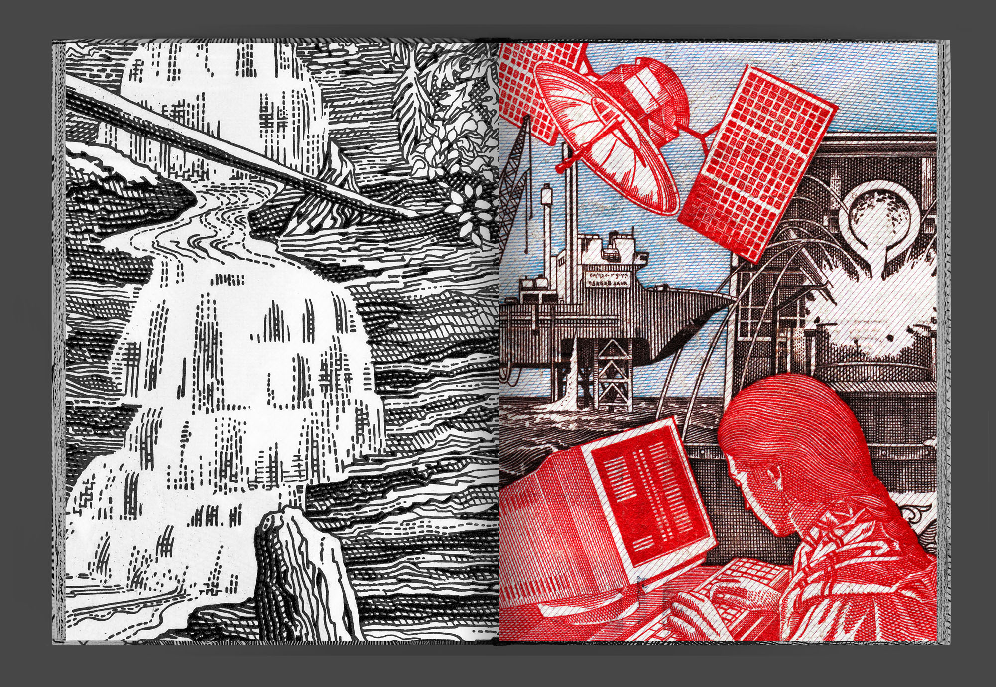
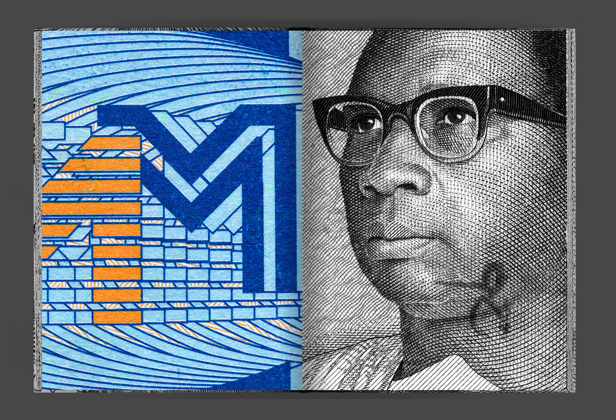
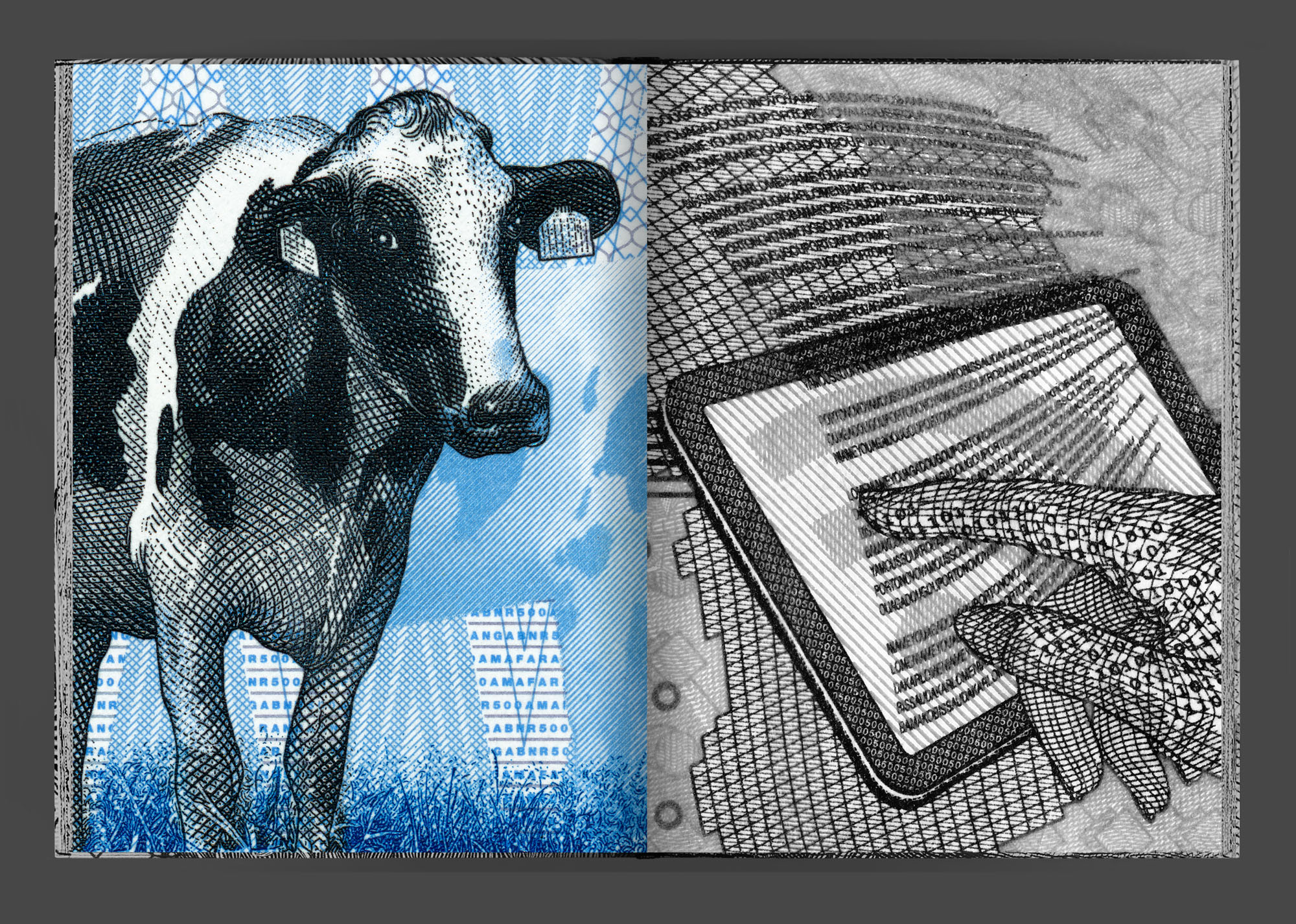
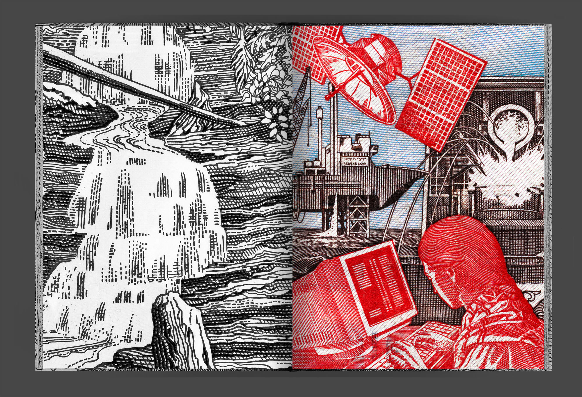
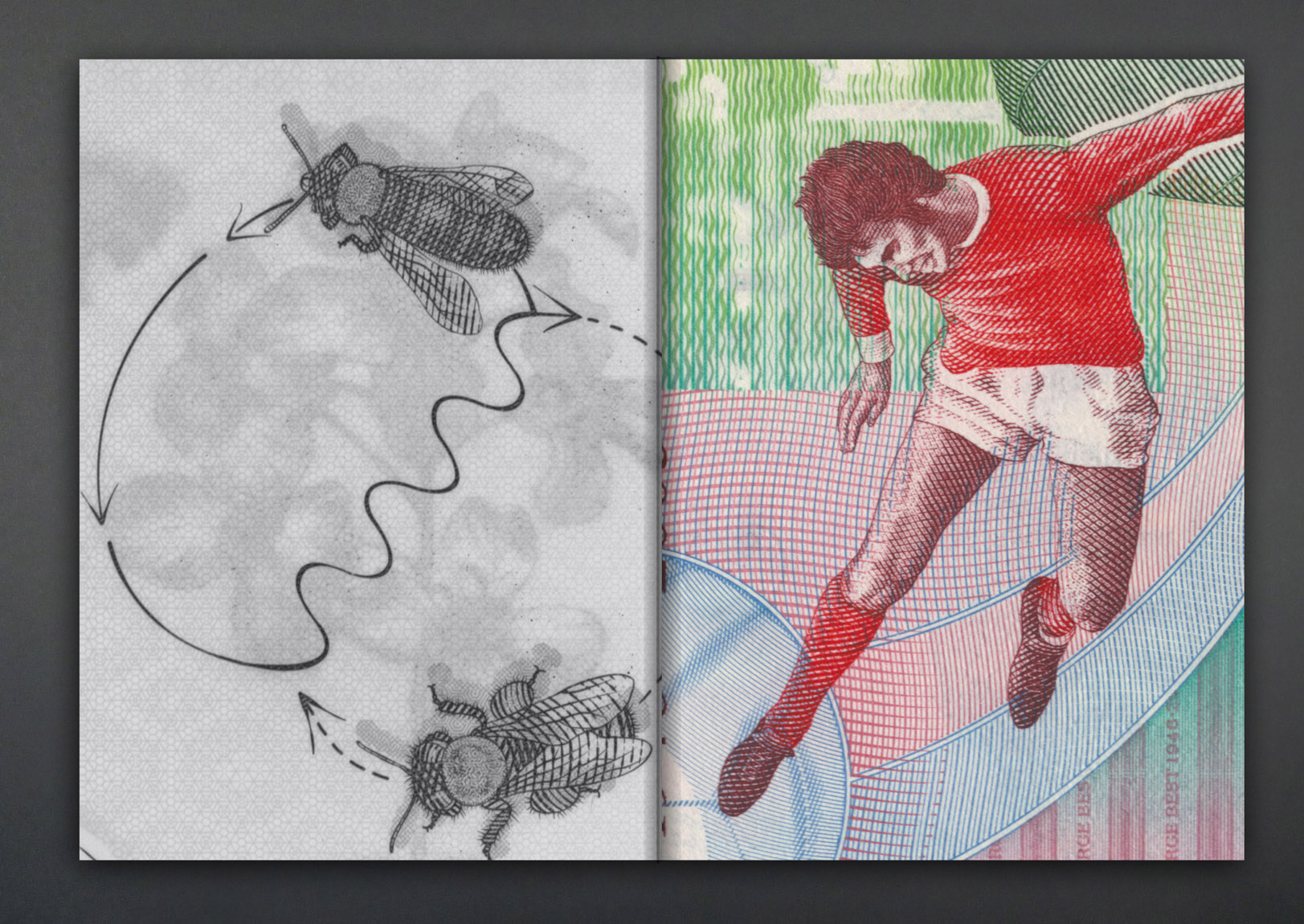
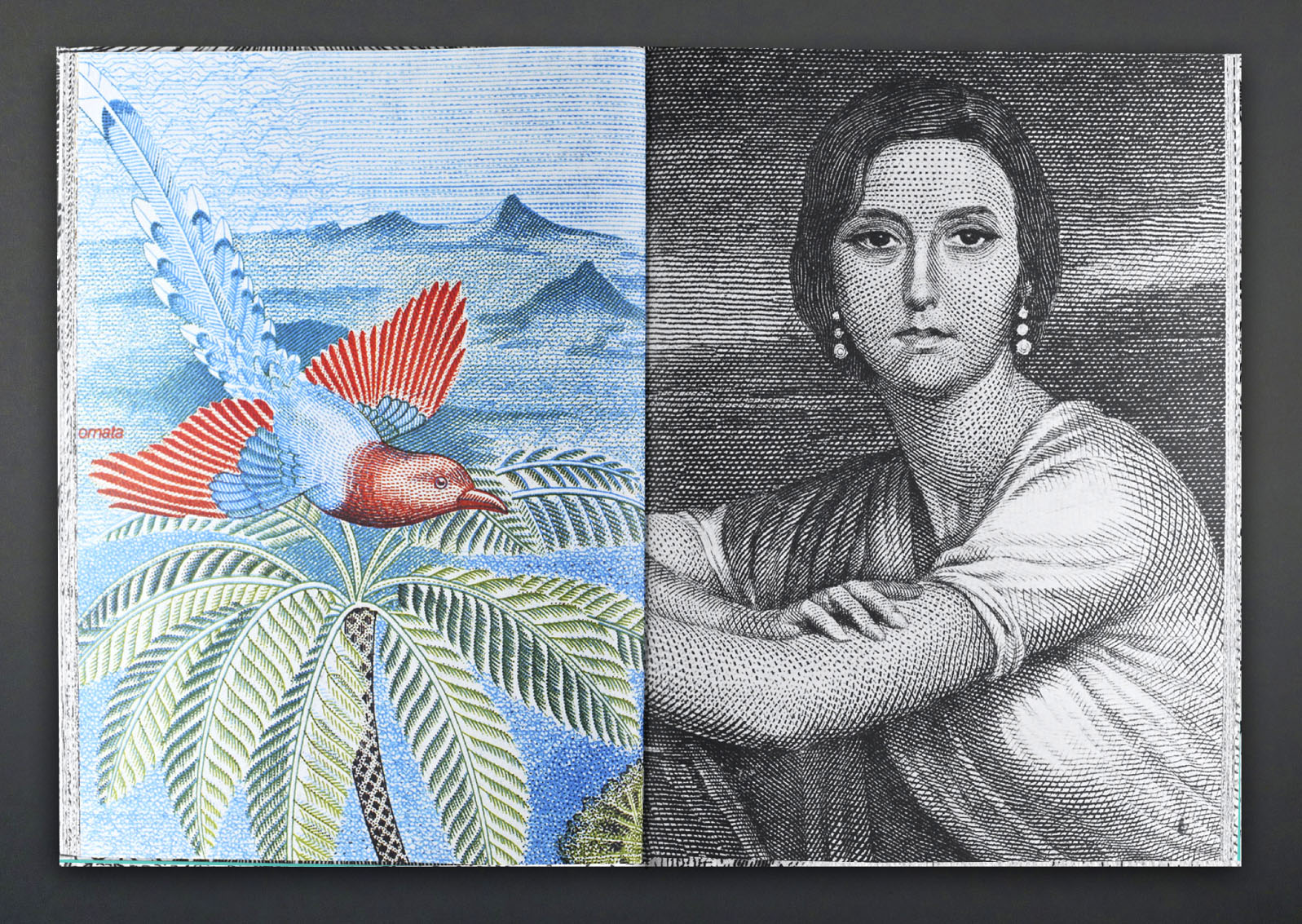
This is a book about the pictures on banknotes: pictures of political subject-matter, historical milestones, distinguished personages, status symbols, and landscapes. Banknotes are mini-posters proclaiming an idealized world. Money is a mystery: monetary value seeks a visual correlative.
The pictures on bills tell stories and glorify power. Strong, happy people engaged in physical labor, for instance. They have access to education and live in a fantastical landscape with abundant fauna. Monetary iconography often takes up similar motifs and reiterates basic patterns. Human figures are portrayed according to pathos formulae, their gestures and facial expressions to be uniformly construed the world over.
I started collecting banknotes and focusing on the pictures 11 years ago while I was traveling in Iran. We tried to conjure the spirit that speaks from the ornamentation of banknotes, as Walter Benjamin put it, and show which pictures are used to imprint value on slips of paper that would otherwise be worthless.
Edited and designed by Prill Vieceli Cremers
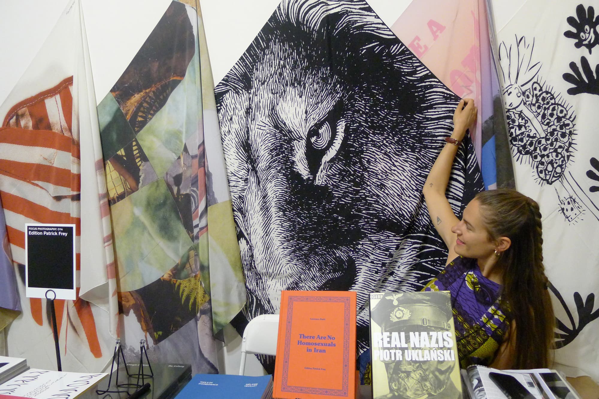
Edition Patrick Frey
Whatever
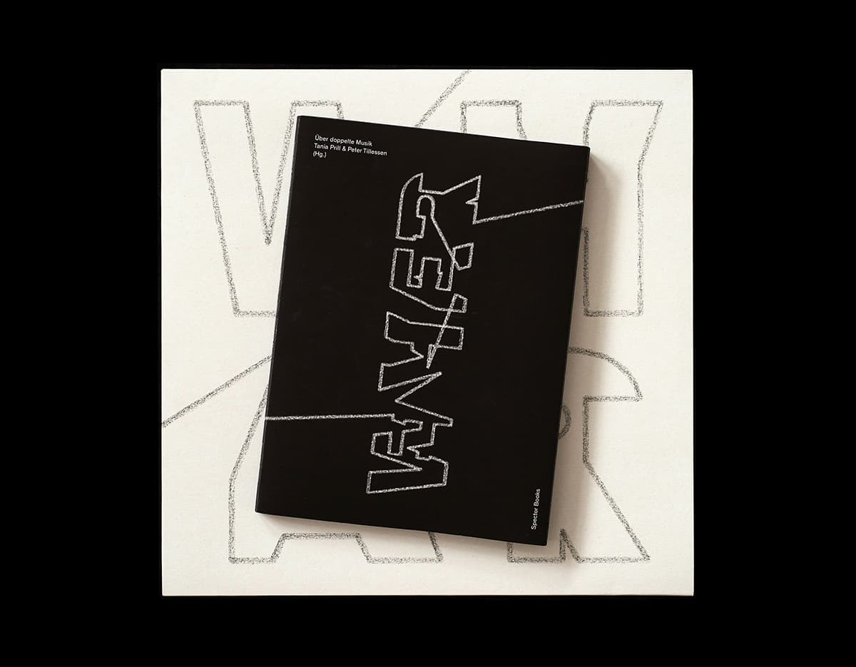
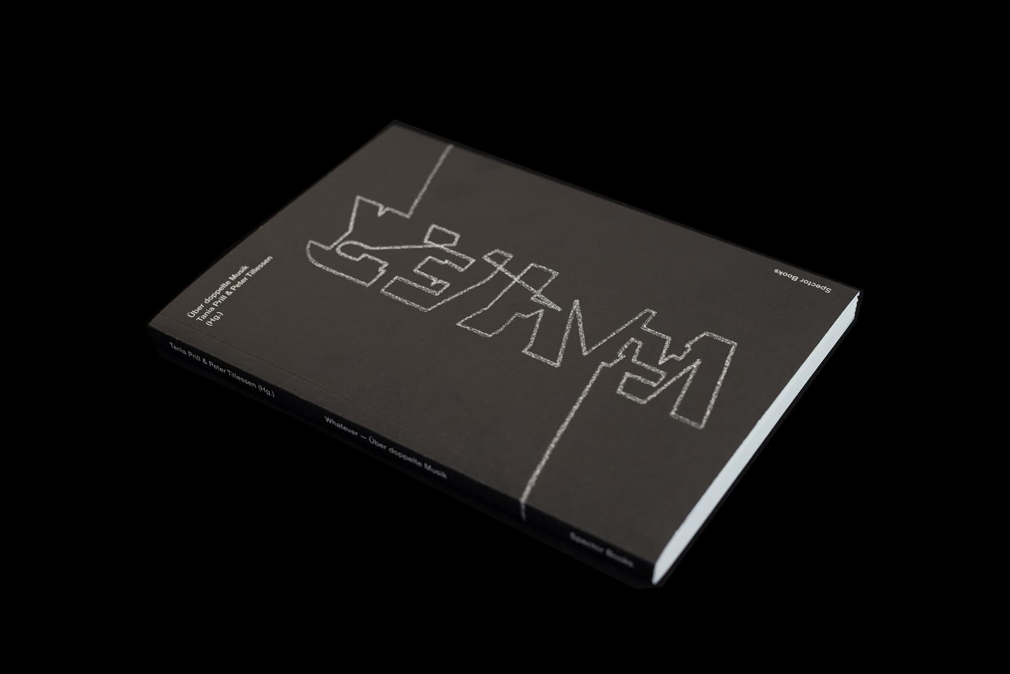
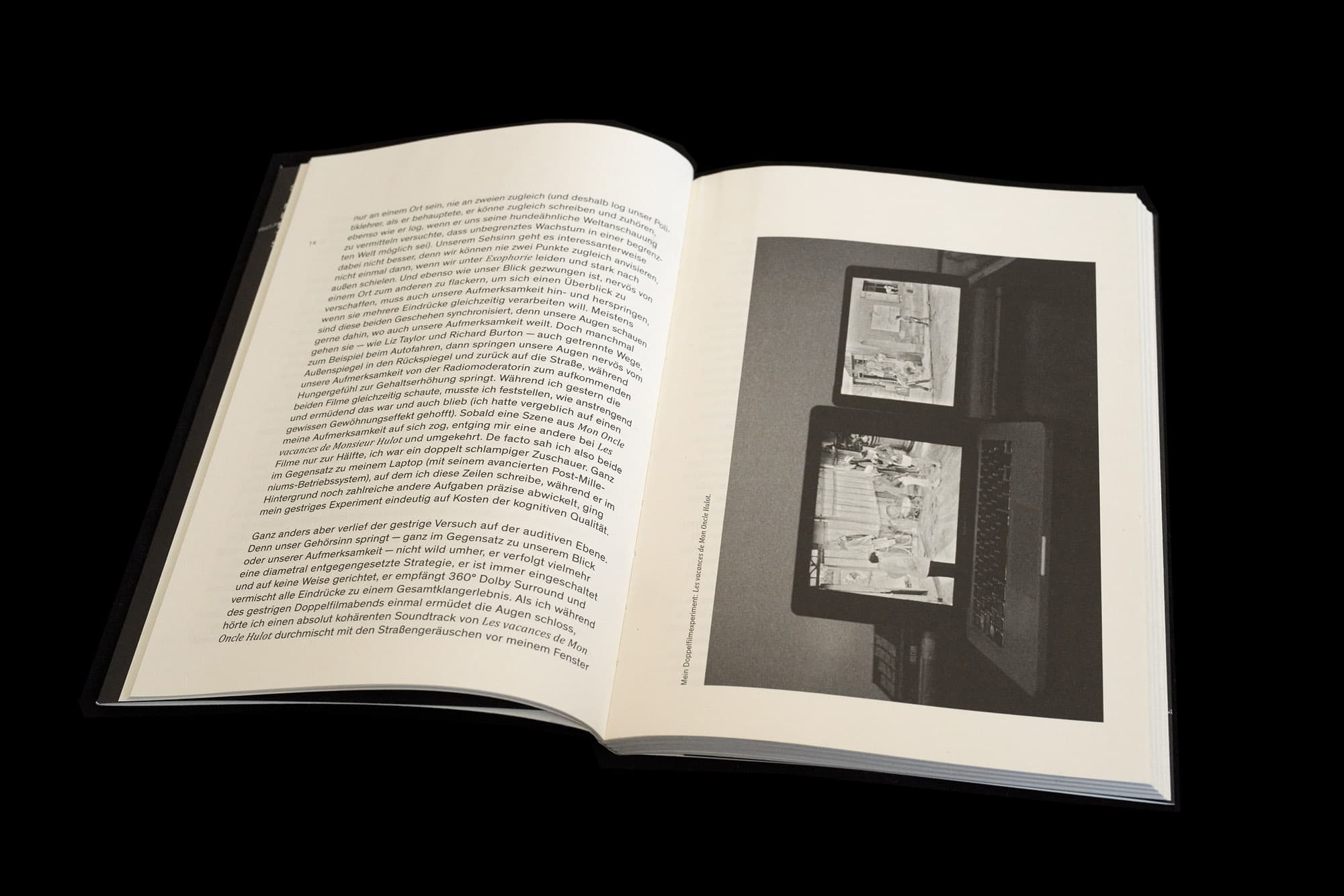
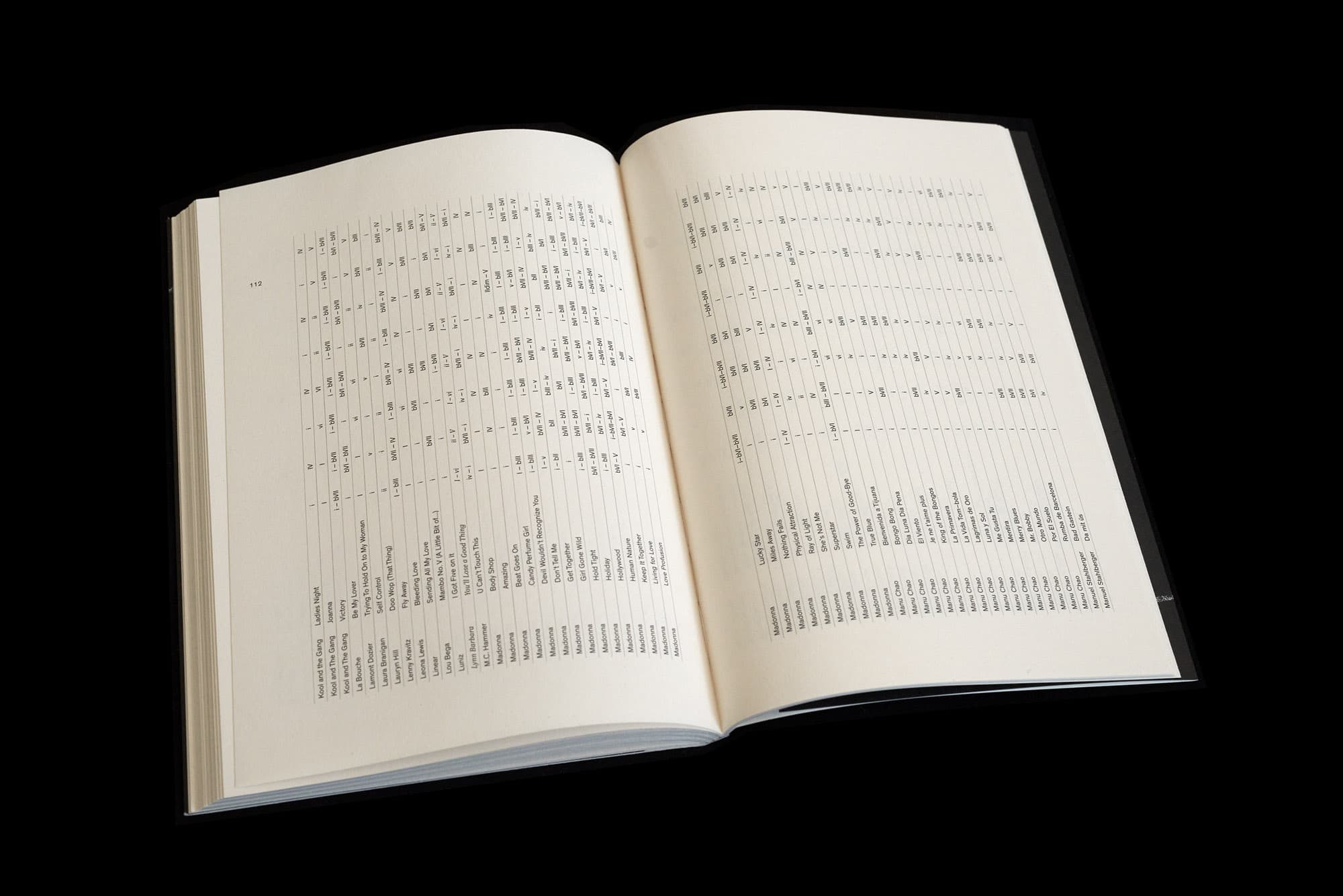
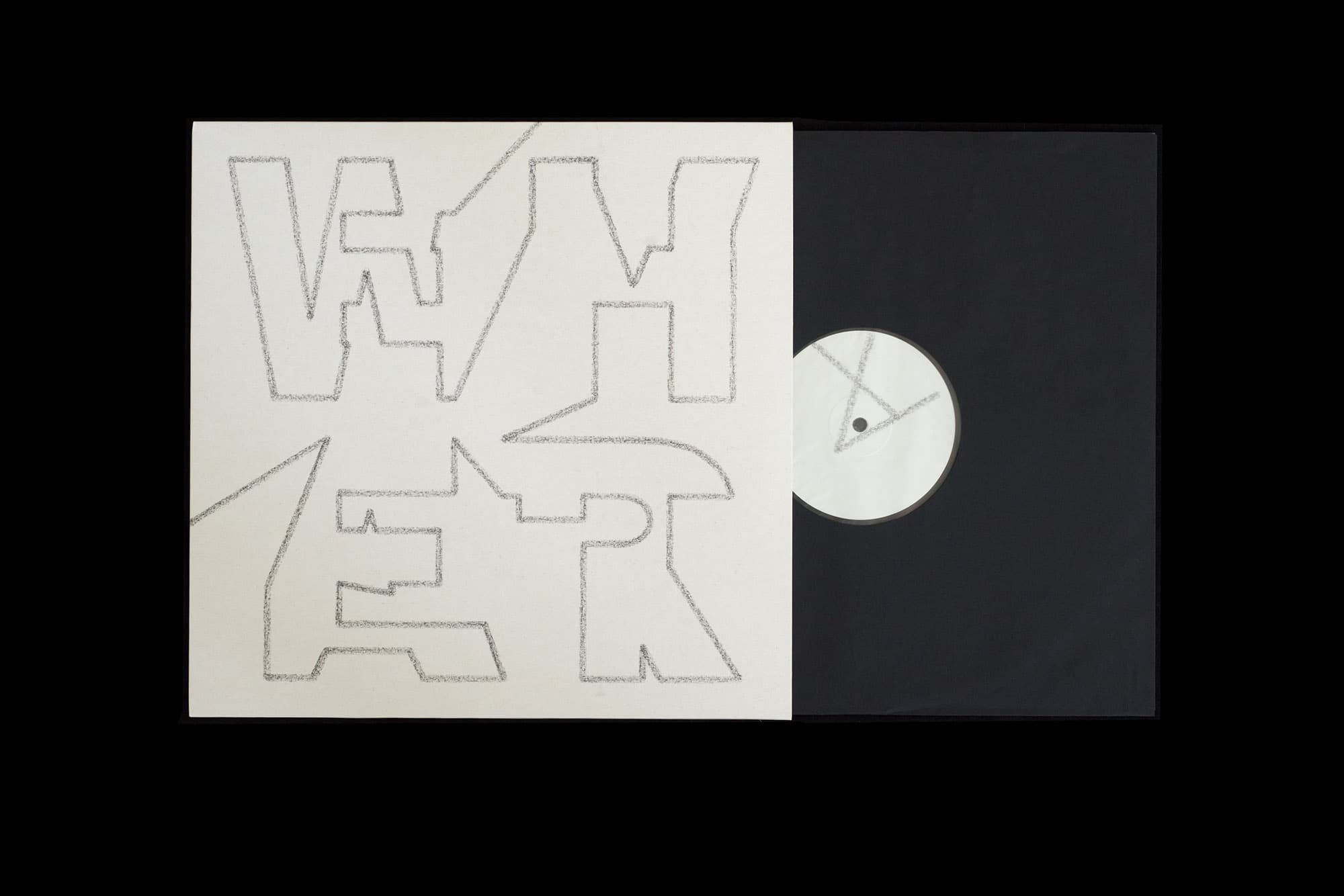
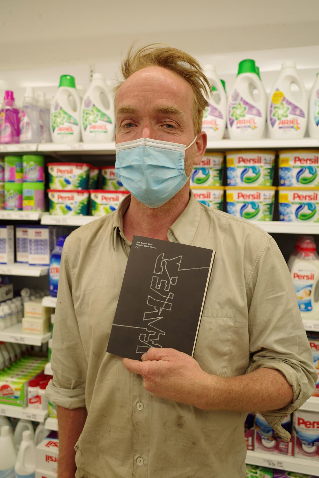
Über doppelte Musik
Book & Record Launch, Live Performance with Kay-Zee and Dimitri de Perrot, Kupper Modern, November 2021. Spector Books & Noi Recordings. Editors: Tania Prill & Peter Tillessen, photos © Peter Tillessen
Palace
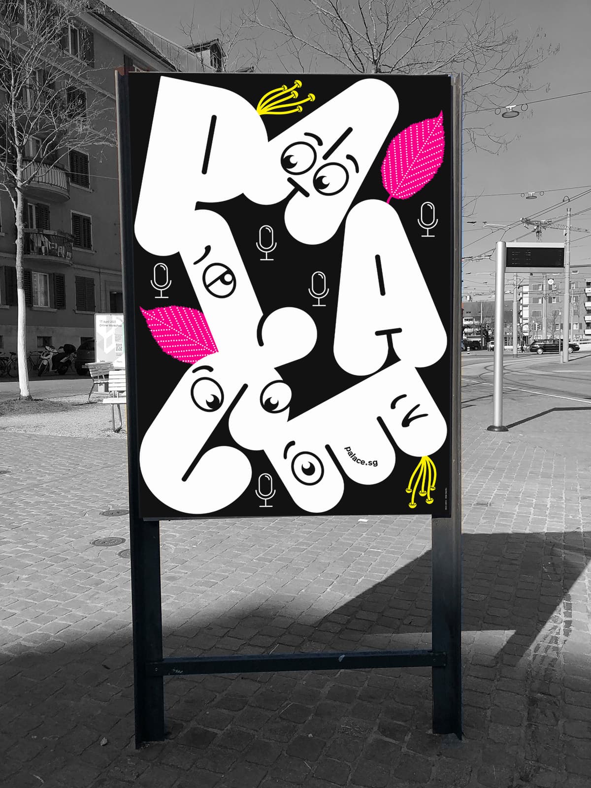
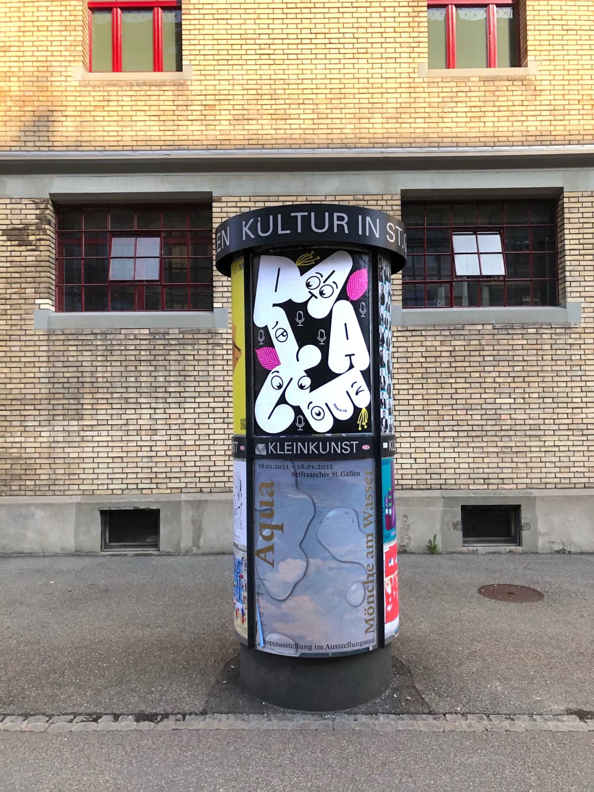
Weltformat Poster, Association PALACE, St. Gallen, Switzerland during the Covid Lockdown. PRINT: Uldry.ch
Ingo Vetter
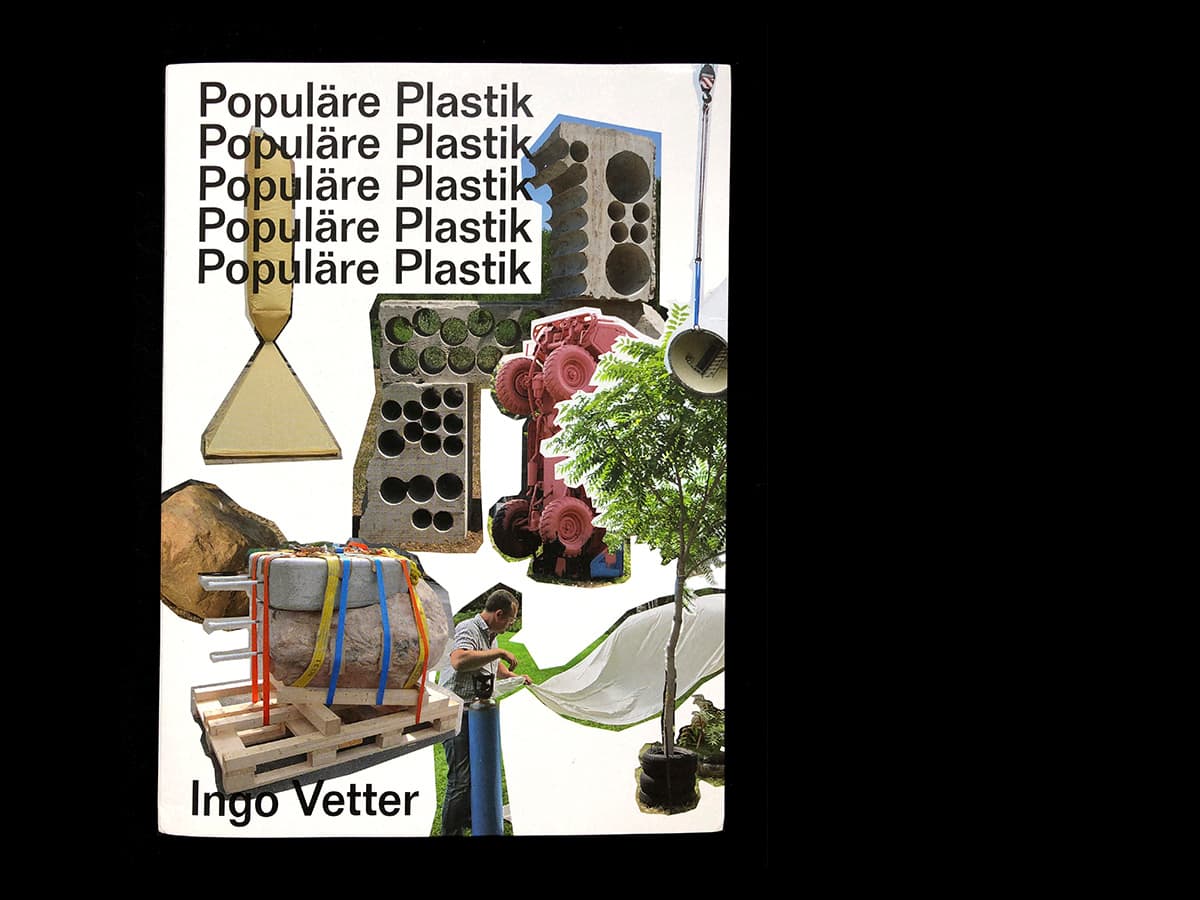
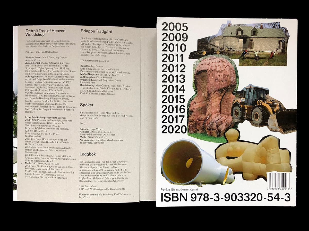
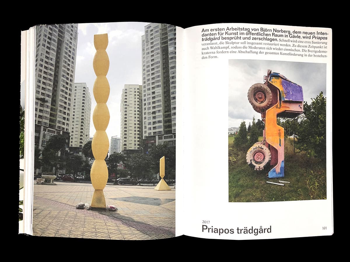
Populäre Plastik
What an impact does an artwork designed for public space have on its location and use of this space? Can it provide an experience or a new point of view? can it create contexts? – from the preface by Ingo Vetter
Design: Christian Hofer, Lea Michel together with Tania Prill
Verlag für moderne Kunst Nürnberg, 2020
Wir publizieren
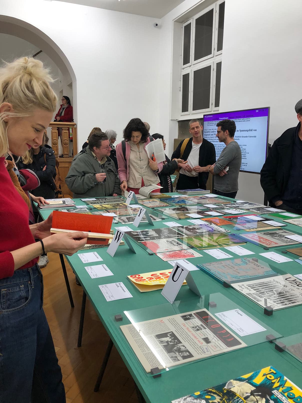
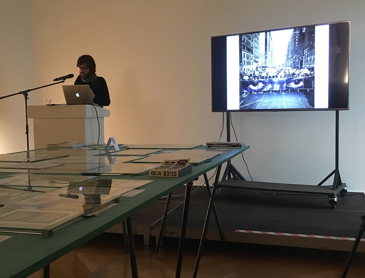
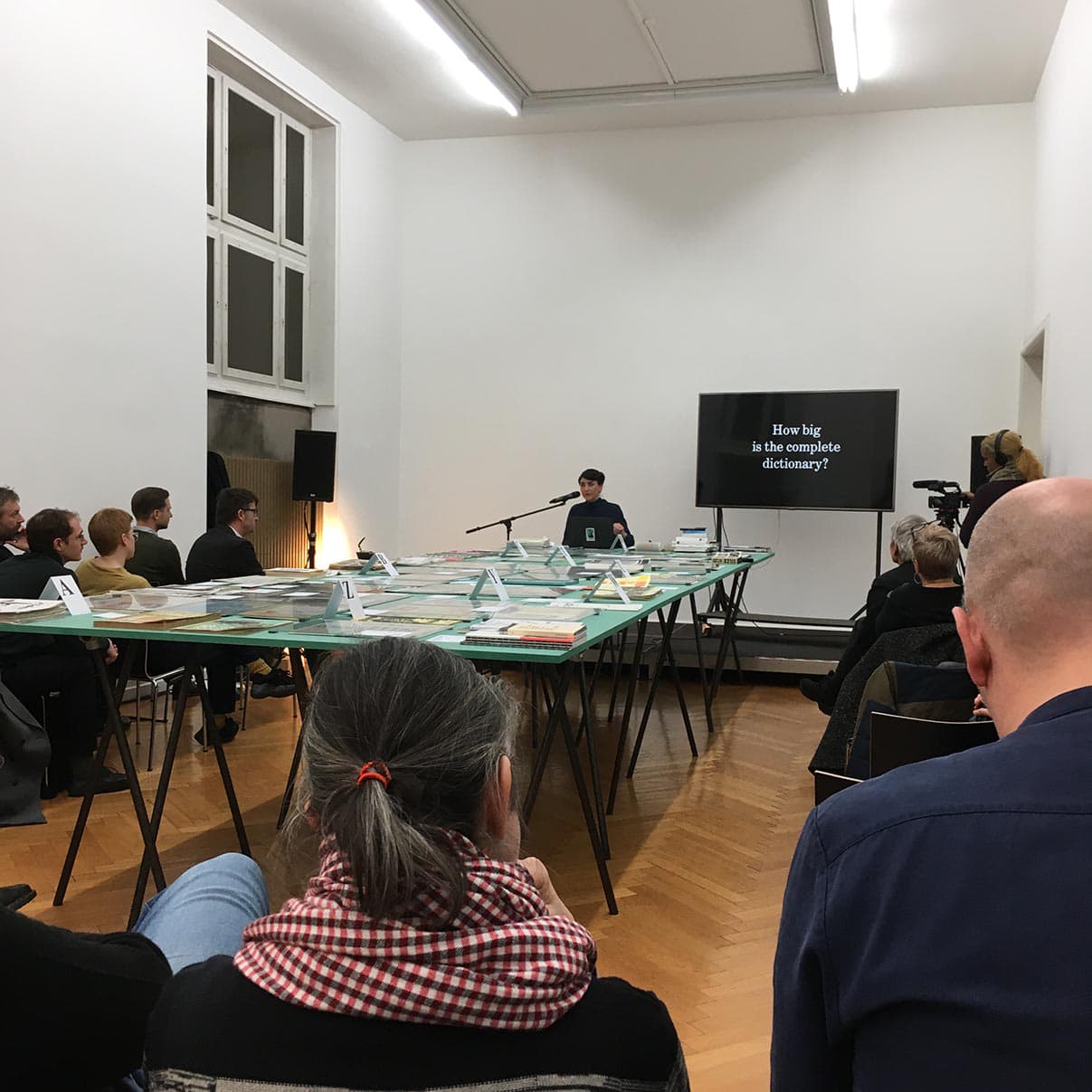

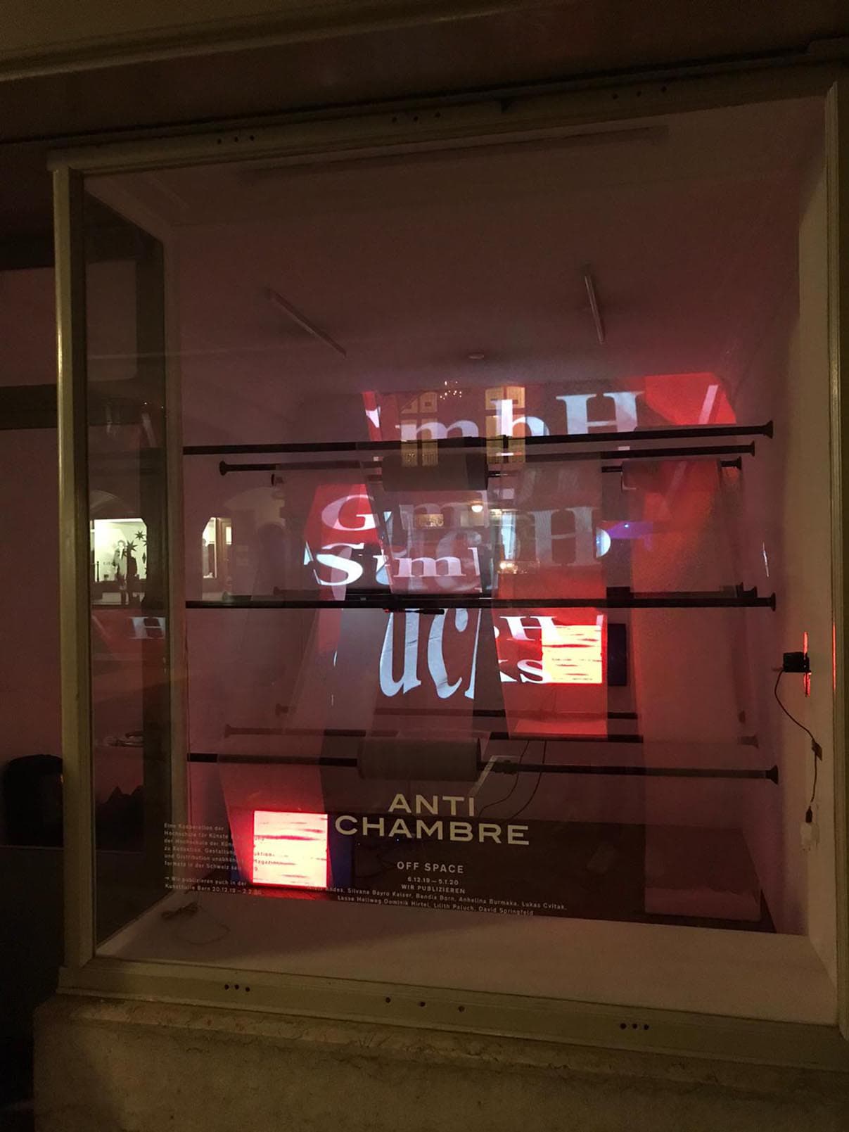
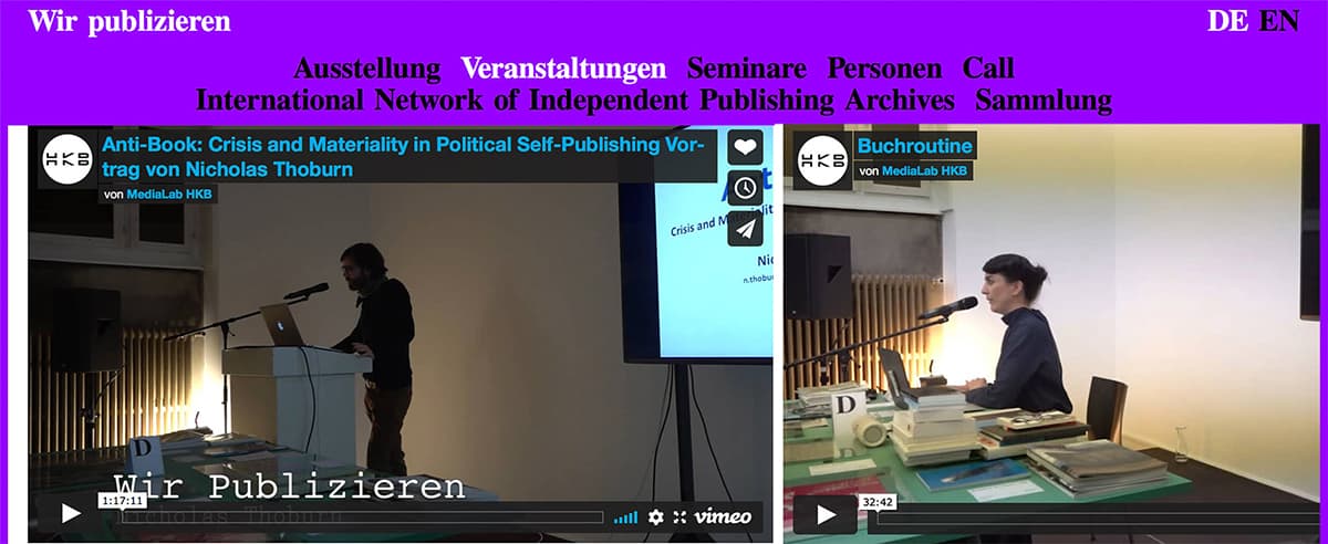
Redaktion, Gestaltung, Produktion und Distribution unabhängiger Magazinformate in der Schweiz seit 1960
Wir publizieren focuses on independent, collective practices in publishing, reproduction and distribution. It is a joint project of the Bern University of the Arts HKB in Switzerland and the University of the Arts Bremen in Germany. We are concerned with the question of how to identify increased interest in printed matter in small editions or obscure networks, and with how themes, approaches, aesthetics, and attitudes have changed in independent publishing since the 1960s (and why).
The exhibition, the conference and the installation Wir publizieren at the Kunsthalle Bern and at the Off-Space Antichambre (December 2019–January 2020) was the first project to activate the Archive of Swiss Independent Periodical Publishing which is based at the HKB.
We are linking up with the exhibition (Museum Weserburg Bremen 2015/2016) and bookproject «Under the Radar. Underground- and Selfpublications 1965–1975» coordinated by Jan-Frederik Bandel, Annette Gilbert and myself together with the students of the HfK Masterprogramm «School of Visual Combinations». wir-publizieren.ch
336 pages 336 books
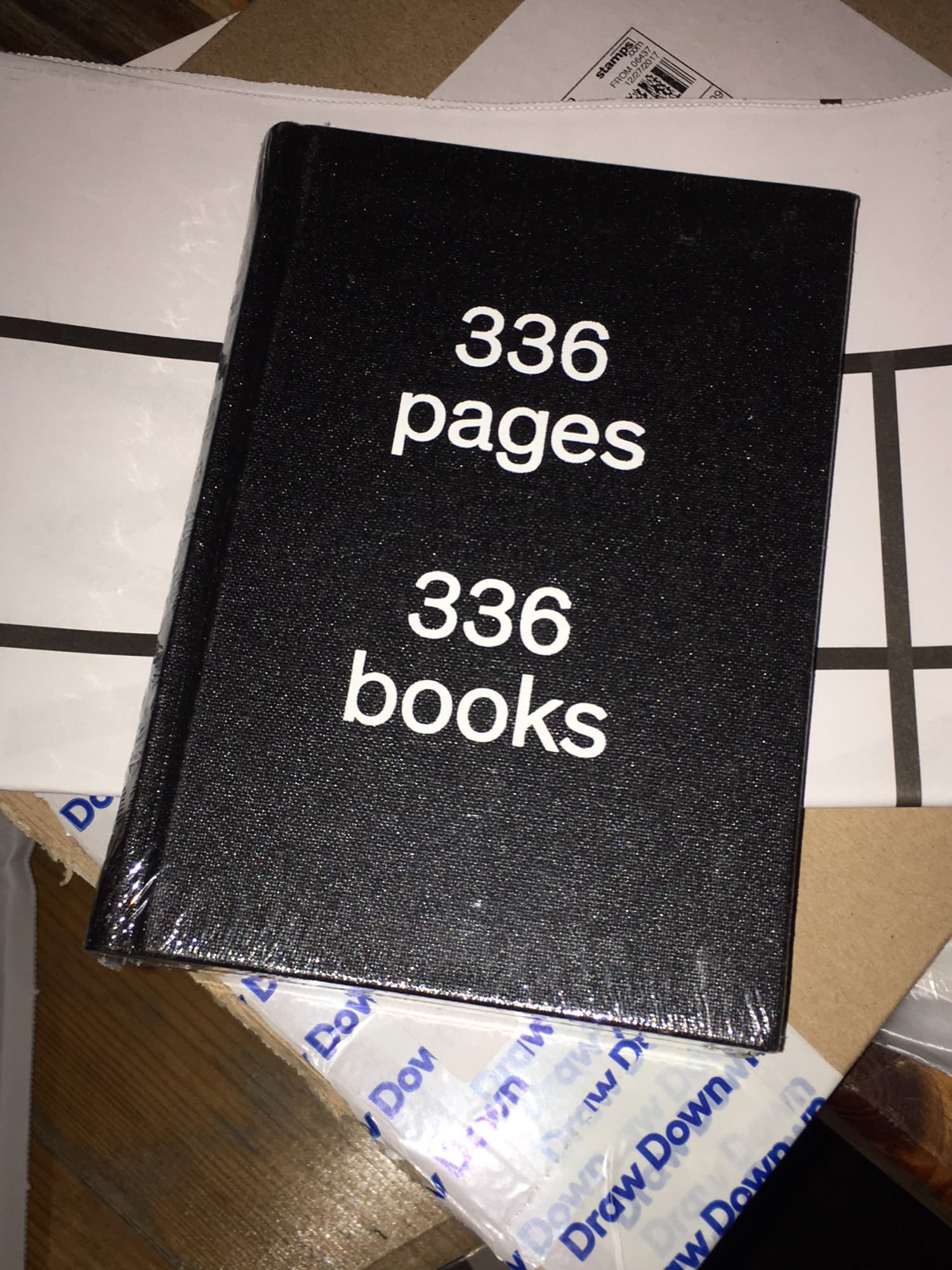
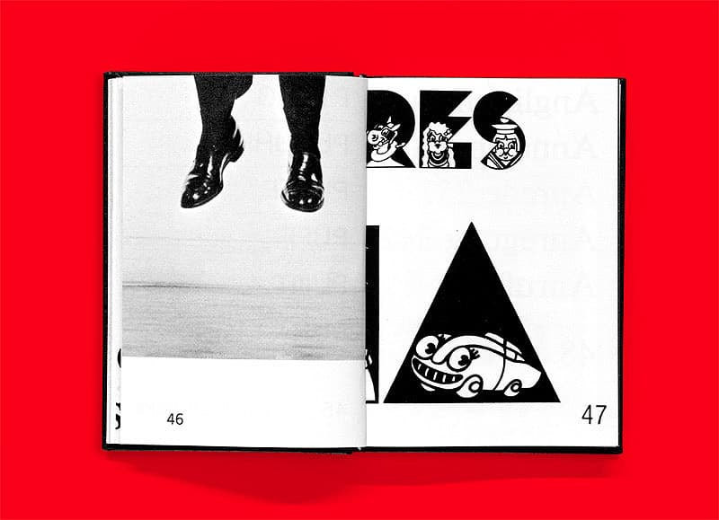
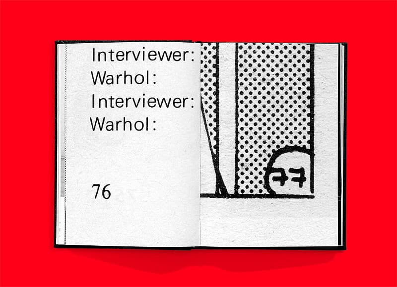
«For this 336-page book we have sighted thousands of books of all different periods, on different topics and focuses, in search of 336 headstrong, incorruptible and humoristic page numbers. On one spread, 2 pagings face each other, they relate to each other by their setting. The entirety of the pages reflects the visual diversity of the world of books.» The structure refers to book by George Brecht, the title is inspired by the artist books by Ed Ruscha. A folded leaflet with an index of the references is enclosed in the book.
151×105mm, Hardcover, Everyedition, Zurich 2013 (Out of print)
Edited and designed by Prill Vieceli Cremers
Bauhaus Dessau
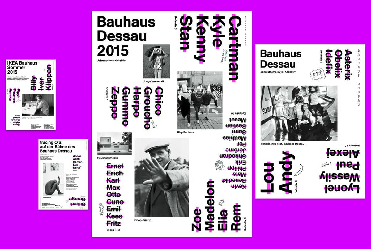
Corporate Design, Stiftung Bauhaus Dessau,2015, Design: Prill Vieceli Cremers
School of Visual Combinations
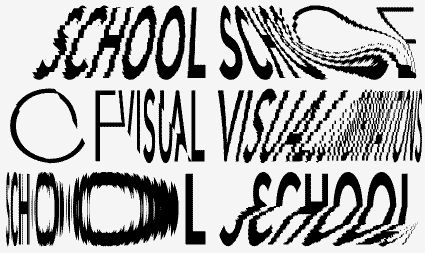
Masterstudio HfK Bremen
schoolofvisualcombinations.hfk-bremen.de
Together with other designers, artists, researchers and thinkers I am supervising the School of Visual Combinations at the University of the Arts Bremen.
Animation: Bolin Chen
Architonic – Logo
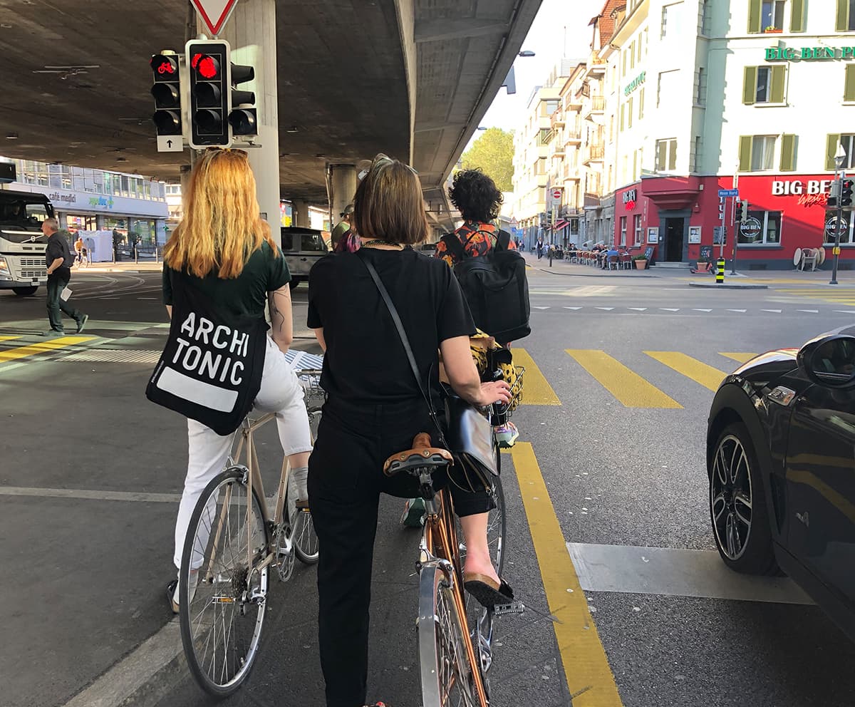

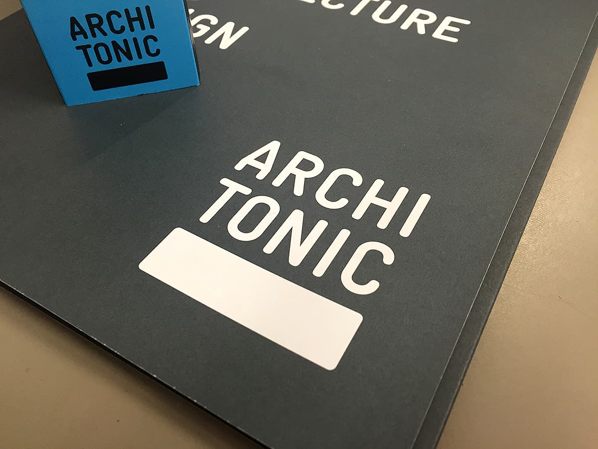
Zurich, 2021
2006 Alberto Vieceli and I designed the Architonic Logo and since then various applications. Nice to see that 15 years later the logo is still in use– unchanged.
Bruchlinien
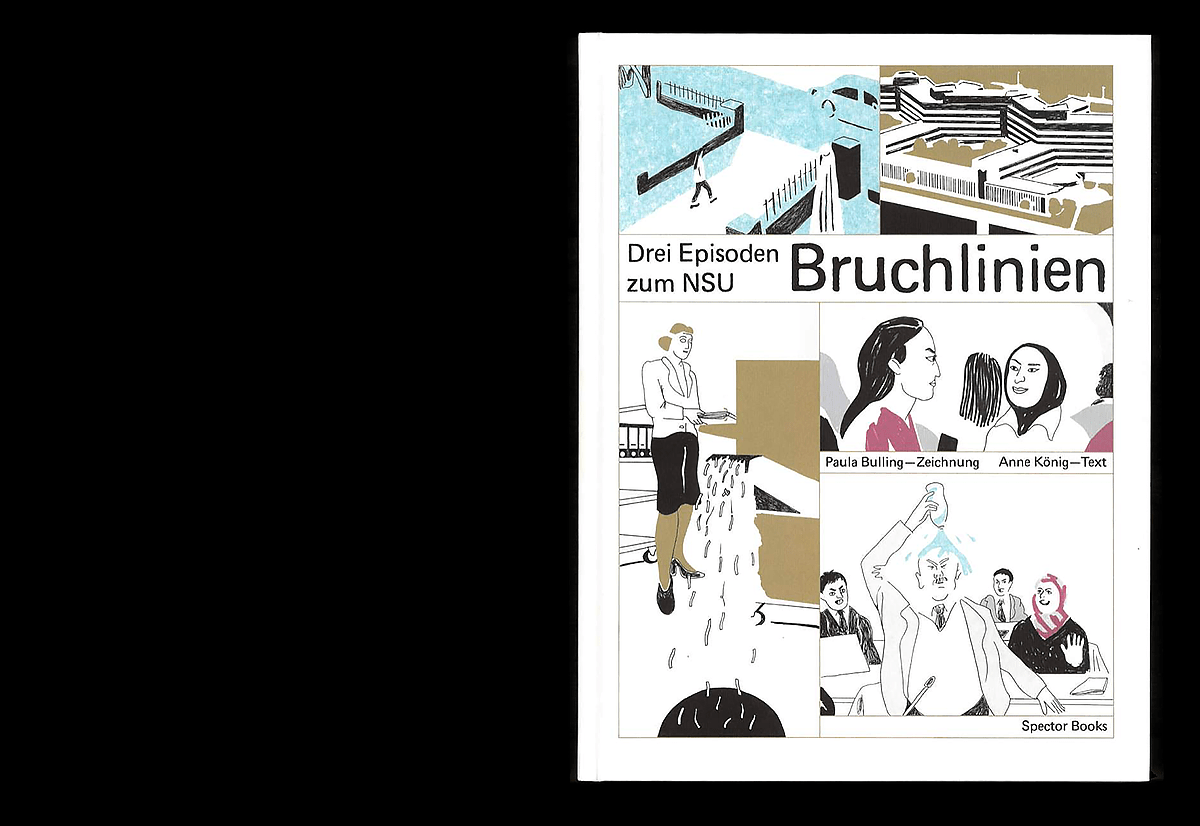
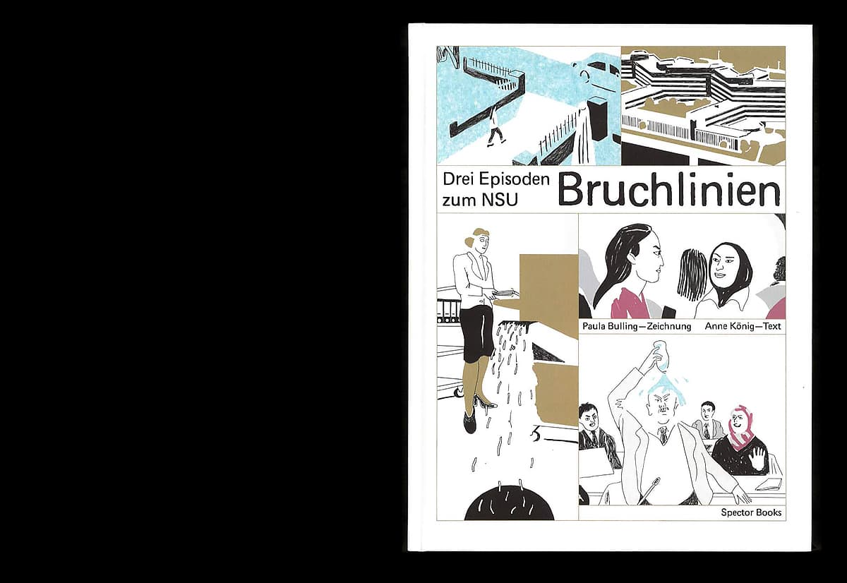
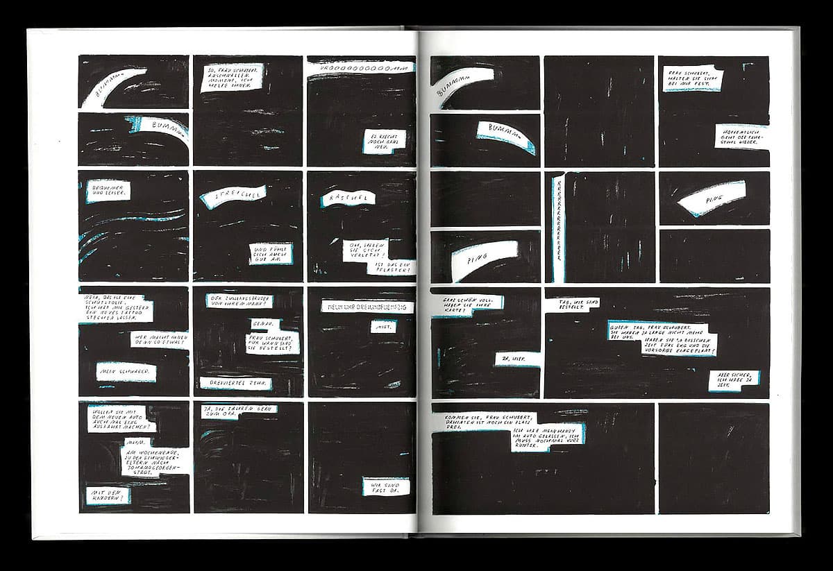
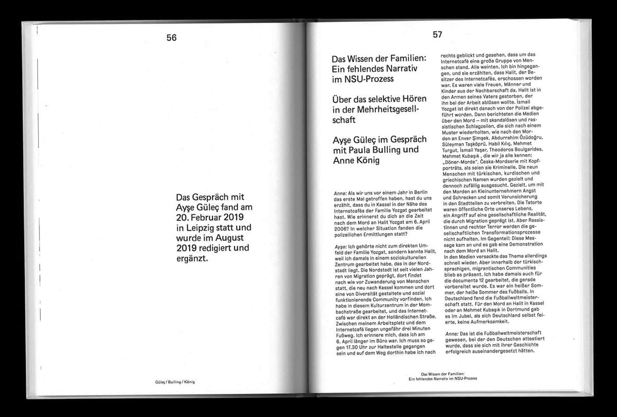
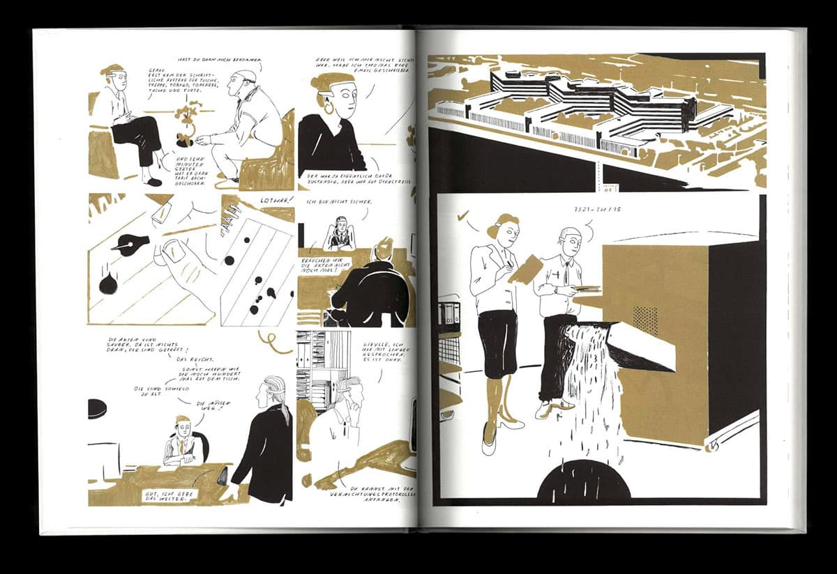
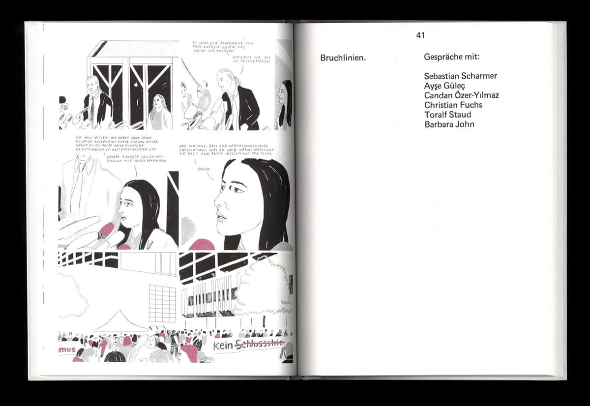
Drei Episoden zum NSU
This book is about the NSU trial that took place from 2013 to 2018. The drawings by Paula Bulling, based on three scenes devised by Anne König, interweave fact and imagination. The comic is accompanied by a series of interviews with Barbara John, ombudswoman for the families of the victims, journalists Toralf Staud and Christian Fuchs, Ayşe Güleç, co-founder of the Coalition for Action on the murder of Halit Yozgat in Kassel, and Candan Özer-Yılmaz, widow of Atilla Özer.
«Dessen ungeachtet ist ‹Bruchlinien› ein Meilenstein für den deutschen Comic: methodisch, ästhetisch, vor allem aber politisch. Die Lektüre ist schmerzhaft, aber das muss sie sein, wenn überhaupt so etwas wie ein Umdenken in den Dienststellen, die bei der Aufklärung der NSU-Morde versagt haben, erfolgen soll.» Andreas Platthaus, Frankfurter Allgemeine Zeitung
Spector Books, 2019
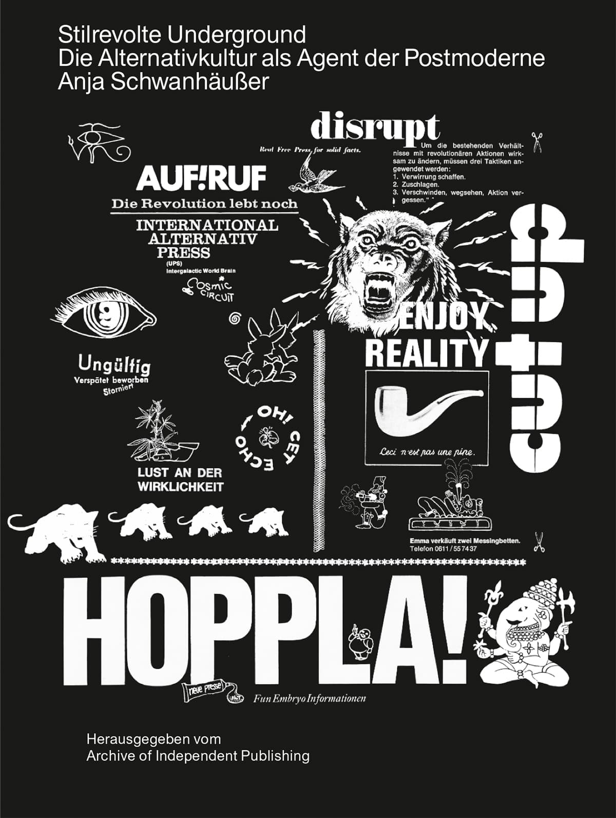
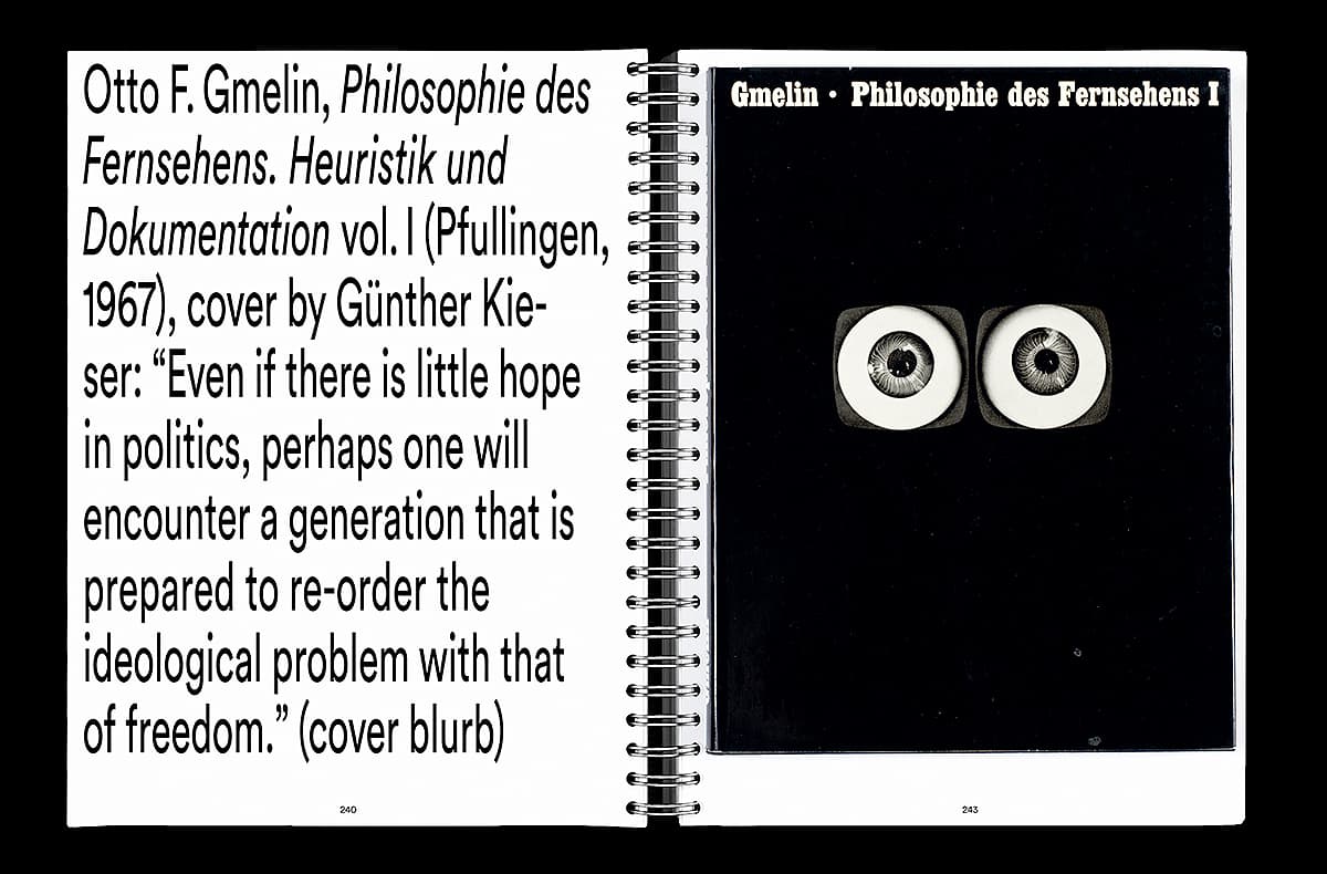
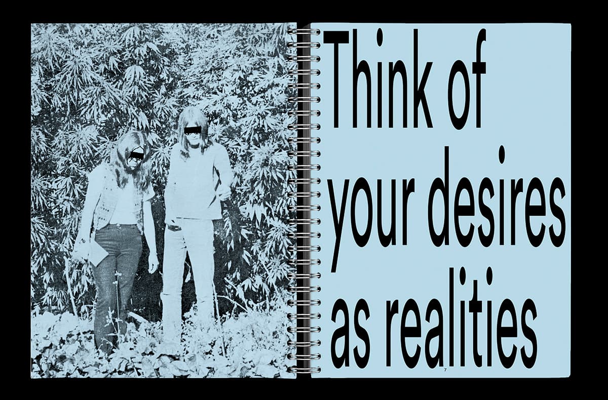
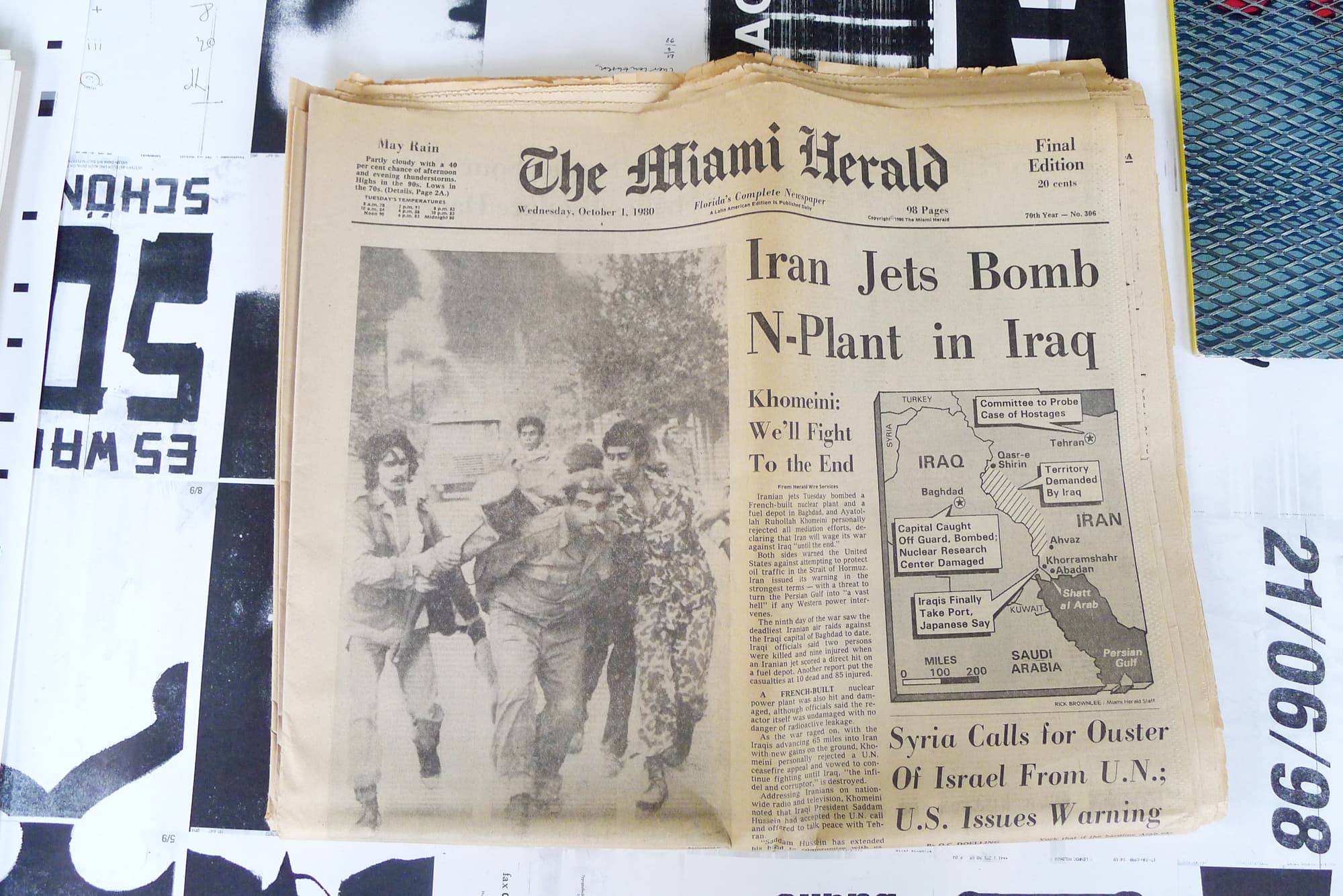
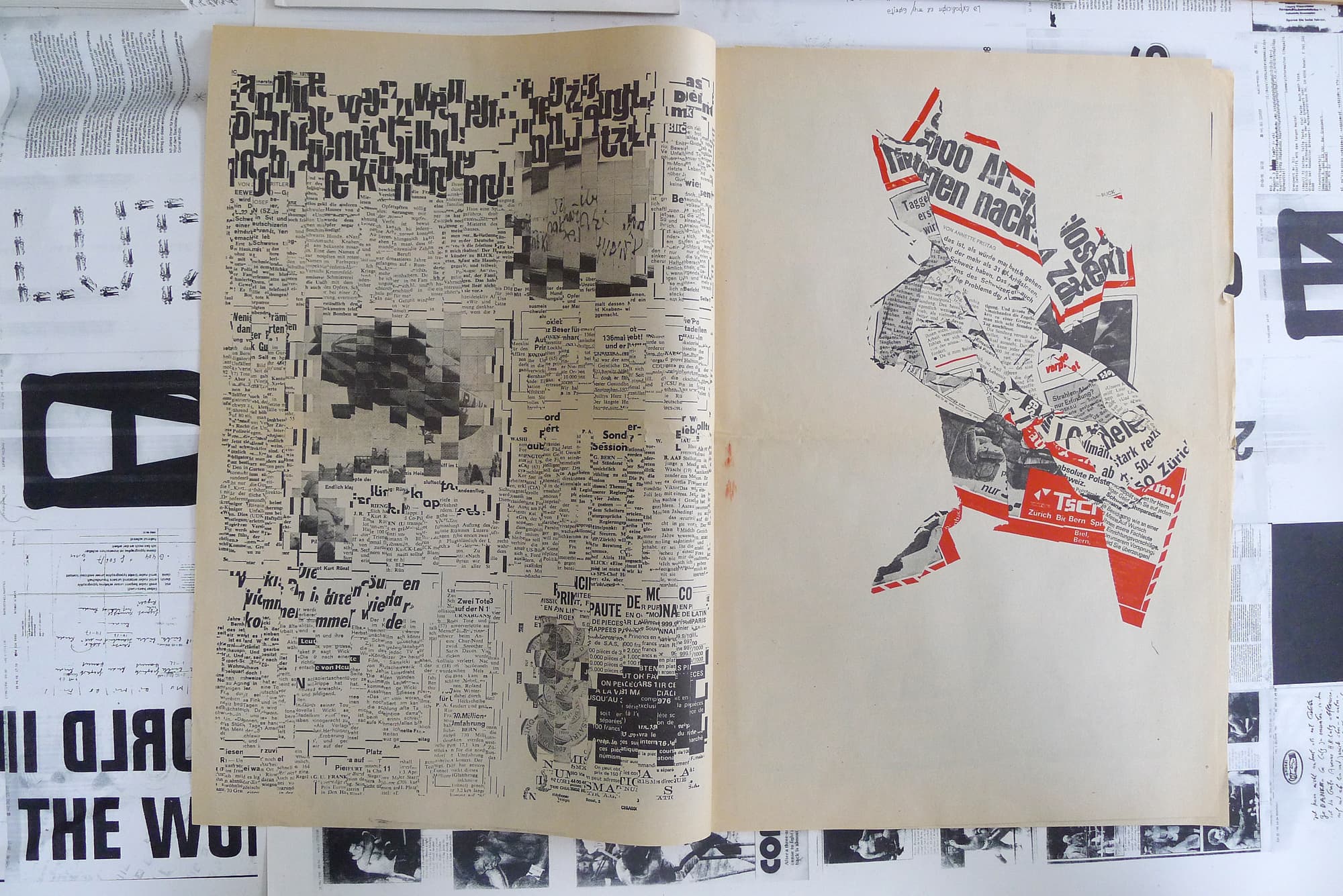
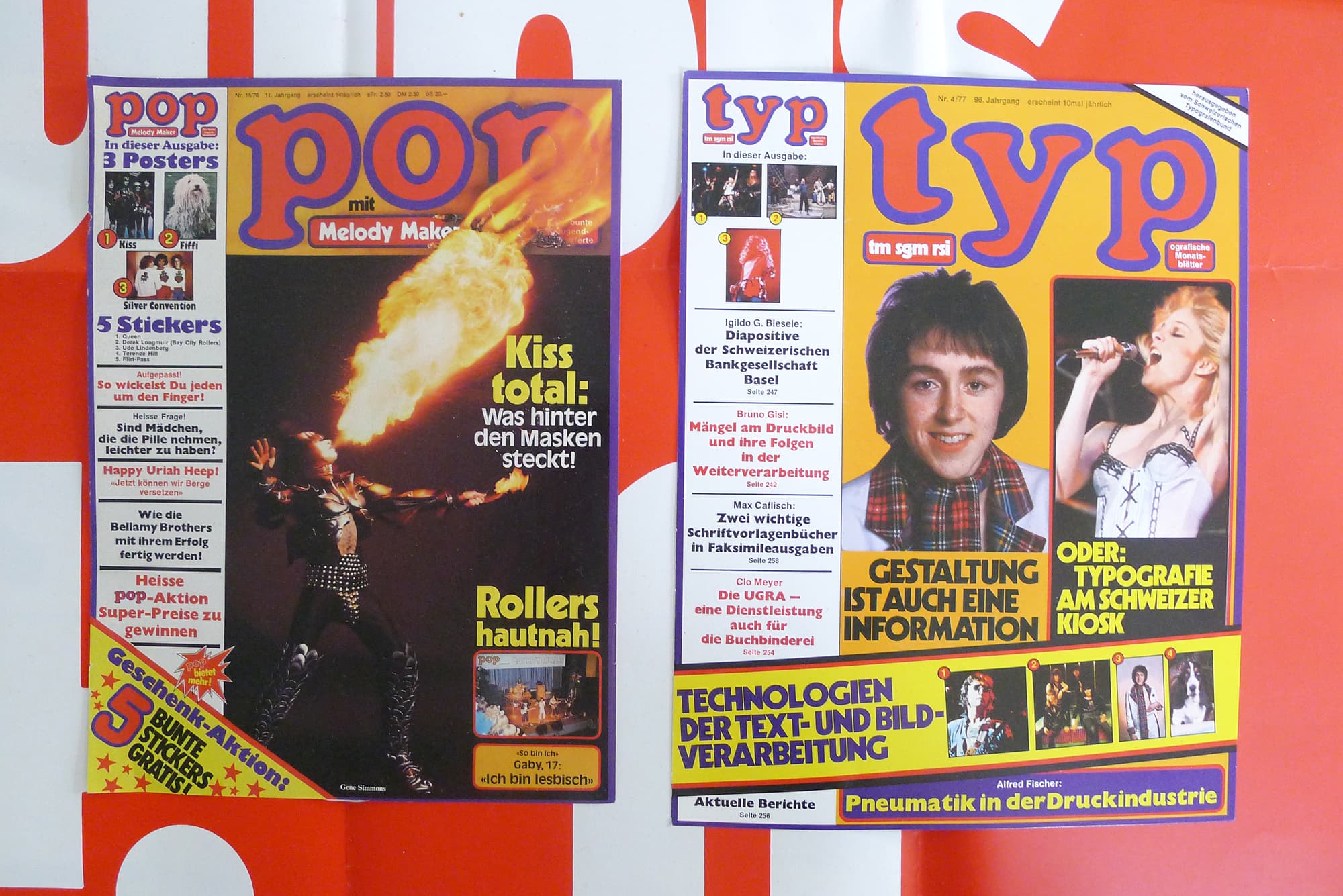
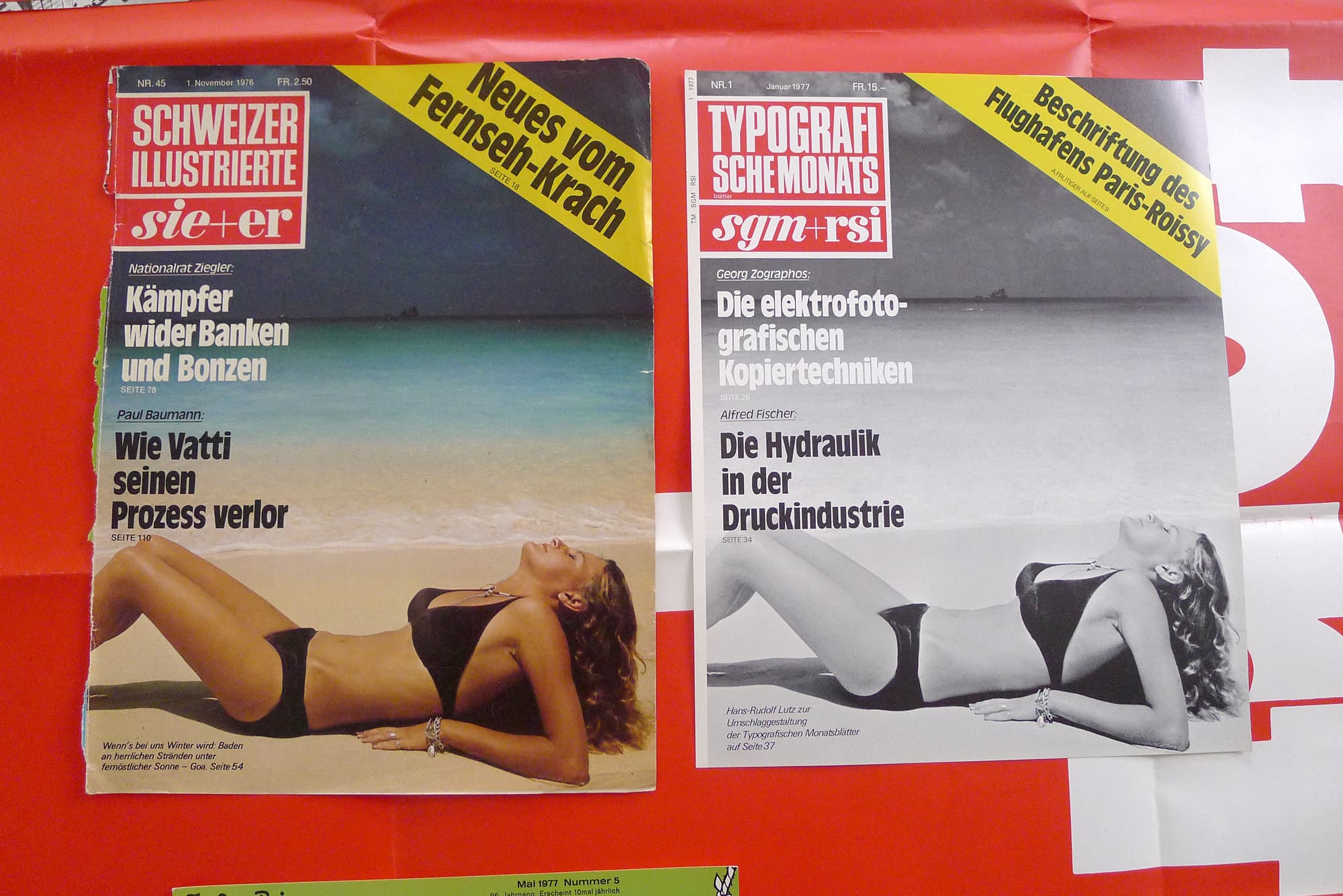
Stilrevolte Underground
AIP
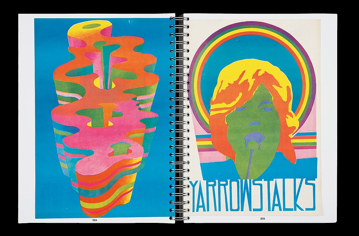
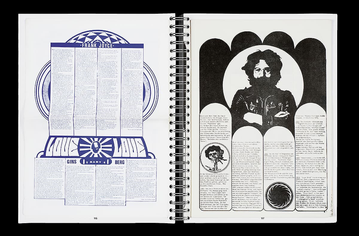
Since 2018 I am running the Archive of Independent Publishing (AIP), a collection of German and international underground and self-publications, now based at the University of the Arts Bremen (HfK). The assortment of hundreds of notebooks, brochures, largely coming from the 1965–75 period, is open to use for researchers, students, and other interested individuals. The value of these publications—often equally wild in regards to politics, content and design—for the history of social movements, political protest forms and alternative life models around and since 1968 is apparent. However, the AIP is most urgently interested in questions that are different (or rather lead in different directions): what significance is gained by media, communication, and design in these life models? What preceding histories to the analog, digital, post-digital media use can be told through these publications? Which breaks with tradition and lines of continuity within graphic design and media thought can be conceived of more precisely than elsewhere? On Whose shoulders is today’s independent publishing standing on? What can it learn from the amateurs, fantasts, and rebels of the 1960s and 70s? How political is design? And which social ideas can be articulated within it?
The AIP has emerged out of the collection belonging to Jan-Frederik Bandel and the project Under the Radar. Underground Zines and Self-Publications 1965–1975. Stilrevolte Underground is the first book of AIP ON TOUR, designed by Jakob Grommas, Viktoria Dietz & myself. Spector Books, 2023
Why Publish? We Publish!
‘Print Out: Archiving and Curatorial Practices of Alternative Publishing Ventures’, international Symposium on Curatorial Practices of Alternative Publishing Enterprises at the Sarojini Naidu School of Arts and Communication, University of Hyderabad in collaboration with Pro Helvetia, Swiss Arts Council, Hyderabad, 2018 / Lecture together with Andreas Vogel
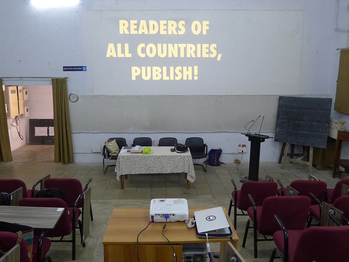
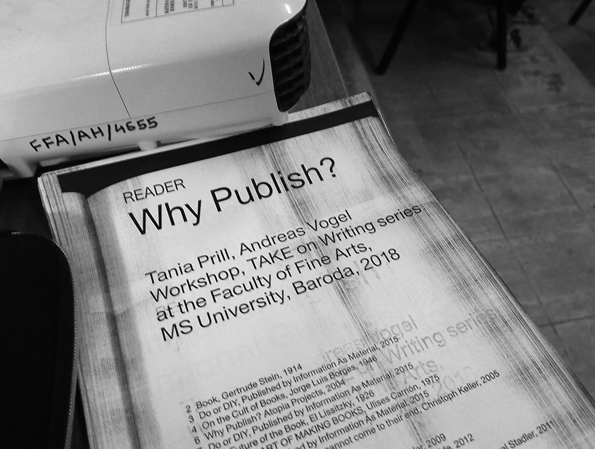
‘READERS OF ALL COUNTRIES, PUBLISH!’ Lecture and workshop together with Andreas Vogel at the Faculty of Fine Arts, MSU Baroda, 2018 / TAKE on Writing Series and Pro Helvetia in collaboration with MSU Baroda and Pro Helvetia.
The Legend of Barbara Rubin
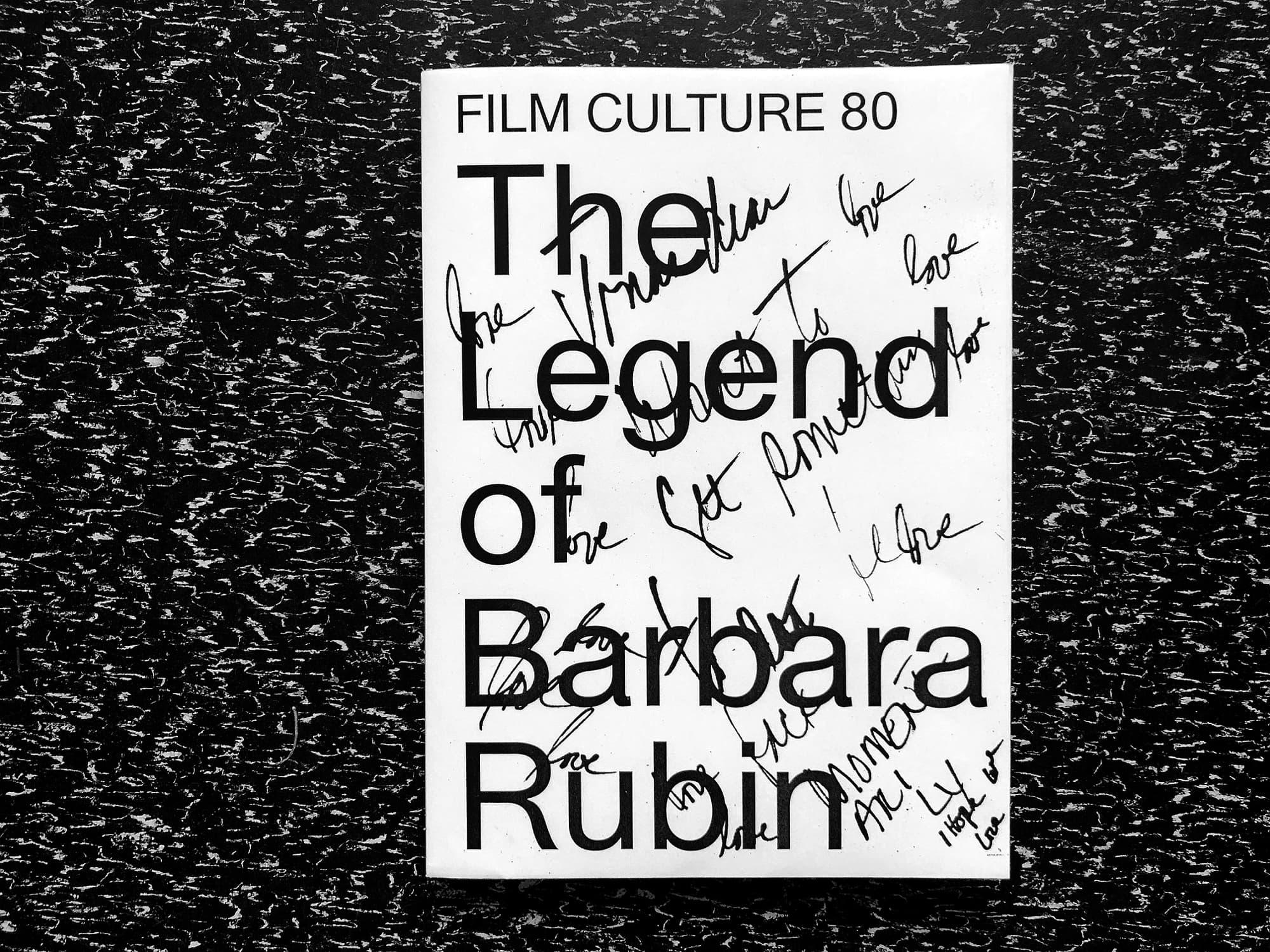
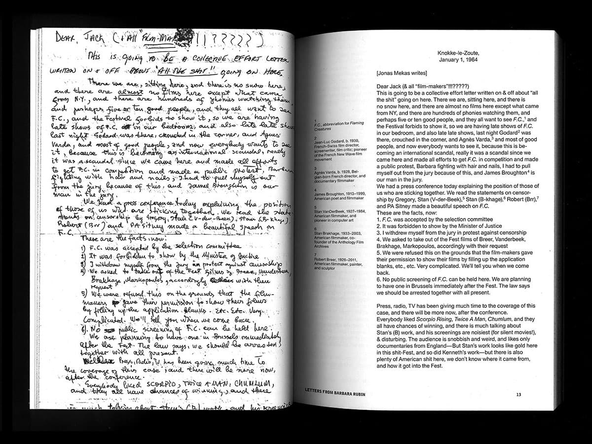
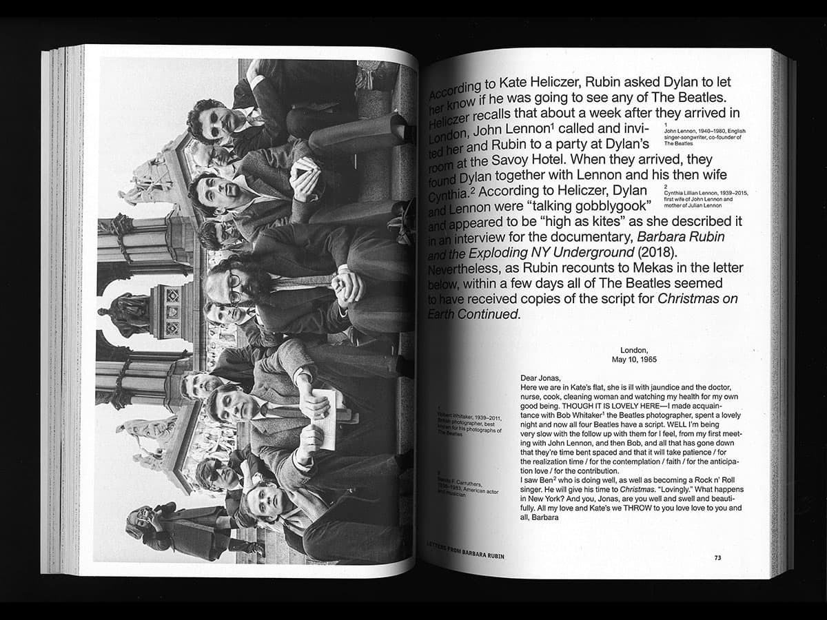
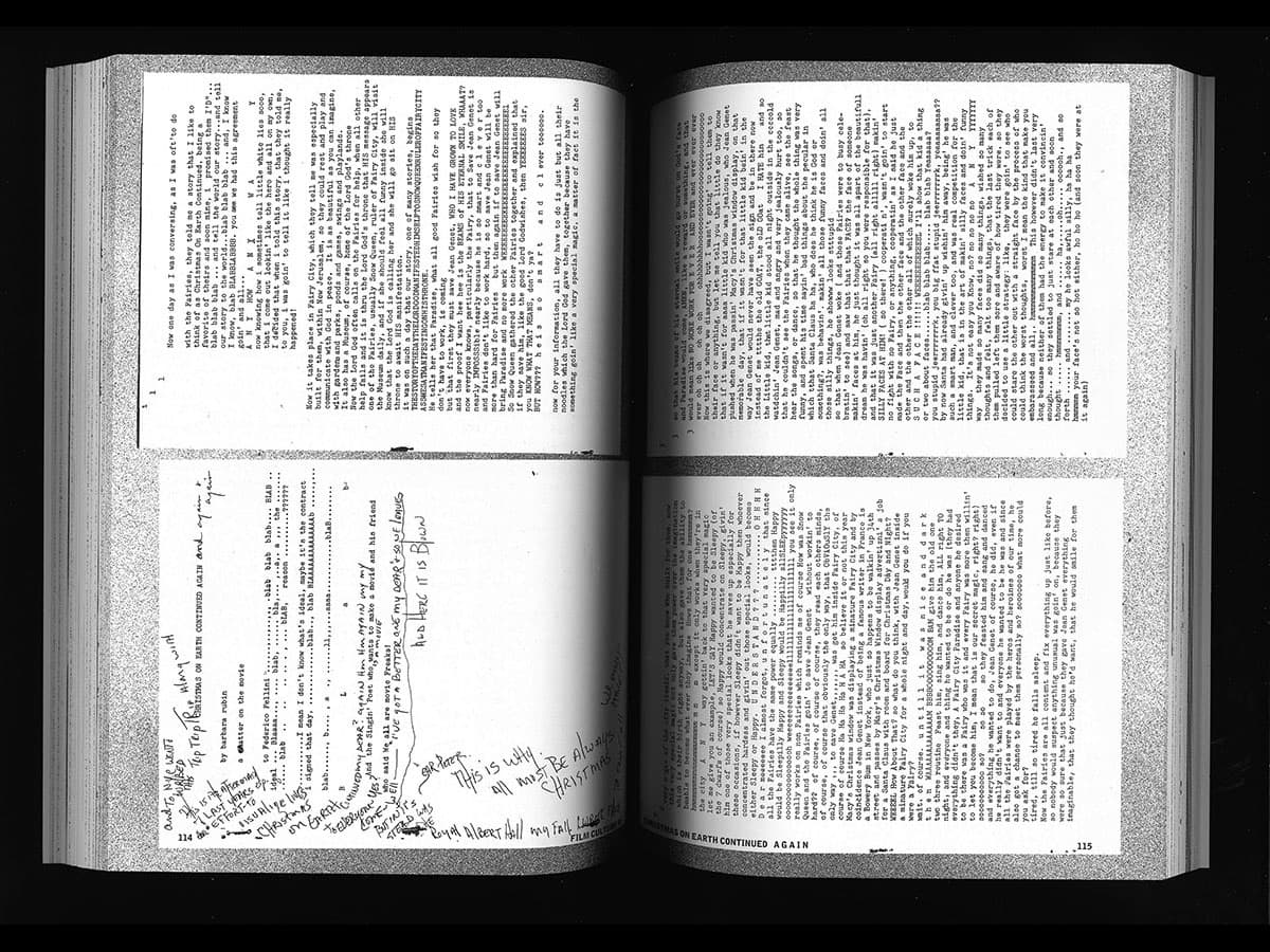
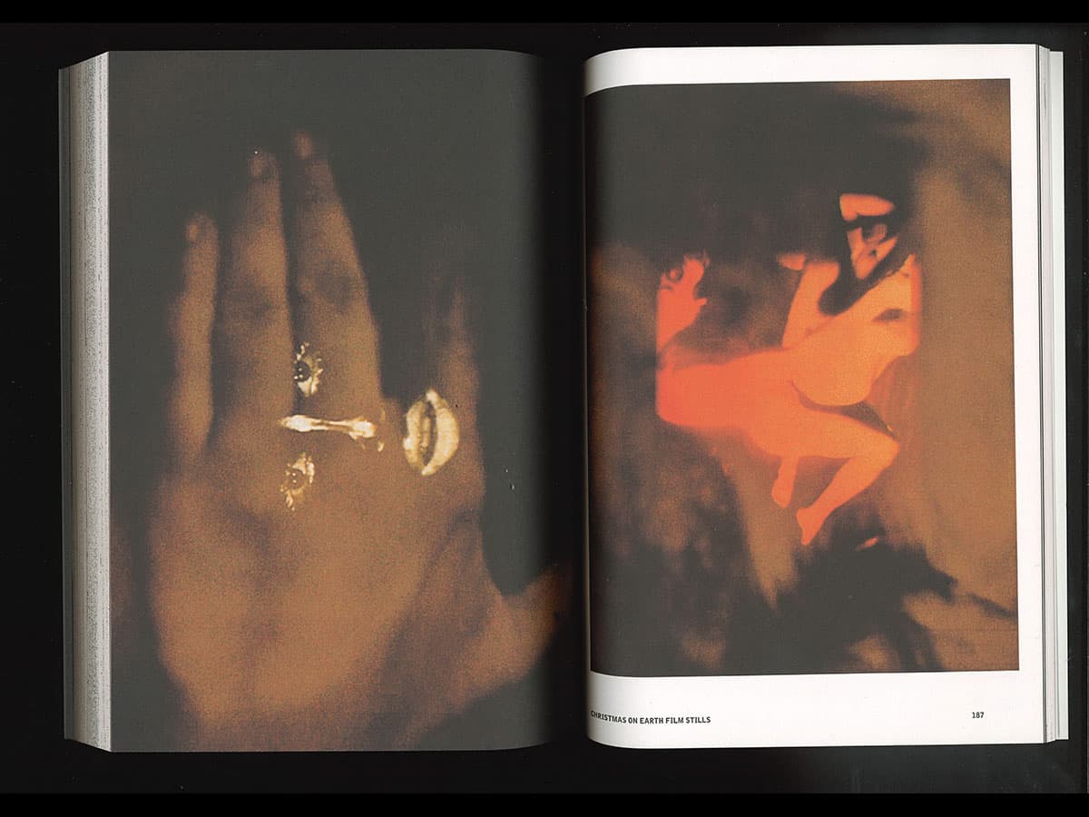
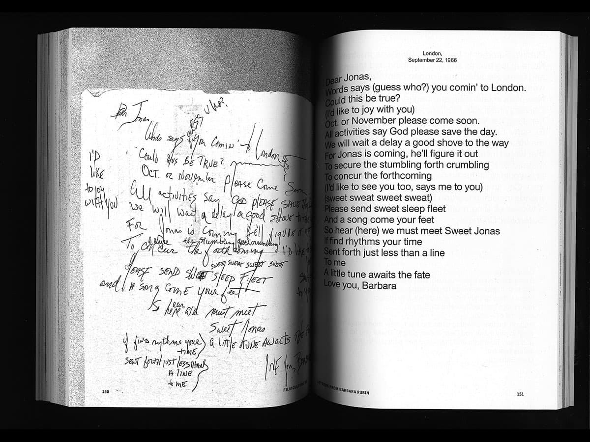
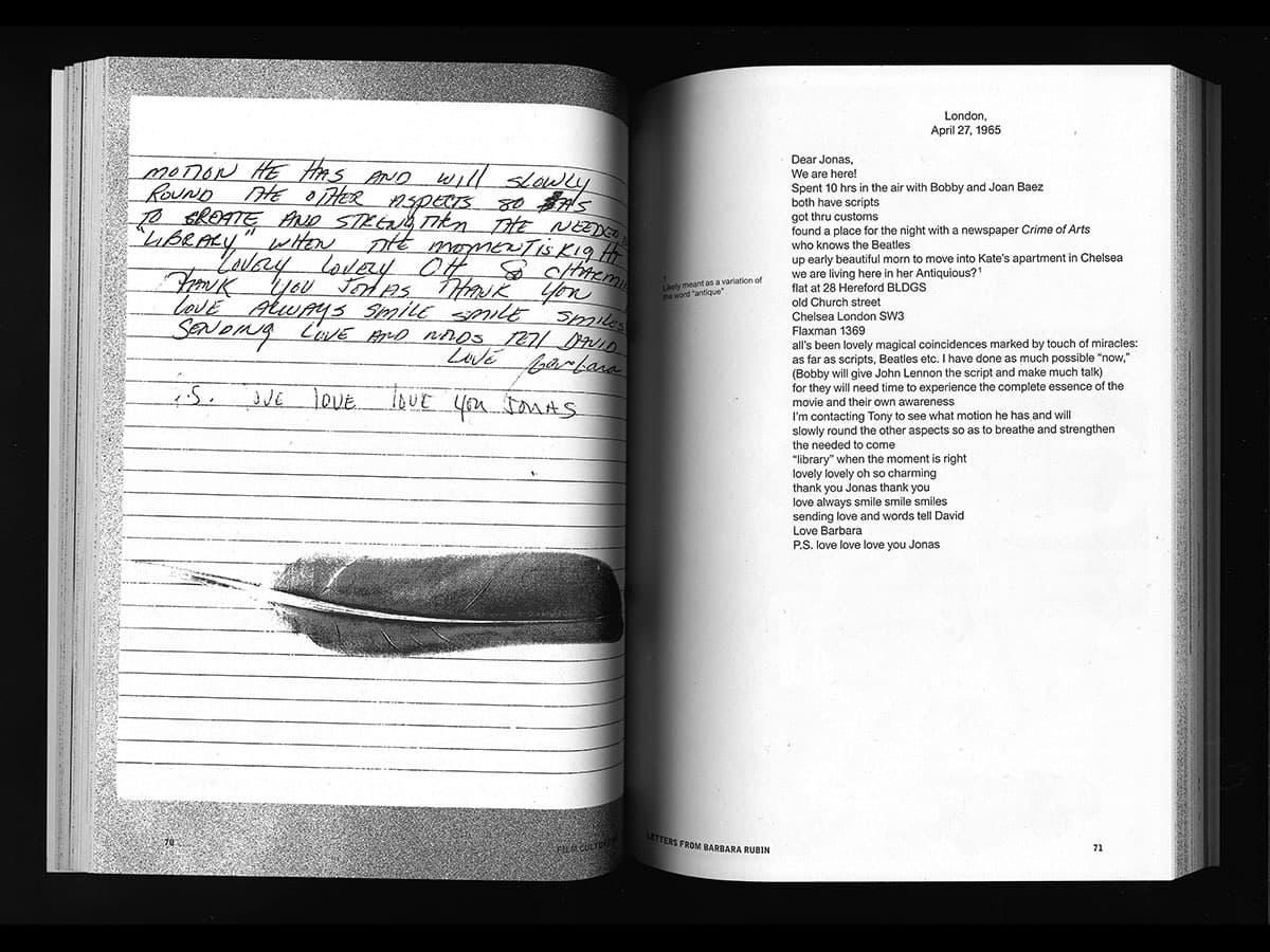
Film Culture 80
The filmmaker Barbara Rubin entered the New York underground in the 1960, while still a teenager and she quickly became a legendary key figures of the community.
This special eightieth issue of the magazine Film Culture features her previously unpublished letters to Jonas Mekas and includes interviews and Rubin’s script, Christmas on Earth Continued, a planned sequel to her notorious film.
Design: Tania Prill & Franziska Bauer, Spector Books.
Awarded as one of the Most Beautiful Swiss Books 2018.
Book launch 1: A Conversation about Barbara Rubin together with Anne König, Jonas Mekas, Marc Siegel and Chuck Smith. September 15, 5–7pm, Printed Matter, New York.
Book launch 2: Friday, September 21, 2018, 3pm at the Classroom MoMa PS1, with Jonas Mekas, Chuck Smith, Franziska Bauer, Sarai Meyron and Anne König.
Typografie als künstlerisches Ereignis
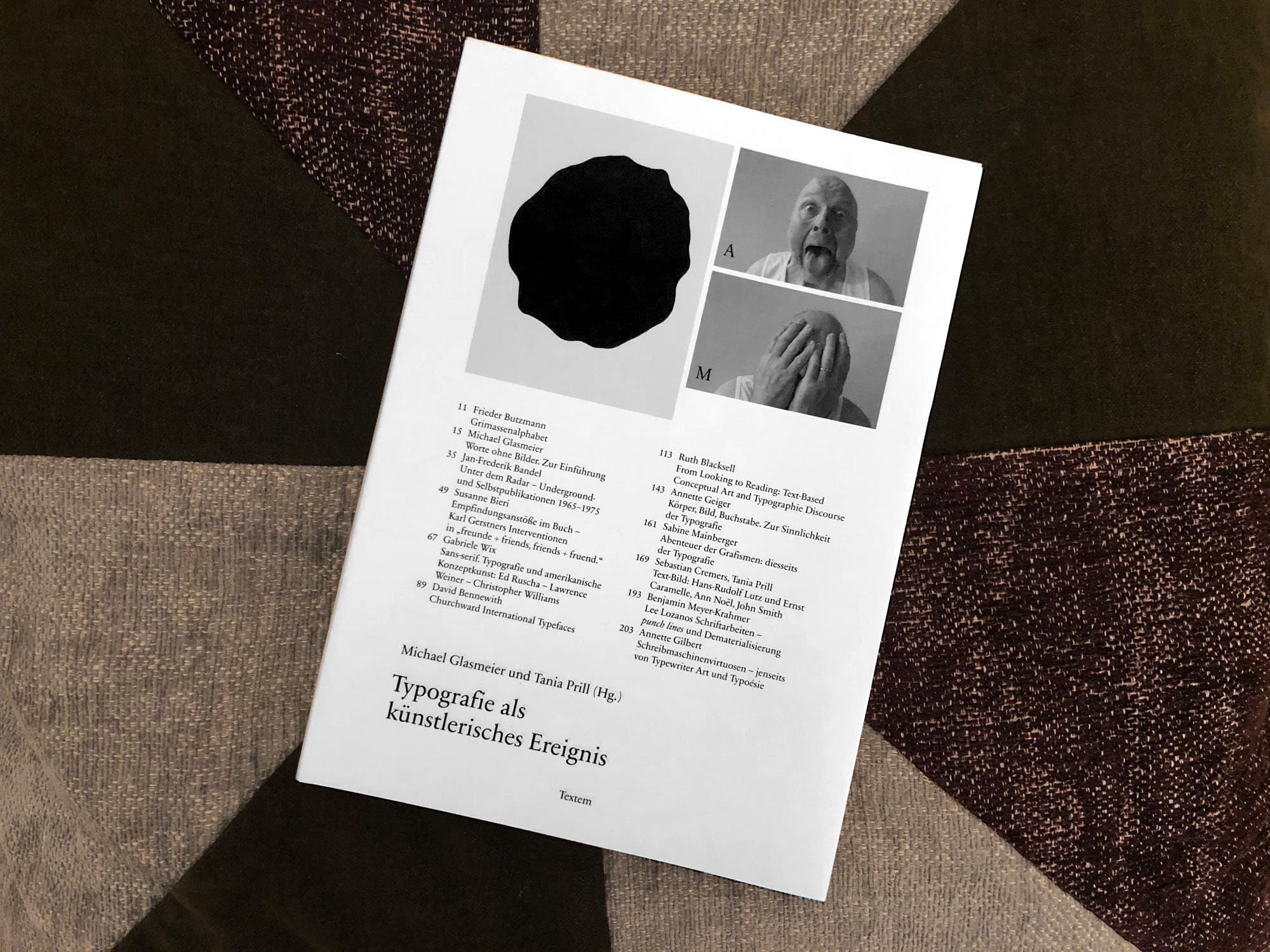
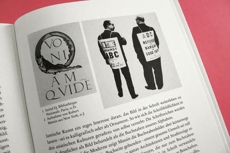
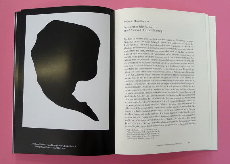
Michael Glasmeier & Tania Prill (Hrsg.)
Mit Beiträgen von Jan-Frederik Bandel, David Bennewith, Susanne Bieri, Ruth Blacksell, Frieder Butzmann, Sebastian Cremers, Annette Geiger, Annette Gilbert, Michael Glasmeier, Sabine Mainberger, Benjamin Meyer-Krahmer, Tania Prill, Gabriele Wix
Gemalte Schrift, gedruckte Schrift, montierte Schrift: Nicht erst seit dem 16. Jahrhundert begleiten differente Formen von Textelementen die bildende Kunst – bis hin zum Ersatz des Bildes durch Schriftlichkeit. Die Publikation will daher mit ihren Beiträgen nicht in erster Linie Text-Bild-Phänomene untersuchen, sondern vielmehr die jeweils spezielle Typografie solcher Worterscheinungen an ausgewählten Beispielen diskutieren. Gerade in den 1960er Jahren wird deutlich, dass etwa mit Fluxus, Konzeptkunst, Pop-Art oder exklusiv mit Visueller/Konkreter Poesie Textelemente eben nicht nur poetische Beigaben darstellen, sondern einen eigenen, individuellen Bildcharakter besitzen, der in einer praktischen Gestaltung etwa von Gemälden, Zeichnungen, Künstlerbüchern, Bildtafeln, Diagrammen, Konzepten, Installationen oder Filmen Ausdruck findet. Hier erprobt die bildende Kunst auf verschiedensten medialen Ebenen einen erweiterten Umgang mit Schrift bis hin zur Entwicklung eigener Schrifttypen. Vor allem aber kommt es in diesen Jahren zur produktiven Wechselwirkung von freier und angewandter Typografie, etwa in den Künstlerpublikationen der Zeit. Methoden der Konkreten Poesie oder der Konzeptkunst werden in die Werbung übertragen usw. Dieses bisher unterbelichtete Feld eines umfassenden typografischen Experiments könnte mit den vereinten Kräften von Theorie und Praxis ein neues Forschungsgebiet generieren.
Textem, ISBN 978-3-86485-125-4
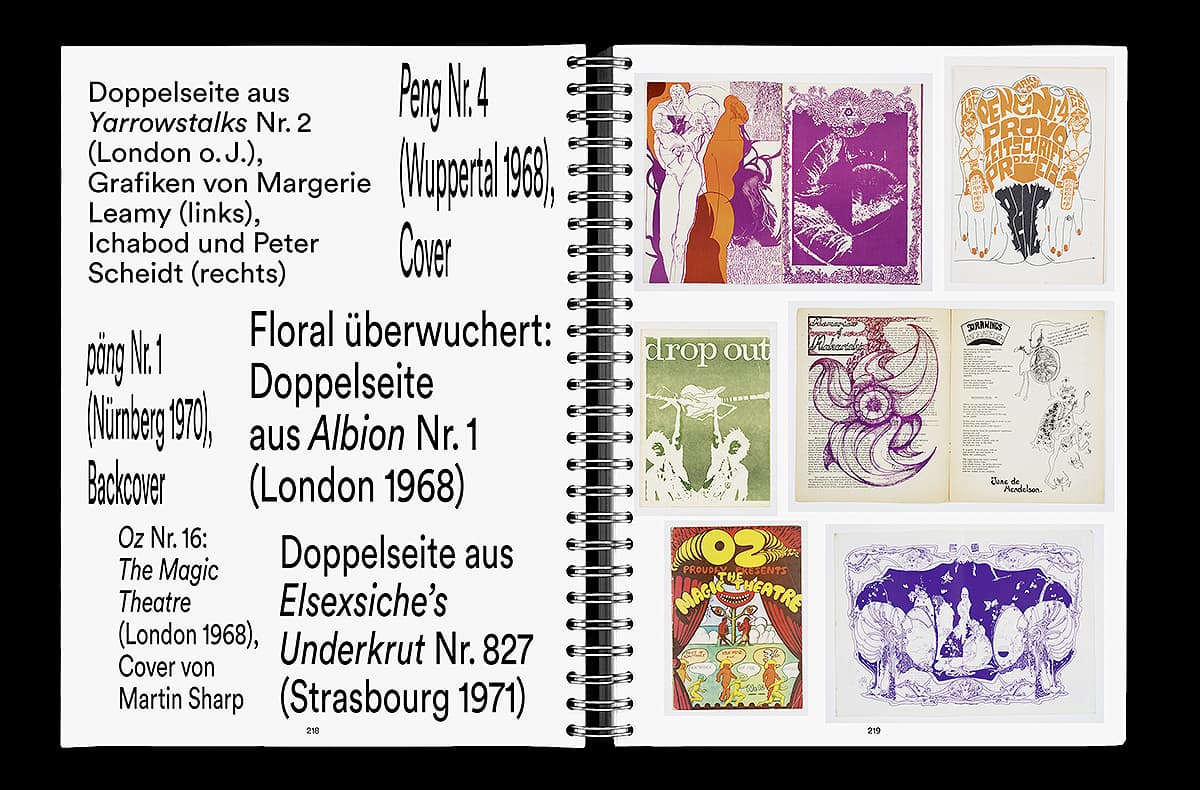
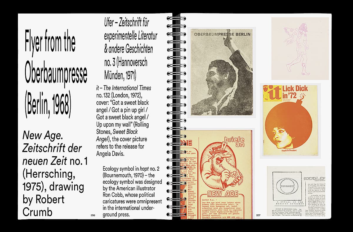
Under the Radar – Underground Zines and Self-Publications 1965–1975

Exhibition and publication
The mid-1960s witnessed a boom in underground and selfpublished works. This exhibition at the museum Weserburg Bremen and the publication is the first to present the underground and self-published works that came out of West Germany in such depth, while also showing the international context in which they emerged: not as an anecdotal history but as an attempt to tap into the aesthetic cosmos of a Do-It-Yourself rebellion, one that also challenges us to take a new look at the current boom in independent publishing, the risograph aesthetic, and so on.
Spector Books, 2017, Edited by Jan-Frederik Bandel, Annette Gilbert, Tania Prill; designed by Prill Vieceli Cremers
Award: Grand Prix, Tokyo Type Directors Club
Exhibition: Jan-Frederik Bandel and Tania Prill, in cooperation with the School of Visual Combinations.
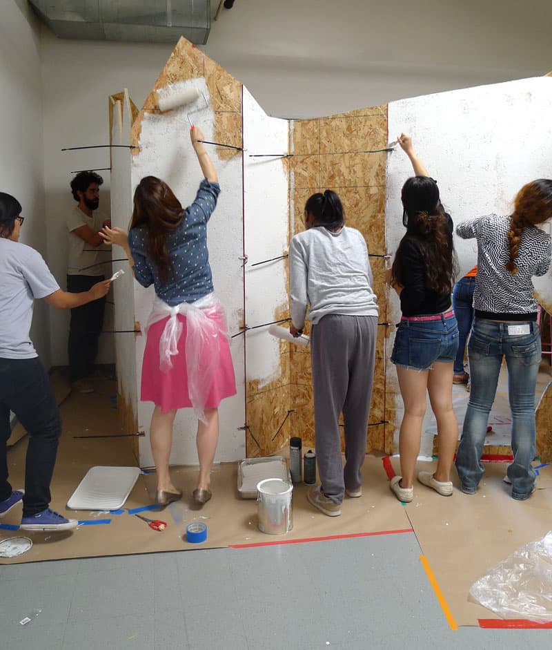
Lutz Open House
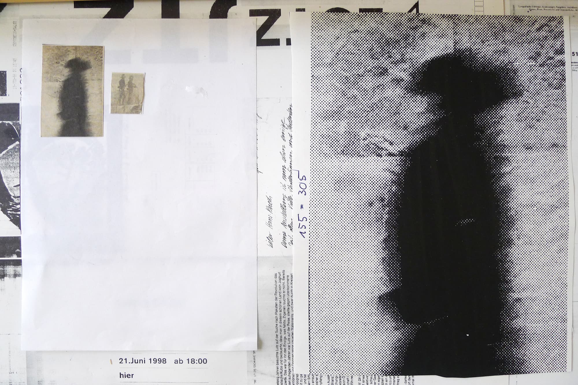
When we had to leave our studio in 2017, which was the former studio of Hans-Rudolf Lutz since 1972, we moved our studio furniture and exhibited some of his work for a couple of days.
Scenography: Sebastian Cremers
Martin Parr
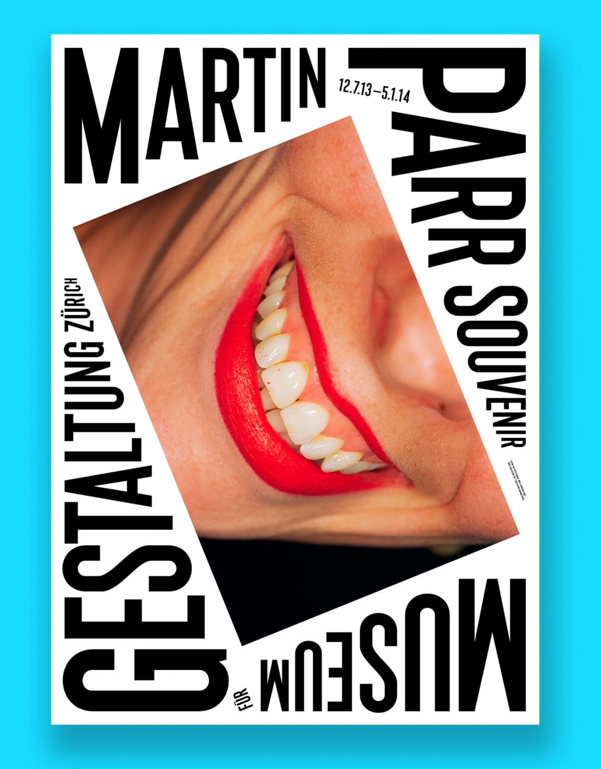
Poster
Design: Sebastian Cremers, Tania Prill, Alberto Vieceli
Zeitlos Schön
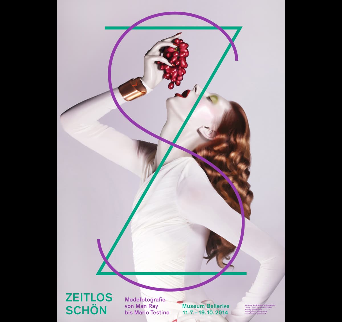
Poster
Design: Sebastian Cremers, Tania Prill, Alberto Vieceli
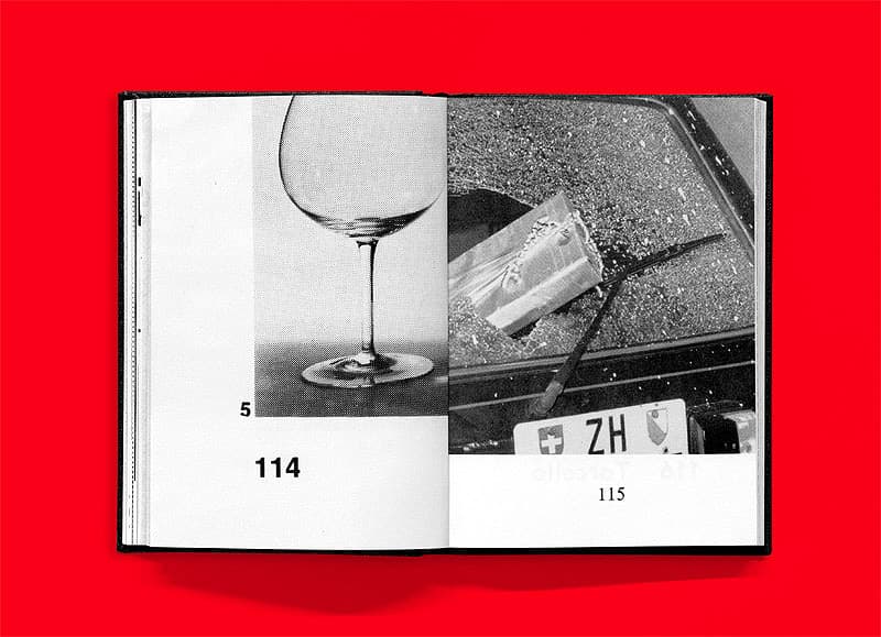
Hot Love
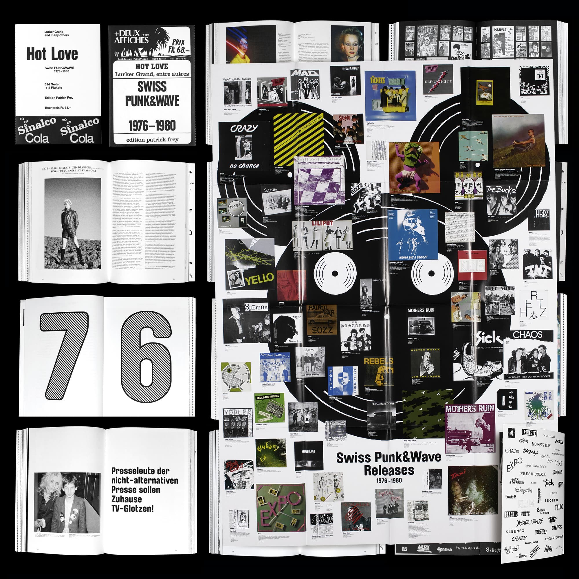
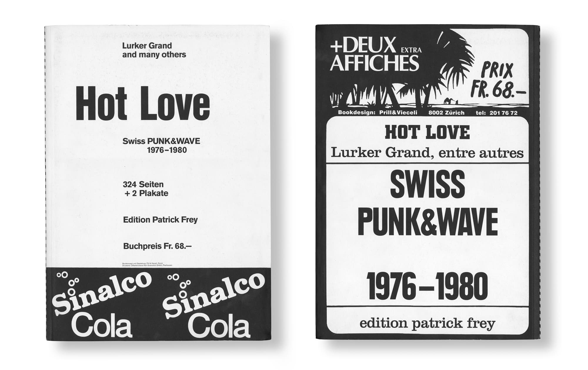
Hot Love – Swiss Punk & Wave 1976-1980 tells the story of the pioneering Swiss Punk scene from the beginning. The Swiss Punk scene emerged in Zurich and Geneva around the same time it started in London and New York, in 1976. Hot Love starts at the very beginning and recounts the complete story until 1980, when Punk went political and much of the energy of the first generation was lost.
Most beautiful Swiss books, 2006
Designed by Prill & Vieceli
Shamans of Cave Graffiti
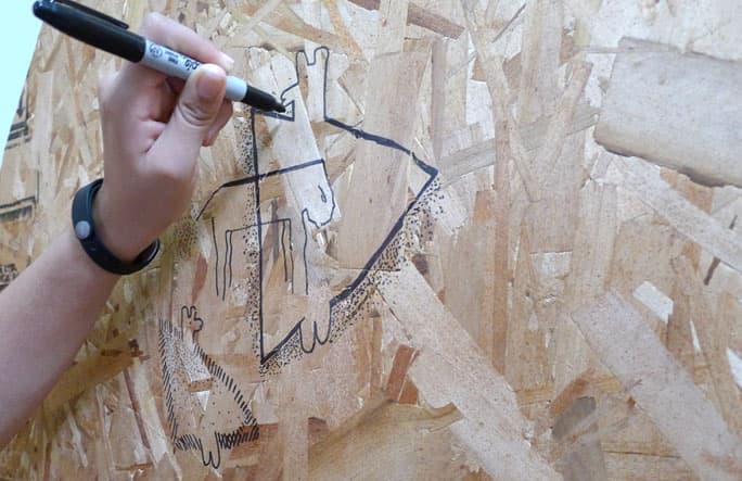
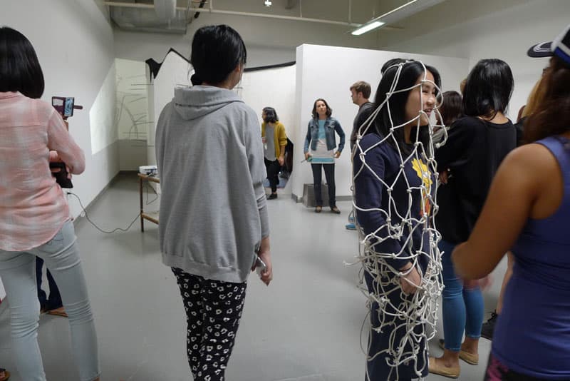
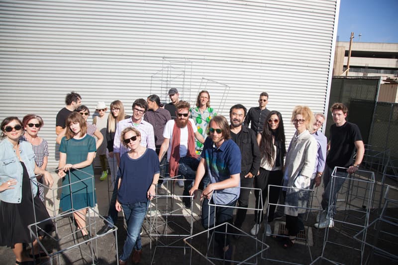
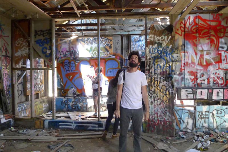
Workshop at OTIS College of Art and Design, L.A., MFA GD Design Week 2015
Kali Nikitas invited me for a workshop during the Design Week together with other visiting artists in 2015. Coordinators: Kali Nikitas together with Menno Cruijsen.
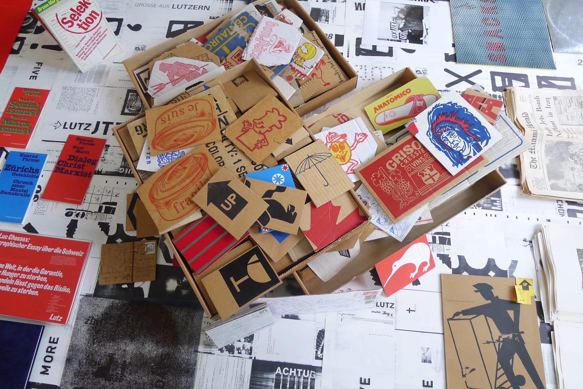
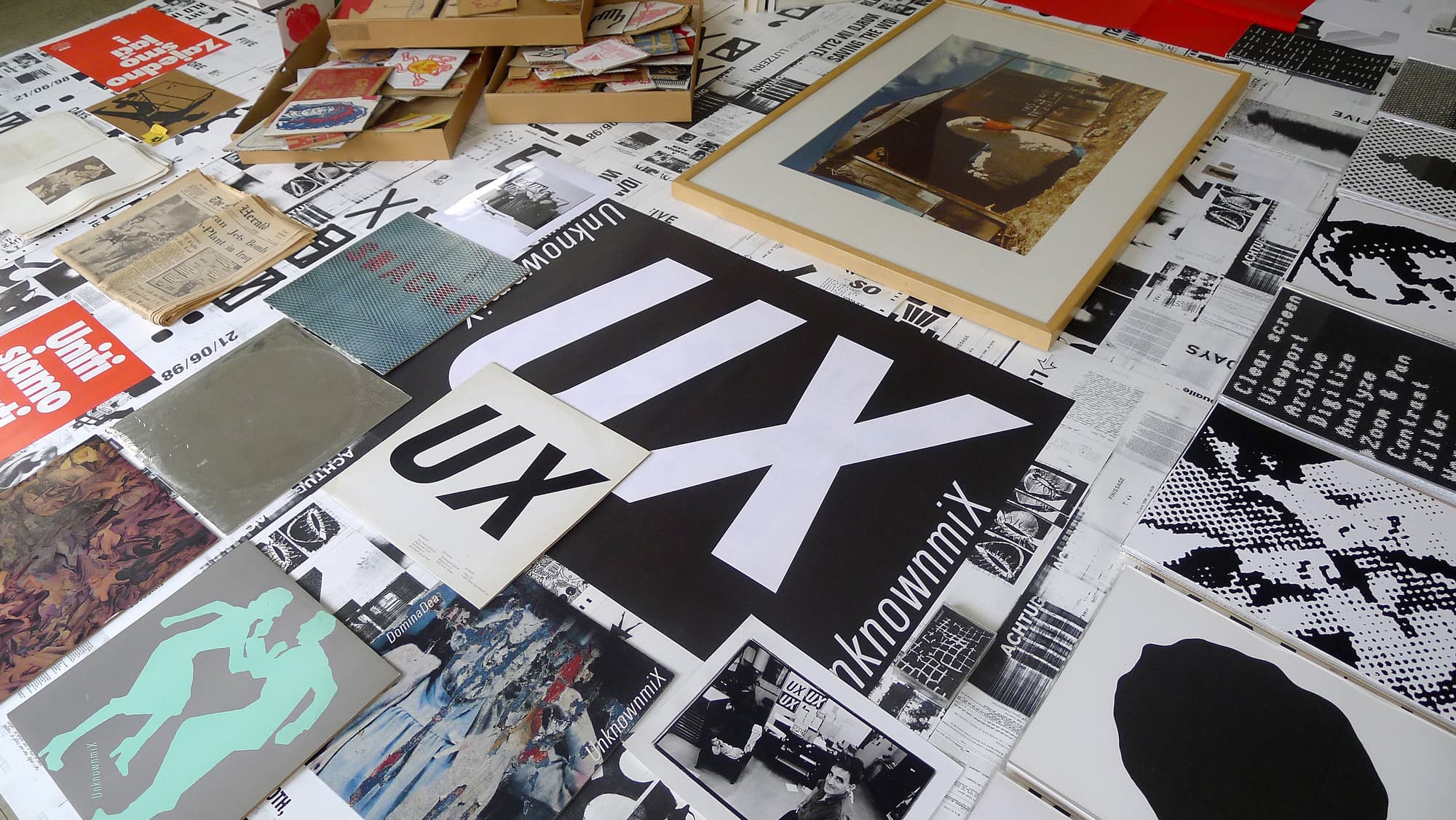
Estate Hans-Rudolf Lutz
Since 1998 I am in charge of the estate of the typographer, teacher, publisher and author Hans-Rudolf Lutz. I am trying to activate his work through lectures and other initiatives. In summer 2021 a reprint of the Hieroglyphs of today will come out as a collaboration with Urs Lehni / Rollo Press.
unsicher
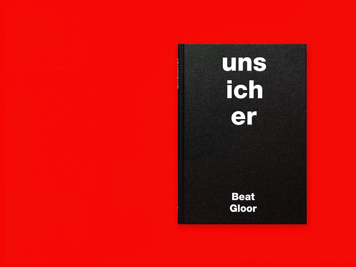
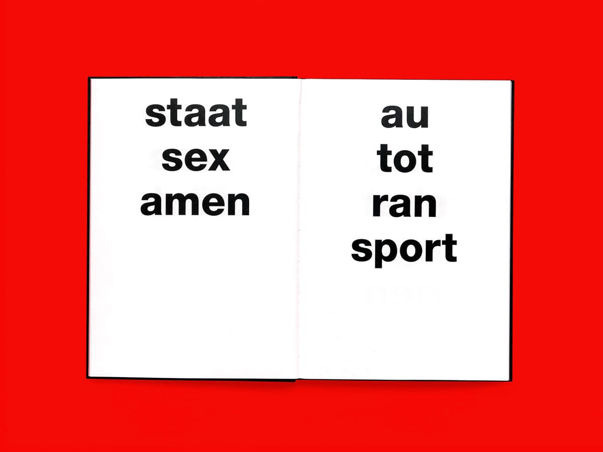
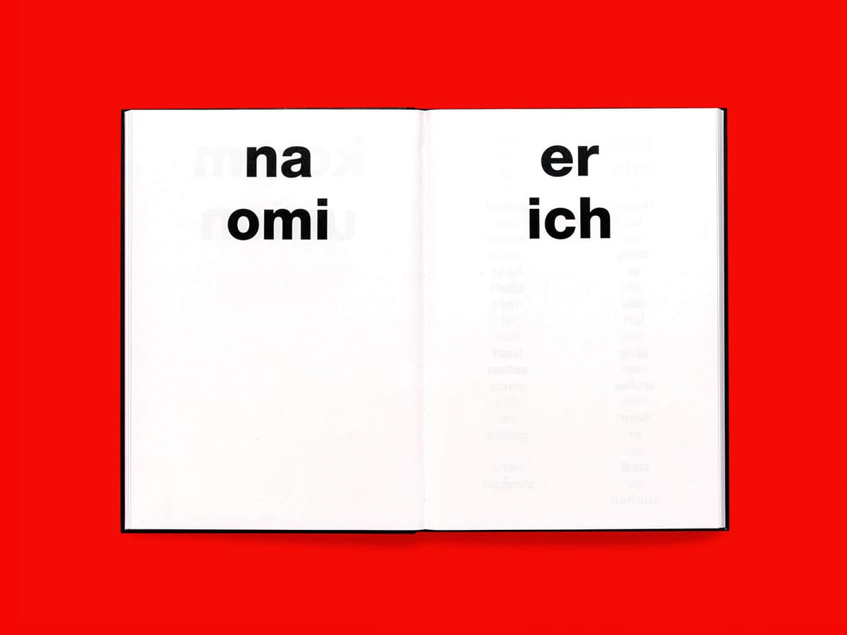
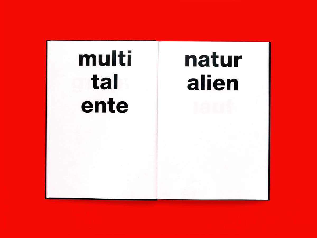
Beat Gloor
«Separations hurt. Separations liberate. Often we miss something afterwards that we thought we were sure of. That makes us insecure.» (Elster & Salis)
Linguist Beat Gloor collected incorrectly separated words over 15 years. The mistakes create new, often humorous meaning. «I would like to warmly recommend this book, which, by the way, has an exceptionally beautiful typography. It is a school of thought as amusing as it is profound.» (NZZ am Sonntag) Designed by Prill & Vieceli – awarded at the Most Beautiful Swiss Books
better safe than sorry
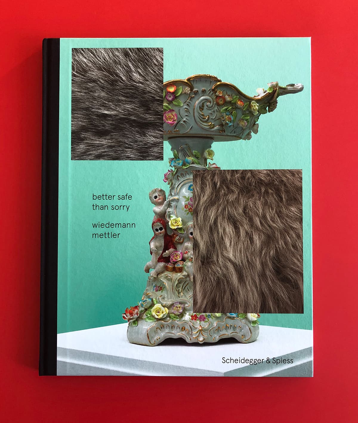
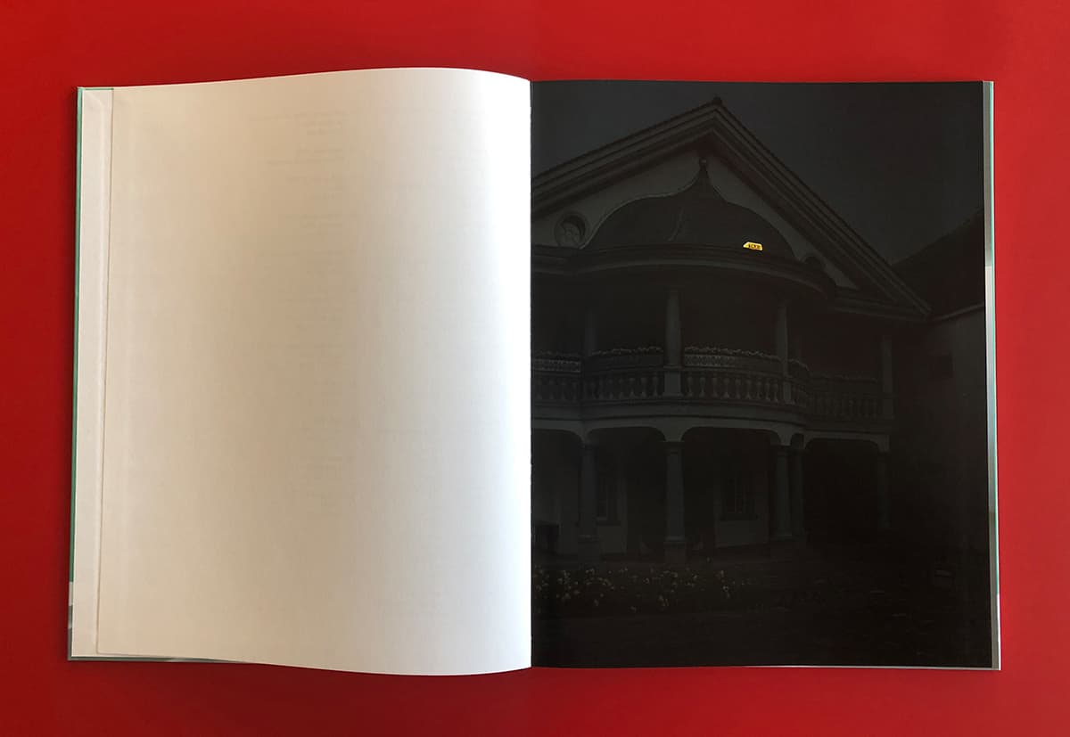

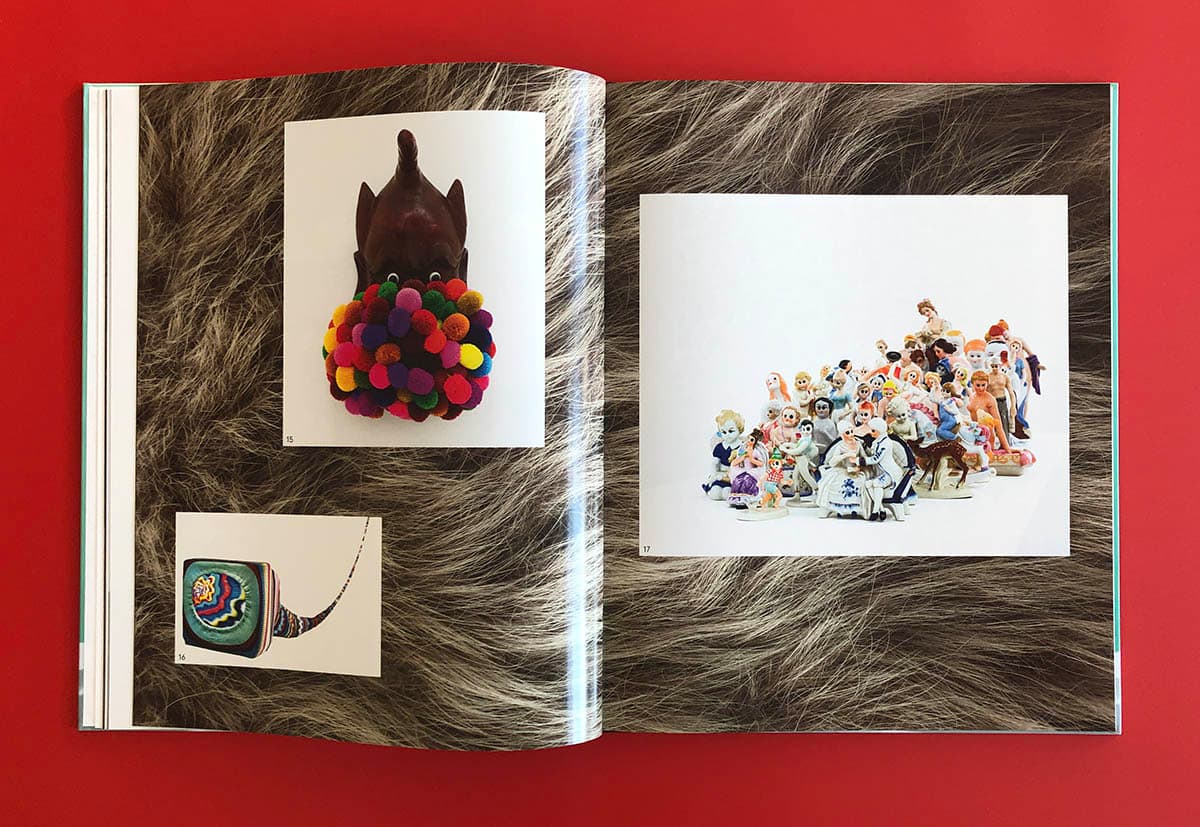
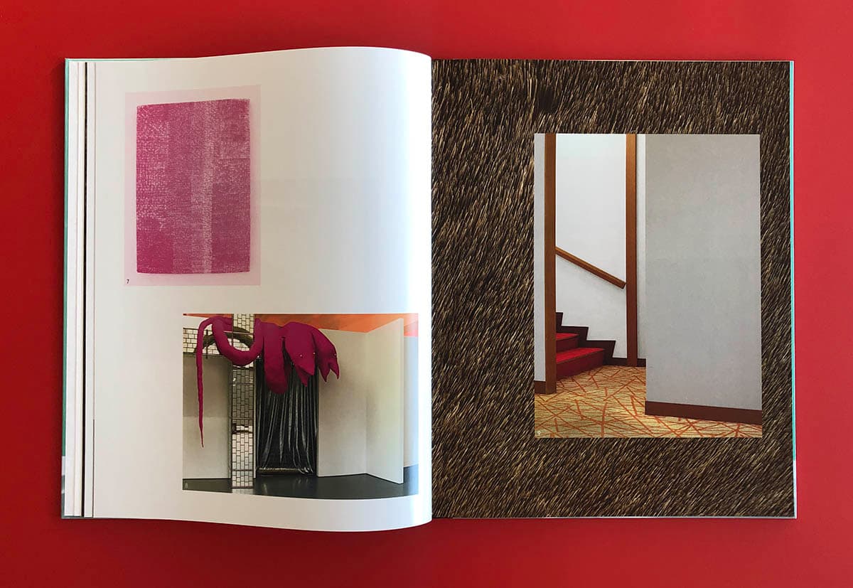
Wiedemann Mettler
Publisher: Scheidegger & Spiess
Design: Prill Vieceli Cremers